





Monumental stacked indexes
Oversized words stacked with rules and a quiet secondary label. The list is the navigation, not a supporting block. This only holds for a short, closed set of destinations; more items turn the type into a wall.
10 published examples


Oversized words stacked with rules and a quiet secondary label. The list is the navigation, not a supporting block. This only holds for a short, closed set of destinations; more items turn the type into a wall.
Client or partner names live inside a sentence, with weight doing the listing. It feels conversational and admits incompleteness. It fails when people need a count, a logo, or a link per name.
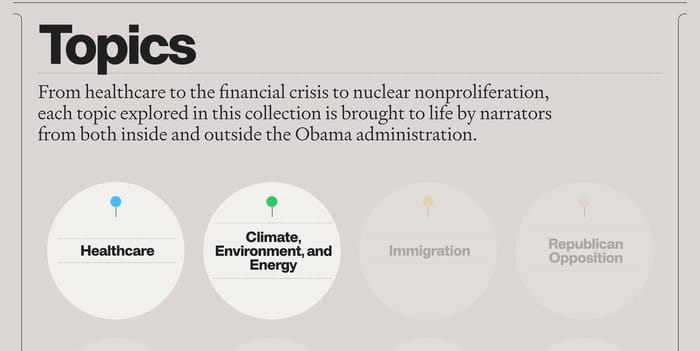
A brief framing paragraph plus discrete topic objects. Here the items are circles with pins, acting as doors into a larger collection rather than as a complete inventory.
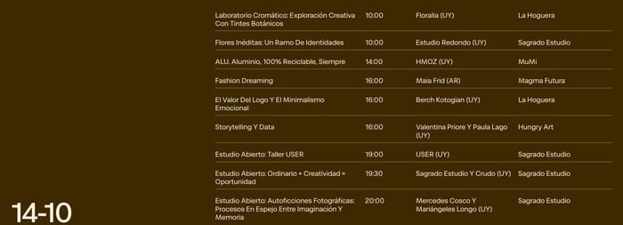
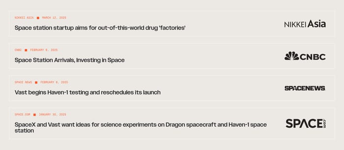
I tend to ask one question in review: can you name an item without reading the whole row? If the title, date, or name is not the first thing the eye hits, the list is competing with itself. Ruled rows work when metadata is the point—round, year, outlet, time. They fail when every row also wants a paragraph; the line height blows up and the scan rhythm dies. Grids help when the item is visual, but equal-height cards punish uneven titles. Hiro’s news cards already show the problem: some headlines wrap four lines, others two, and the “Read more” footer becomes the only stable landmark. Stacked display type, like Ryden’s service index, is a list only if the labels stay few and the secondary language stays quiet. Past five or six items, monument type becomes a wall. Inline client rolls are honest about incompleteness—“to name a few”—but they hide count and order. They are the wrong tool when the roster is the product. A useful test: cover the images. If the remaining type still ranks the set, the structure is doing the work. If not, you designed a mood board.
Use a table or ruled row when people compare the same fields across items—time, stage, year, outlet. Cards win when the item needs a picture or a variable-length story. If you find yourself repeating the same three labels on every card, you already wanted columns.
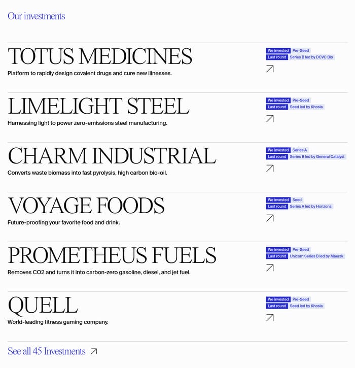
Enough to prove the set has range, not enough to stall the page. Social Impact Capital shows a handful of named investments plus a count. That works when the rest of the page still has a job. A full roster belongs on its own view once scrolling past the list starts to feel like work.
Same fields, not the same word count. Shared slots—name, one line, one meta—keep the scan even. Optional blurbs should collapse or truncate so a short item does not look unfinished next to a long one. Uneven cards are fine if the title still sits on a common baseline.