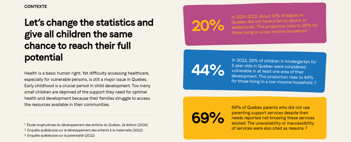












Cited problem statistics
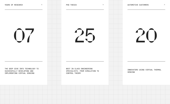
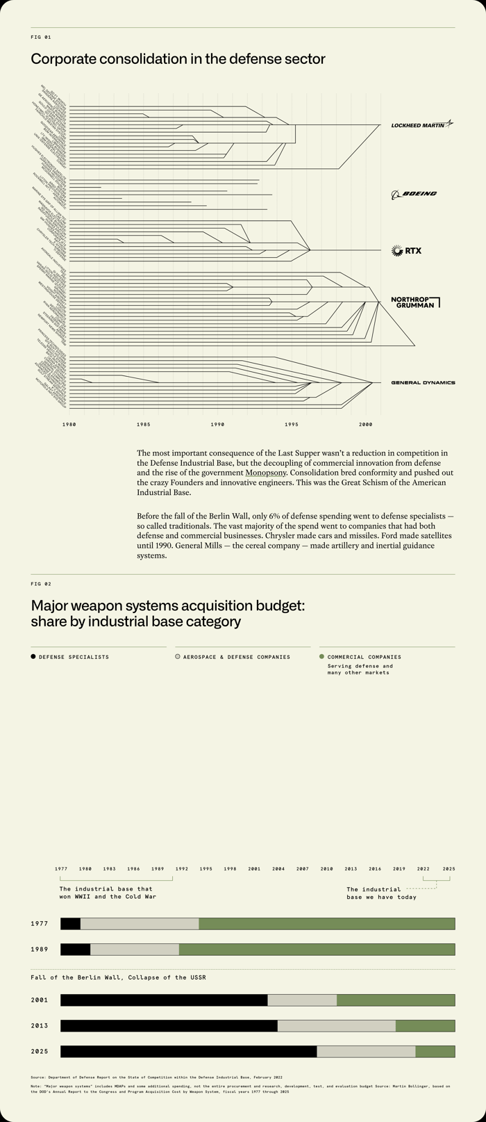
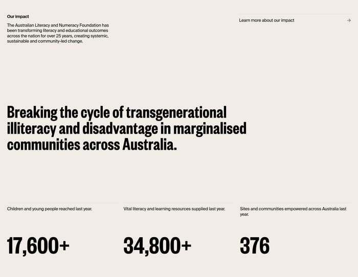
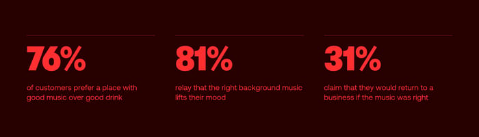
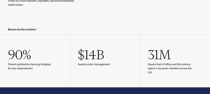
Numbers sit beside a mission or context block and carry sources. The figure is not a trophy; it is evidence that the problem is real and unevenly distributed.
41 published examples

Numbers sit beside a mission or context block and carry sources. The figure is not a trophy; it is evidence that the problem is real and unevenly distributed.
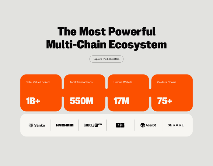
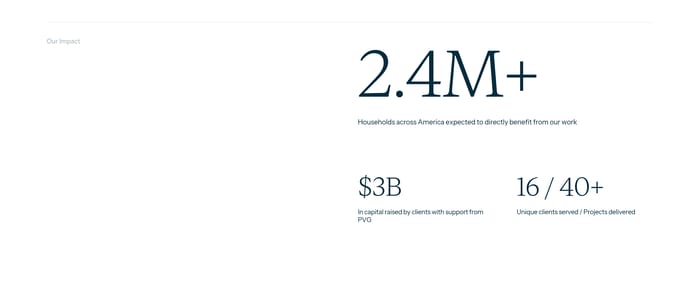
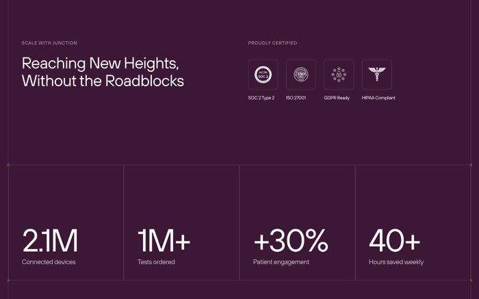
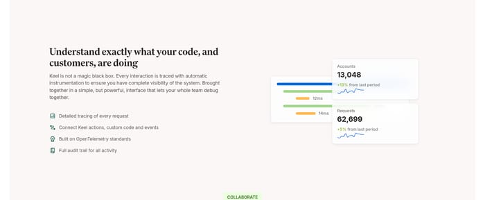
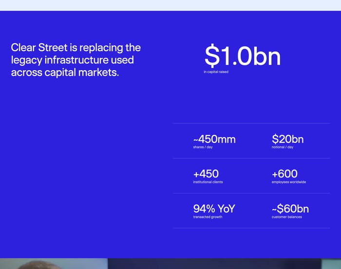
Equal-weight metrics sit in a band or card row to show volume: value locked, sites powered, devices connected. Partner marks or certifications often ride along as secondary proof.
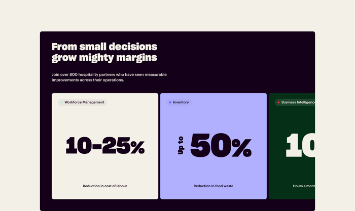
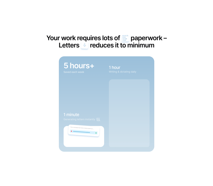
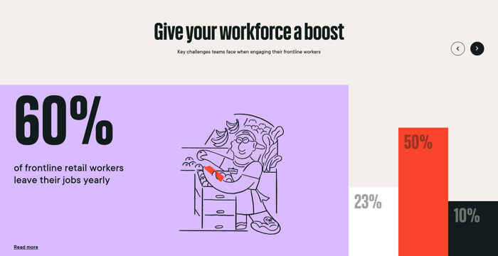
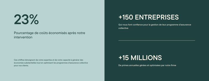
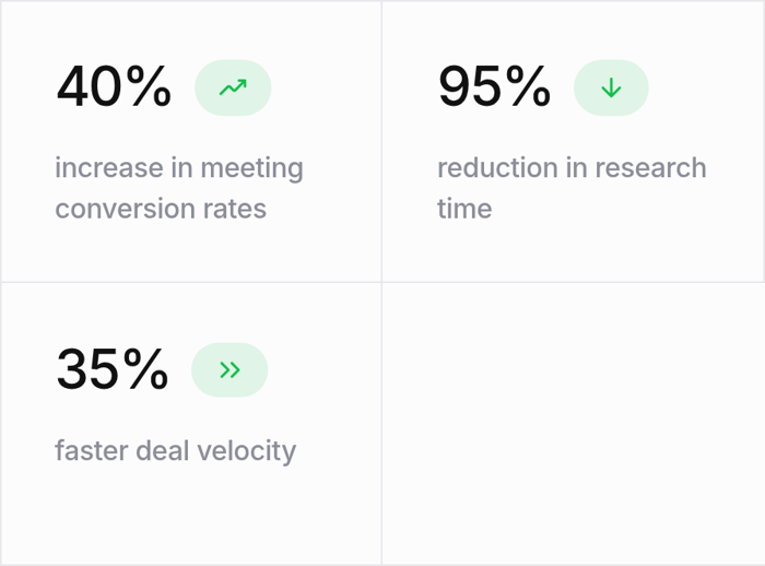
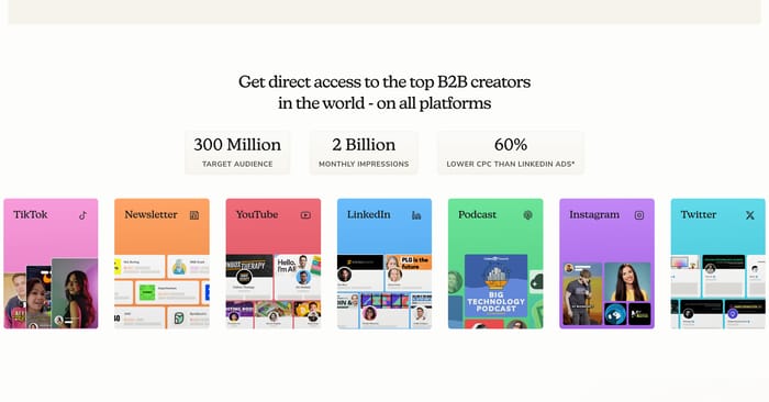
Each metric lives in its own tile, often color-coded by feature or result. The layout sells a portfolio of gains rather than one headline number.
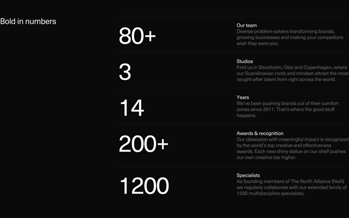
In critique I look first at whether the numbers share a unit of meaning. A row that mixes revenue, team size, and years of experience can feel like a résumé dump. Three related outcomes, or one scale story told four ways, usually hold together better. Type hierarchy is the real craft. The figure should win the first look, but the label has to survive a skim. Tiny captions under huge numerals fail the moment someone asks “of what?” Ranges and “up to” language need extra care; they read as marketing unless the qualifier sits next to the number, not buried below it. Color and cards help grouping, not celebration. A tinted tile can separate workforce from inventory. Four identical orange blocks can also flatten four different claims into one texture. Test the section in grayscale and on a phone: if the labels collapse into a caption soup, the layout is doing too much. Citations, plus signs, and rounded figures are honesty tools. A sourced percentage next to a mission statement earns more trust than a lonely 69%. Rounding to 1B+ is fine for ecosystem scale; it is sloppy for a precise operational count. If legal or research will later demand a footnote, design the footnote now instead of hoping the number can stand alone.
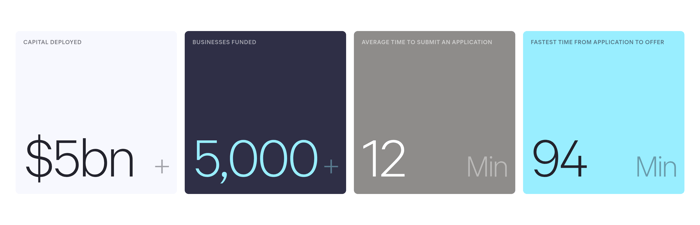
Three or four related claims usually hold. Past that, the row starts competing with itself and labels shrink. If you need more proof, split by theme or move secondary figures into a later case study rather than stretching one band.
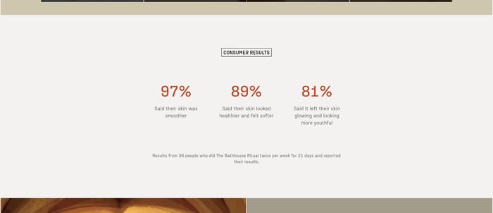
When the number only makes sense after a named client, a photo of the work, or a before-and-after claim. A lone 360 or 10x without that context looks like decoration. Pair it when the reader needs to know whose result they are looking at.
Keep the rounding visible and consistent. 1B+ and 75+ signal approximation; 2423 does not. Put the qualifier in the same line as the number, and avoid mixing precise counts with marketing plus-signs in the same row.