













Testimonial Section Design Patterns

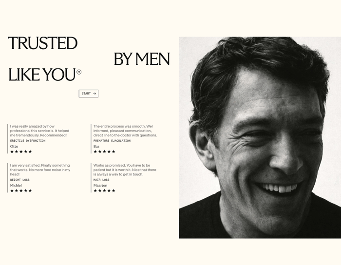
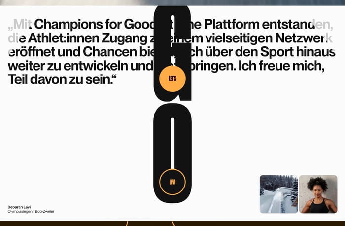
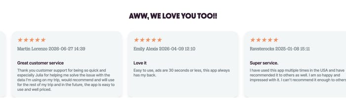
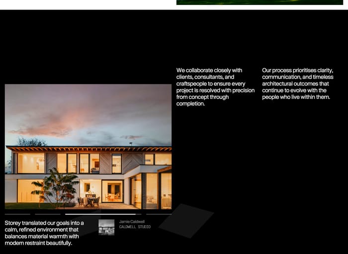
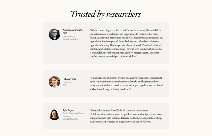
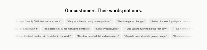
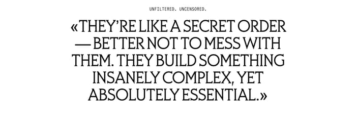
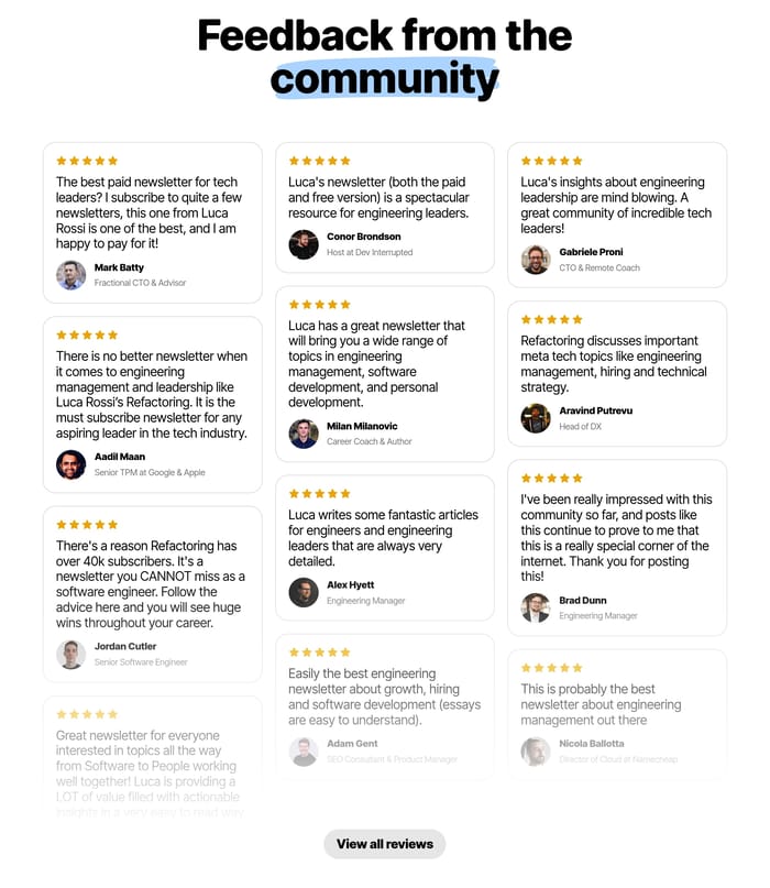
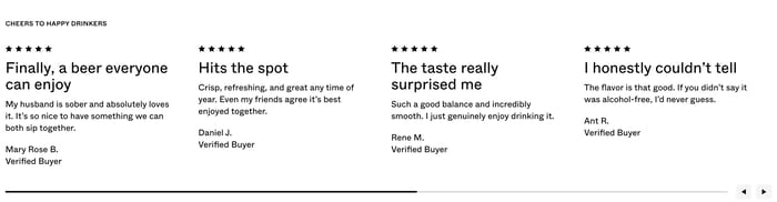
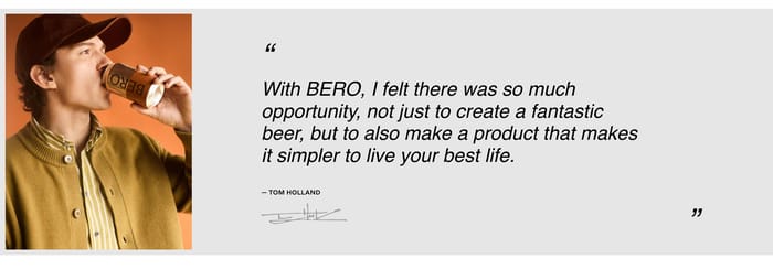
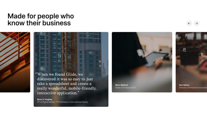
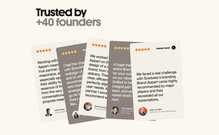
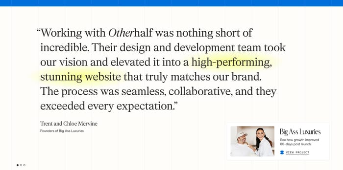
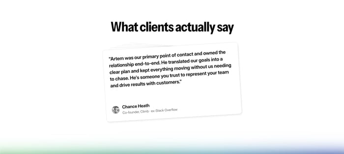
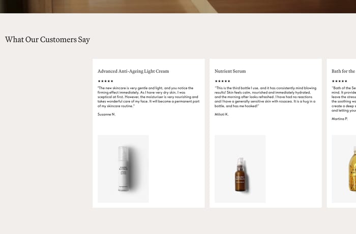
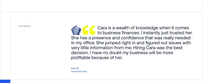
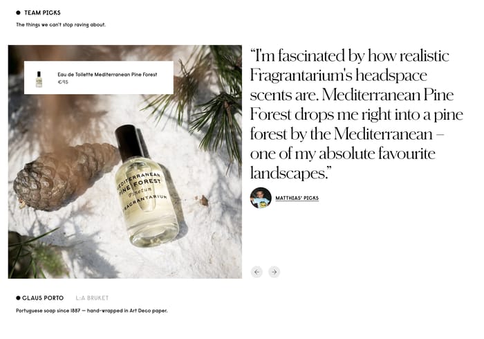
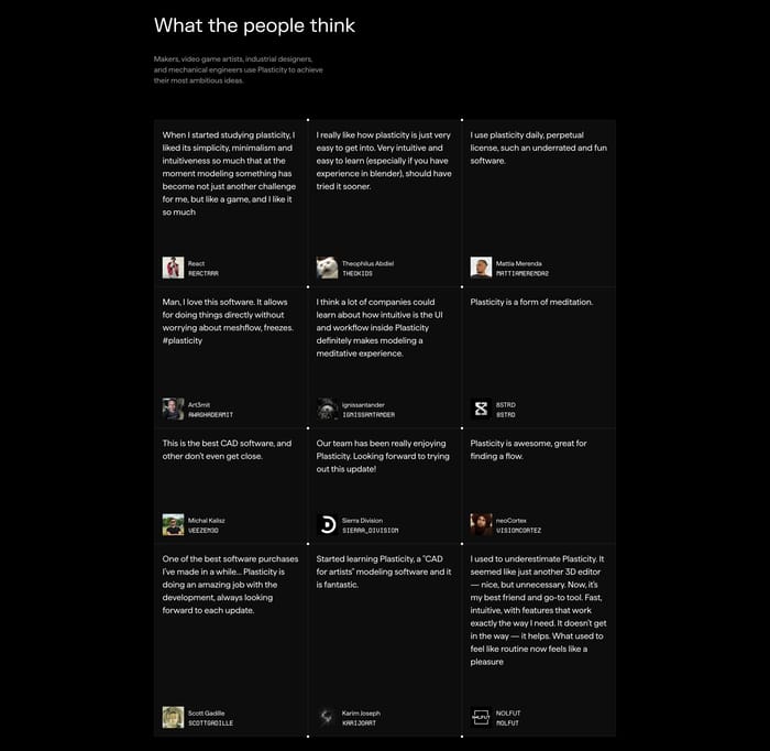
A testimonial section is a block of customer, client, or press language used as proof. It sits between claims and conversion. After features, near pricing, or next to a product, it answers who already believes this? The collection shows how wide that job can stretch. Some pages give one quote the whole stage and treat it as editorial type. Others pack many voices into cards, carousels, or a wall so volume itself becomes the argument. Commerce layouts pin comments to a specific SKU, rating, and photo. B2B layouts pair a sentence with a metric, a logo, or a short case-study card. Attribution ranges from a first name to a founder photo, title, and company mark. Video and advisor portraits show up when the product needs a face, not just a line. The useful question is not whether you have testimonials. It is which kind of proof the reader needs at that scroll position.

270 published examples

How to design a Testimonial section

I tend to read the quote first with the brand name covered. If the sentence could sit on any competitor's site, the section is decoration. Specificity is the real layout problem: a long, concrete quote needs type scale and line length, not another star row. A thin quote needs company, role, and maybe a result beside it, or it will feel planted. Watch the hierarchy between voice and chrome. Giant quotation marks, five-star rows, and logo walls can outshout the words. If the eye lands on the card stack before a single claim, the composition is doing theater. Carousels hide the second and third voices; that is fine when one story is enough, wasteful when the argument is lots of people. Grids and quote walls work only if each cell is scannable in two seconds. Truncation that cuts before the payoff is worse than fewer quotes. Attribution has to match the buying committee. A first name is enough for a sauce or serum. A title and company mark matter when the reader is a VP comparing vendors. Photos help when trust is personal; they clutter when the proof is the outcome. Mix quotes with metrics only when the number and the sentence describe the same win. Otherwise the section reads as two half-arguments.

Testimonial design questions

Is one strong quote better than a wall of reviews?

One exceptional quote is stronger than six interchangeable compliments. Use a single voice when the sentence names a concrete outcome and the reader already understands the product. Use a grid or wall when the risk is whether this is only one happy client. Marketplace and consumer pages often need that chorus. If every card says great to work with, you do not have a volume problem. You have a copy problem.

When should a testimonial become a case study card?

A testimonial is a voice. A case study is a narrative with context, metrics, and a path to read more. Mixing them in one module works when the quote is the hook and the card is the evidence. It fails when both try to be complete. If the reader needs the full story, send them out. Do not stuff a six-minute case into a quote card.

Where should a testimonial section sit on the page?

Place the section against the objection it answers. After a feature list if the doubt is whether this actually works. Beside a SKU if the doubt is whether this is the right one. Ahead of pricing if the doubt is risk. Footer-only testimonials feel like leftover inventory. A hero quote can lead the page when the line is more interesting than your headline. Otherwise it steals focus from the offer.

Unlock premium section designs

Go Pro to get instant access to 270 premium section designs + exclusive features

Related section categories

Curating the internet’s finest.