





Bento Sections: Patterns From Real Product Pages

Bento sections are modular grids of mixed-size tiles. Their job is to present several related claims at once without forcing a single linear story. On a landing page they often sit after the hero and act as a product map: capabilities, proof, and atmosphere in one scan. The collection ranges from full-bleed fashion photography to dense industrial metrics and SaaS UI fragments. Some layouts stay nearly equal, like a feature board. Others stretch one tile into a hero and tuck stats or quotes into the remainder. Color-blocked cards, overlapping product chrome, and instrument-style dashboards all show up. What stays consistent is hierarchy through scale. The largest tile sets the thesis; smaller ones supply evidence. When that relationship is clear, a bento reads as one argument. When every tile is equally loud, it reads as a pile.

12 published examples

Your design research assistant sponsor preview
Your design research assistant
150,000+ screens, flows & UI components from best apps
Readymag sponsor preview
Readymag
Create your dream website with Readymag

Get weekly top sections delivered to your inbox, every monday. No spam, only inspiration.Unsubscribe anytime.

Bento design patterns to explore

Full-bleed editorial mosaics

These grids treat photography as the structure. Attaquer fills the viewport with campaign tiles, each carrying a headline and shop action. The mosaic feels like a lookbook, not a feature list. It works when the product is visual and the copy can stay short.

Proof-heavy mixed tiles

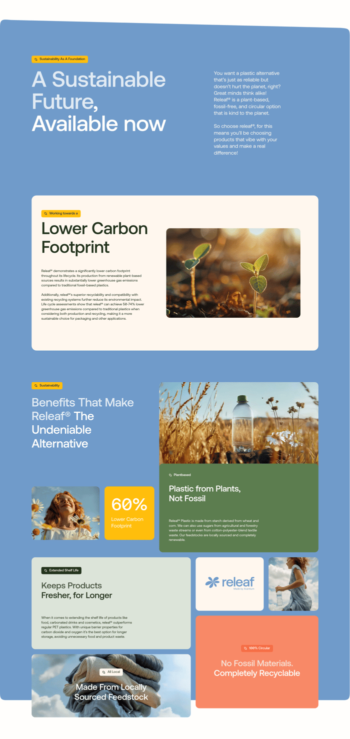
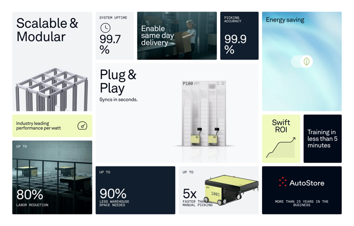
Zapio and Releaf rank claims by tile size and color. Big stats, product stills, and short labels share one field. The eye lands on the oversized number or the cream card first. This pattern is for proof, not narrative. Too many equal percentages and the argument flattens.

SaaS capability boards

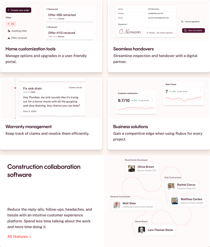
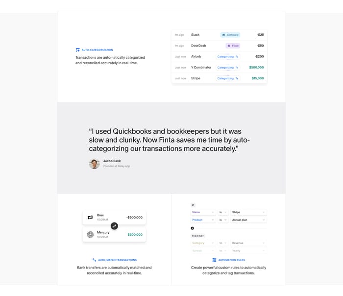
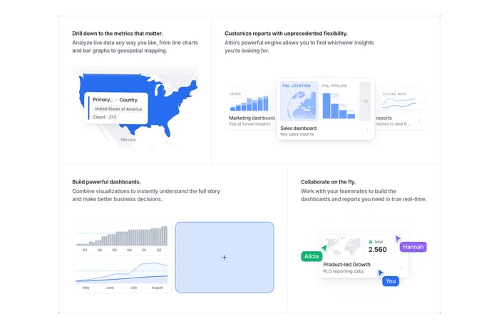
Outseta, Rubus, and Attio turn the bento into a capability map. Each card names a job and shows a cropped interface. Near-equal cells work because the product is a stack of peers. The risk is caption-sized type inside the mock fighting the title outside it.

How to design a Bento section

The review question I keep asking is: can I name the one idea this grid is arguing? If I cannot, the tiles are competing. Scale should do more work than decoration. A double-width product shot or an oversized stat tells people where to look first. Equal cards work when the product really is a set of peers, like payments, CRM, and email sitting side by side. They fail when one capability is the actual reason to buy. Watch the UI chrome. Cropped product surfaces sell specificity, but they go muddy if type inside the mock is smaller than the caption outside. Photography-led tiles need a contrast plan for type and buttons; fashion images already fight for attention. Dense metric grids need breathing room and a limited palette, or they become a dashboard nobody invited. On small screens the irregular mosaic usually becomes a stack. The order of that stack is the real design: the former hero tile should still lead, and orphaned stats should not land first. I tend to test by covering the largest tile. If the leftover grid still makes sense, the supporting claims are doing their job.

Bento design questions

When is a bento stronger than a simple feature list?

A bento earns its complexity when several claims need to be seen together and they are not equally important. Scale can rank a hero capability against supporting proof. A vertical list is cleaner when the story is sequential, or when there is no visual evidence worth cropping. If every item would get the same size tile, you probably wanted a list.

How many tiles can a bento hold before it stops grouping?

The stronger examples stay graspable in one look: a few large cells, or a dense mosaic with one obvious lead. Past that, headlines, screenshots, and stats stop reading as one argument. A practical test: describe the section in one sentence. If you need a clause for every tile, split the grid or cut a claim.

What usually breaks when a mixed grid hits a phone?

Irregular column spans collapse into a single column, and the original lead can sink. A side stat may greet people first. Treat the stacked sequence as its own composition. Keep in-tile interface crops simple; tiny dashboard chrome that works at desktop width becomes noise when the card is full-bleed on a phone.

Unlock premium section designs

Go Pro to get instant access to 12 premium section designs + exclusive features

Curating the internet’s finest.