





Case Studies Section Patterns That Prove the Work

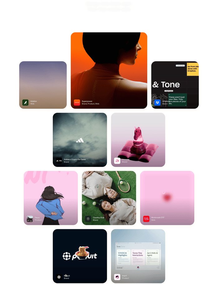
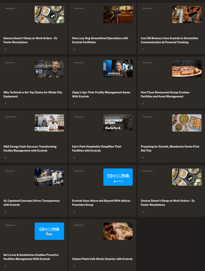
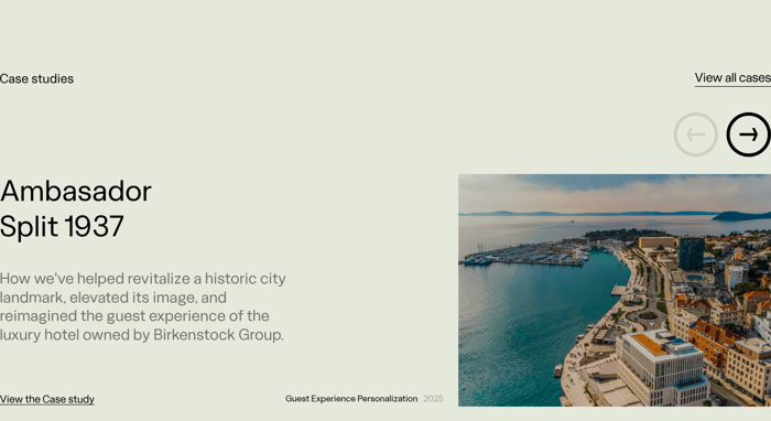
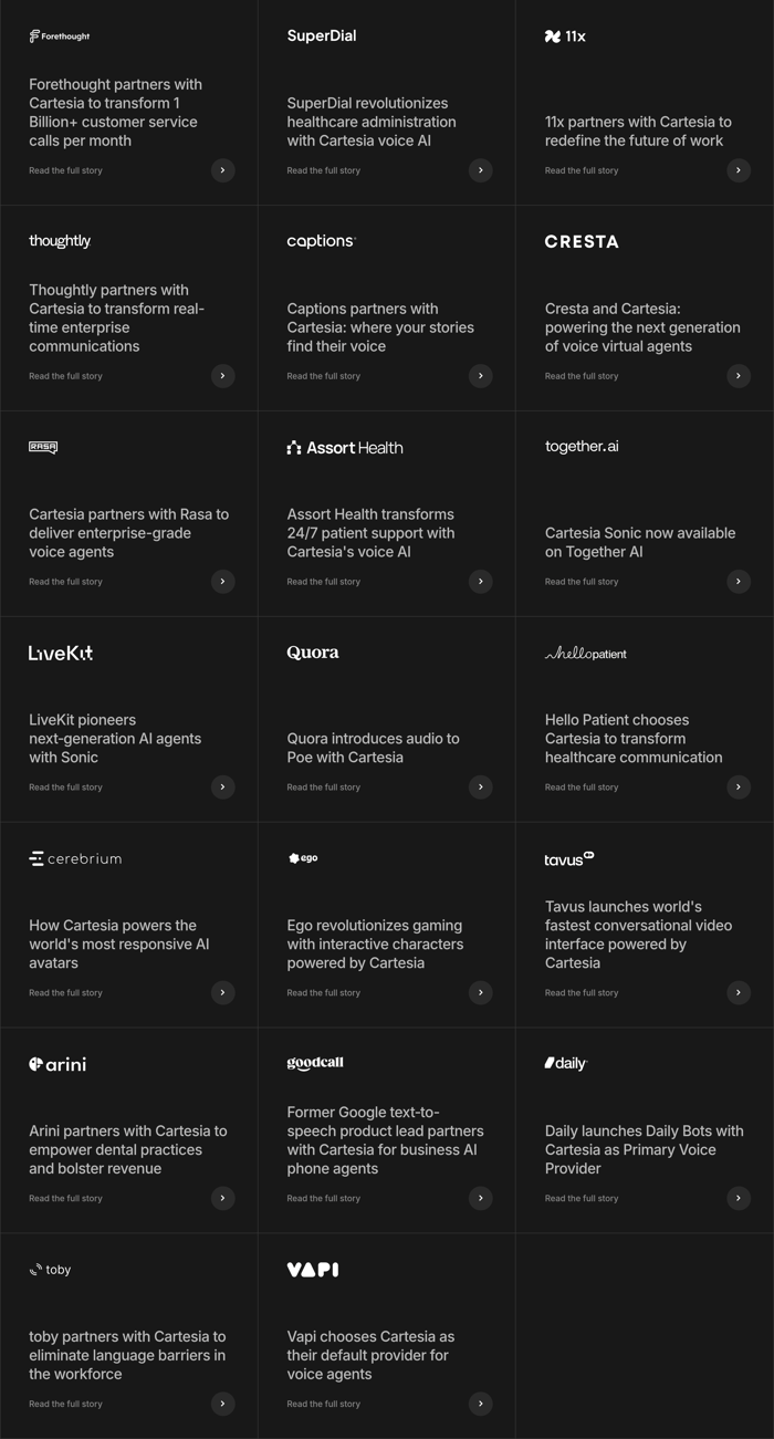
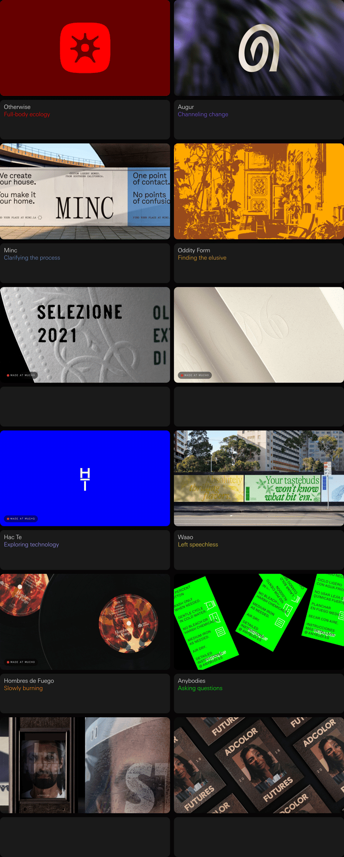
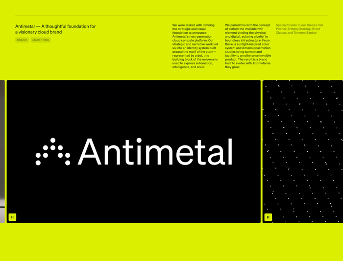
Case studies sections sit between marketing claims and the actual work. Their job is to make a visitor believe the company has done this before, for people like them, with a result that matters. In this collection the same job takes very different shapes. Studios often treat the section as a project index: names, disciplines, and a path into the archive. Product companies treat it as proof: a logo, a number, a quote, a video. Some pages feature one story at a time with editorial scale. Others present a dense grid of headlines so a buyer can scan for their industry. The useful variation is not decoration. It is how much story you show before the click, and whether the section is selling craft, outcomes, or volume of evidence.

14 published examples

How to design a Case Studies section

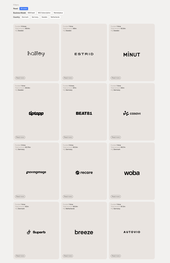
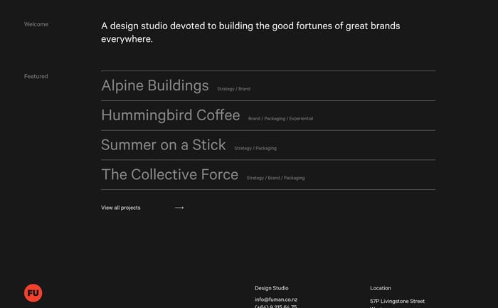
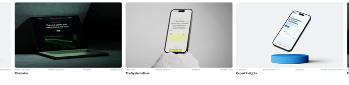
When I review these, the first question is whether a stranger can name the customer, the problem, and the result in one glance. Text lists fail when the names are unknown and the tags are internal jargon. Metric modules fail when the number is huge and the context is missing, or when every card repeats the same sentence structure. Visual mosaics look expensive and say almost nothing if the caption is just a brand plus a discipline. I tend to ask for a secondary line that states the intervention. Catalogs need a hierarchy: one featured story or a working filter, otherwise a dozen equal cards flatten into wallpaper. Watch contrast on dark cards, especially muted gray type on charcoal. If the whole card is not clickable, people miss the story. A useful trade-off is fewer cases with a sharper outcome versus a complete archive that only insiders can parse. Motion and video help only when a paused frame still carries the claim.

Case Studies design questions

How many case studies should a homepage section show?

Enough to prove range without becoming a second archive. One featured story plus a short list, or three to six cards, usually beats a wall of twelve equal tiles. If you have a large library, surface a filter or a view-all link and keep the first screen curated for the audience on that page.

How much of the story belongs on the section versus the case page?

Enough to make the click feel earned. A name, a sector, and one concrete result usually suffice. Long process copy on a landing module competes with the next section. Save the strategy narrative for the dedicated page, unless you are featuring a single flagship story and the rest of the page is quiet.

When does a text-only case list outperform a visual grid?

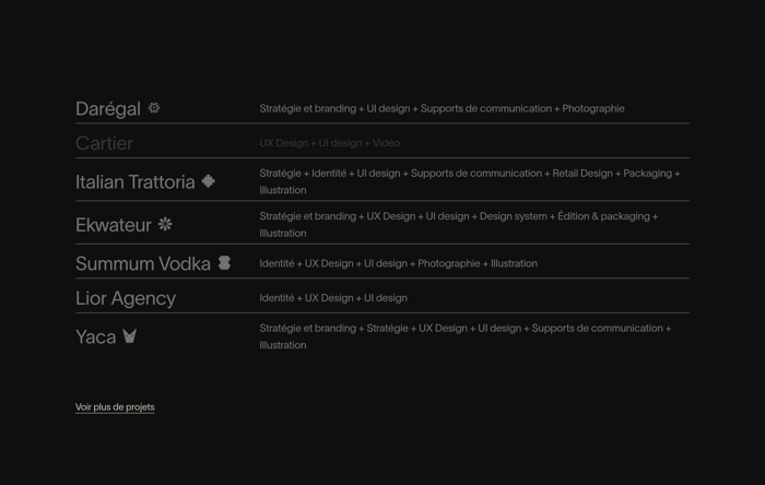
When the client roster is the signal and the site already has a strong visual voice elsewhere. A restrained list also ages better than a mosaic of hero shots that go stale. It underperforms if the names are unknown. Then a single outcome line or a small still next to the name earns the click.

Unlock premium section designs

Go Pro to get instant access to 14 premium section designs + exclusive features

Related section categories

Curating the internet’s finest.