


























Quiet trust strips
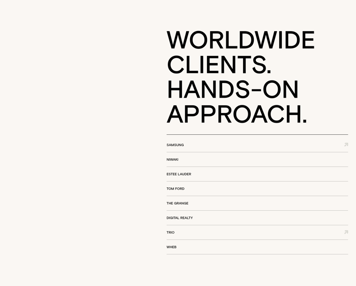
A short headline and one even row of monochrome logos. The section stays thin so it can sit under a hero without competing. Best when the names already carry the argument.
33 published examples

A short headline and one even row of monochrome logos. The section stays thin so it can sit under a hero without competing. Best when the names already carry the argument.
Logos sit under a specific sentence or beside large numbers. The copy frames who these companies are and why they matter, so the marks become evidence instead of wallpaper.
Logos live in cells, white cards, or a sliding track. Structure equalizes awkward mark shapes and can hint at a longer roster without dumping every logo on screen at once.
In review I look at three things first: optical size, contrast, and claim. Marks of wildly different widths will never look even if you only match bounding boxes. Scale to visual weight, then test the row at 375px. If two logos vanish, the set is too large or the treatment is too faint. Monochrome is the default because mixed brand colors fight the page. It fails when a mark depends on color or when gray-on-white drops below a comfortable contrast. Full-color logos can work on a strong field, but they need more space and fewer neighbors. The headline is doing more work than the marks. “Trusted by” is fine when the names are famous. A more specific line, or a metric sitting above the grid, gives the logos a reason to exist. A photo background or a dense card wall can look premium and still fail if the marks become texture. Motion is a trade-off. A slow marquee implies breadth. A static grid implies a curated shortlist. If logos are the only proof on the page, I would rather have six sharp, well-spaced marks than a blur of twenty.
Enough to feel real, few enough to stay sharp. Six to eight well-known marks usually beat a crowded wall. If the set is long, keep a short static row in view and let the rest live in a slow marquee or a second row that can wrap.
Only when color is part of recognition and the field can hold it. Most pages look calmer in one ink. Convert to a single tone, then restore color for the one or two marks that become unreadable in gray. Never mix full-color and muted logos in the same row.
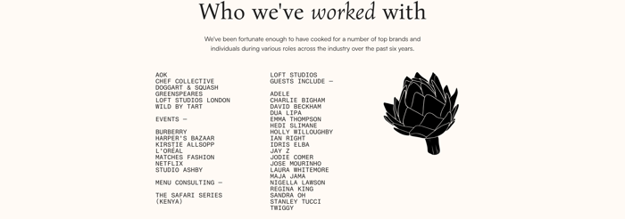
When the names are stronger than the files, or when you want the section to feel editorial. A typeset roster also avoids licensing and optical-size fights. Use it on about pages and studio sites. Keep the classic logo strip when a buyer is scanning for familiar marks in a few seconds.
Compare section designs that serve a similar purpose on your page.