







How It Works: Patterns From Real Product Pages

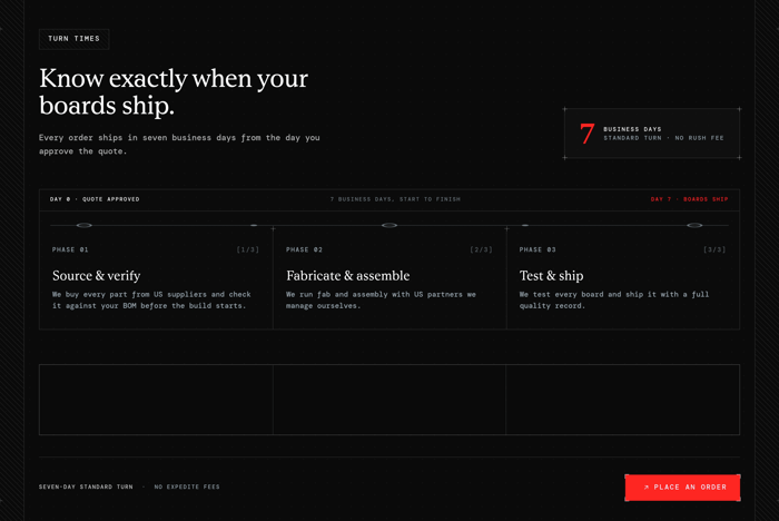
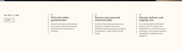
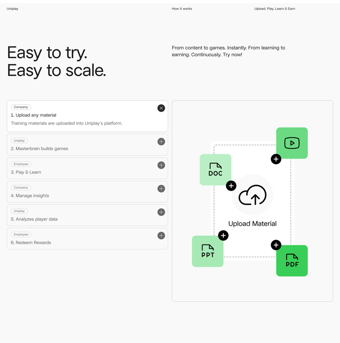
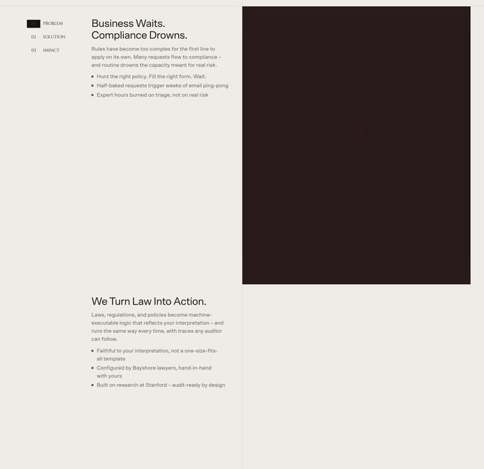
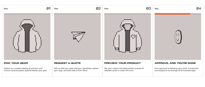
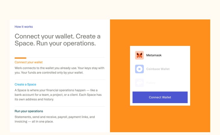
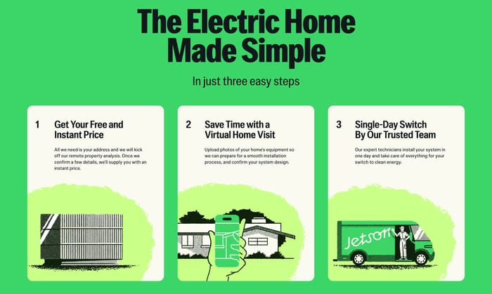
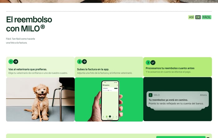
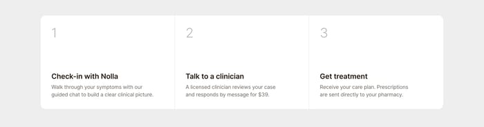
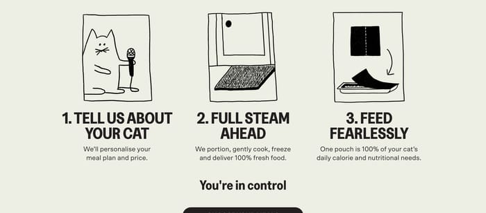
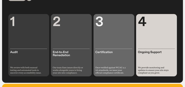
A How It Works section explains the path from first contact to a finished outcome. Its job is to reduce uncertainty: what happens, in what order, and what the user or team actually has to do. On product pages it often sits after the promise and before pricing or proof, answering the quiet objection that the offer is too abstract. You will see more than one way to do that work. Some teams use three numbered cards with a verb-led title. Others draw a linear roadmap, a system diagram, or a product interface that stands in for the missing step. A few skip the grid entirely and write the process as a scene. That variation is not decoration. It is a choice about whether the reader needs a sequence, a mechanism, or evidence that the thing already exists.

83 published examples

How to design a How It Works section

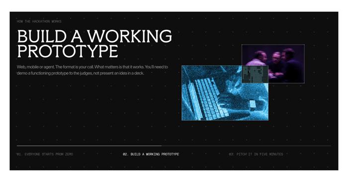
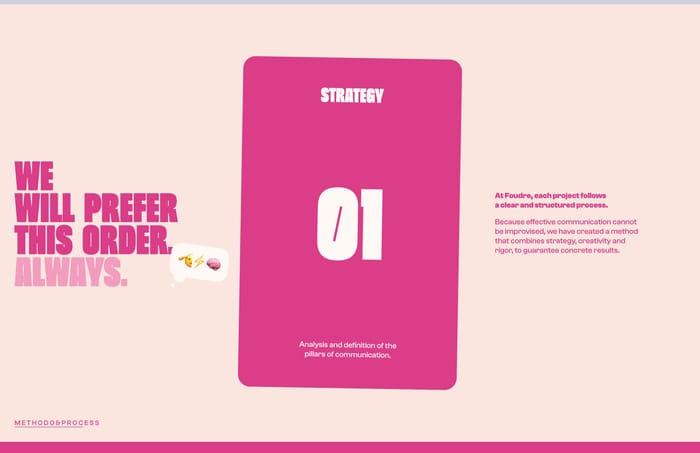
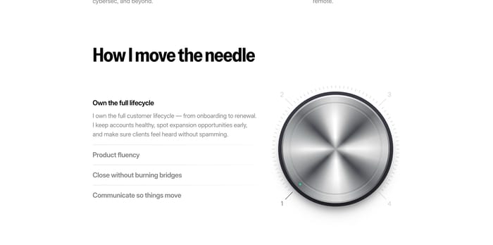
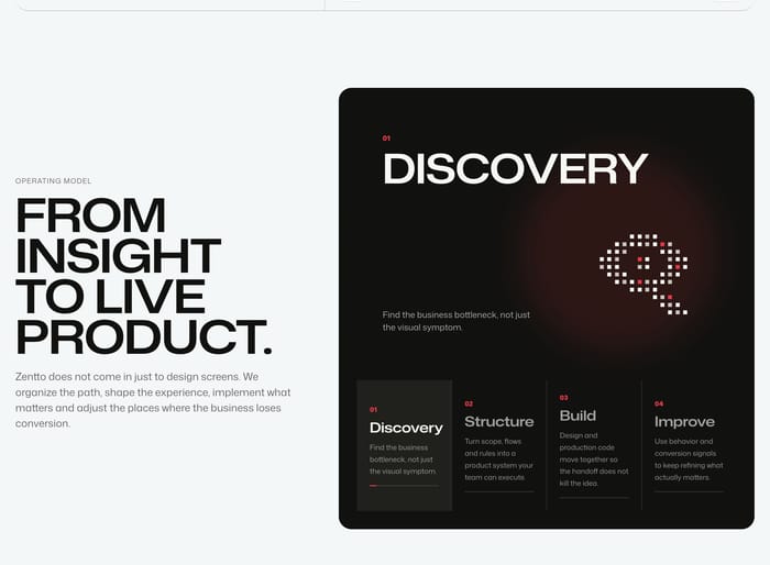
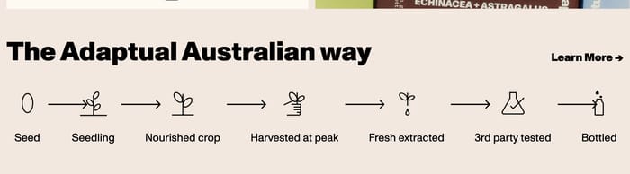
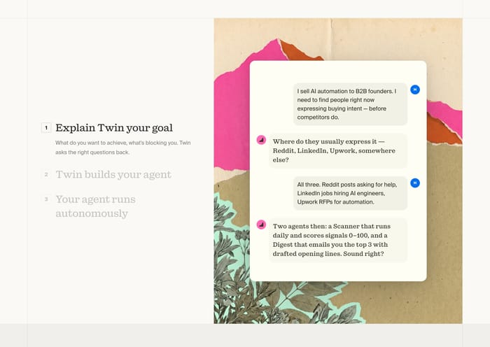
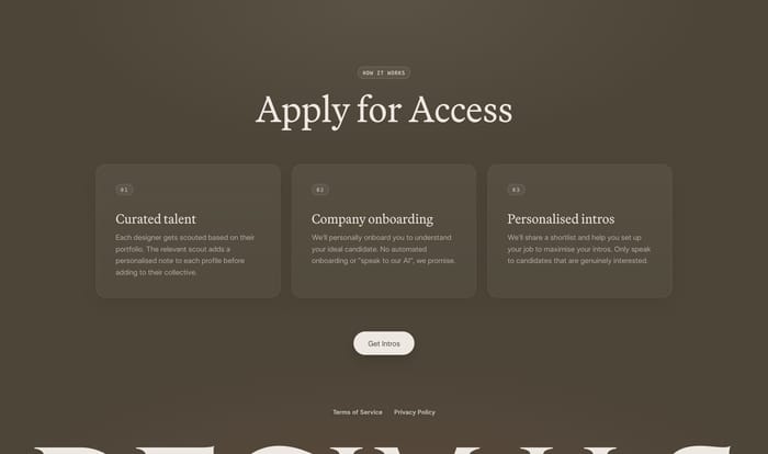
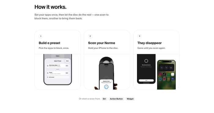
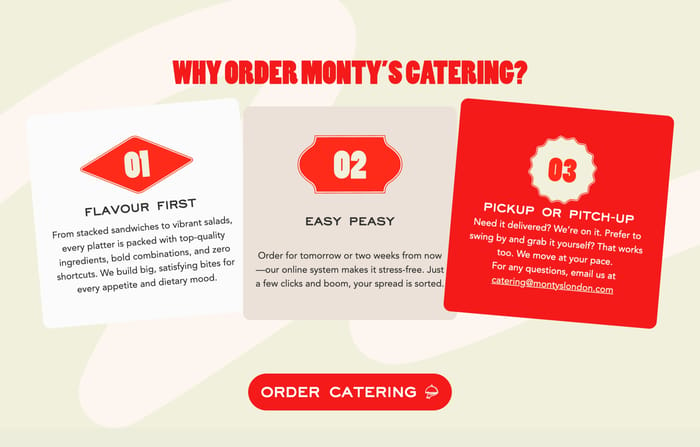
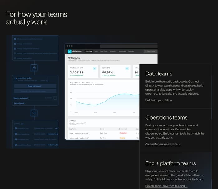
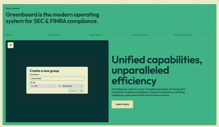
The first review question I ask is whether the steps are actions the reader can imagine, or internal phases dressed as a customer journey. "Discovery, Structure, Build, Improve" can sell a studio method. It fails on a consumer product, where people want "scan the disc," not "onboarding alignment." Count the cognitive load. Three steps with one verb and one outcome each scan cleanly. Seven icons in a row start to feel like a supply-chain poster unless each mark is unmistakable. If a diagram needs a legend, it is probably a methodology page, not a landing-section explainer. Watch the relationship between copy and picture. A screenshot that shows the exact moment described in step two earns its space. A decorative dial or overlapping circles only helps if the metaphor maps to the claim. Otherwise it becomes a second puzzle. Cover the headline. Can you still tell what the product does from the steps alone? If not, the labels are too generic: setup, customize, enjoy. Horizontal timelines and Venn diagrams also need a single-column plan; the sequence has to survive without the original geometry. A button under the steps only works if the last beat already implies readiness. "Get intros" after a human onboarding story is coherent. A leap from "we bottle it" to "apply now" is not.

How It Works design questions

How many steps belong in a How It Works section?

Three is common because it fits a beginning, a middle, and a result without a long row of equals. Four can work when the last beat is support or iteration. Past that, you are often mixing user actions with internal phases. Collapse the internals, or move them to a longer methodology page.

When is a diagram better than step cards?

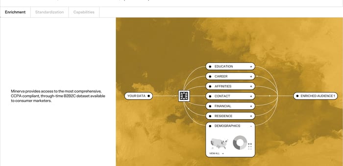
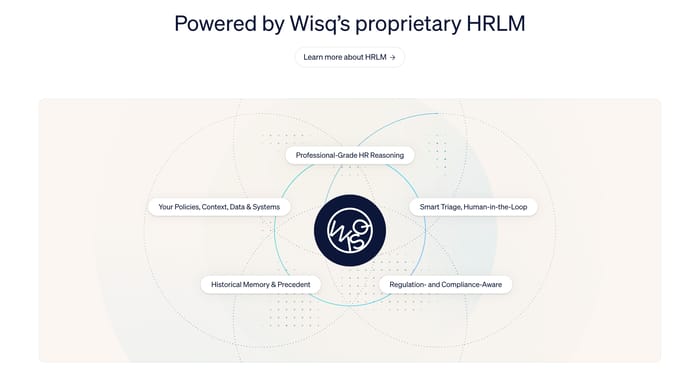
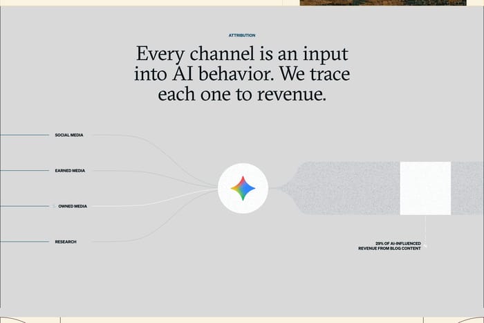
Use a diagram when the reader needs relationships, not order: inputs into a model, overlapping capabilities, many sources becoming one output. Cards imply sequence and agency. If nobody actually does step two, a card layout will feel staged. Keep every label concrete enough that the graphic still makes sense if the illustration vanished.

How do you keep How It Works from becoming another features grid?

Features answer what the product can do. How It Works answers what happens next and who does the work. If every card could live in a features row, rewrite around time, handoffs, and outcomes. After reading, someone should be able to estimate effort, wait, and the first action they must take.

Unlock premium section designs

Go Pro to get instant access to 83 premium section designs + exclusive features

Related section categories

Curating the internet’s finest.