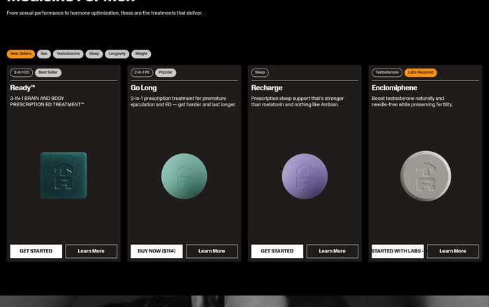
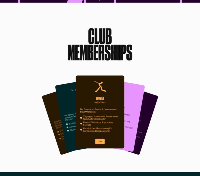
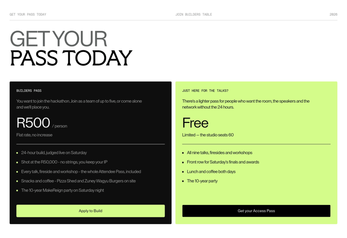
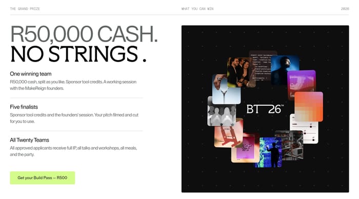
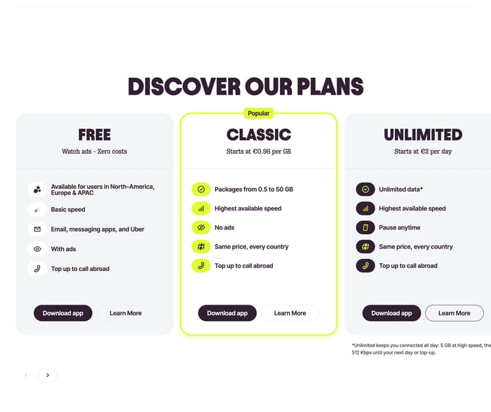
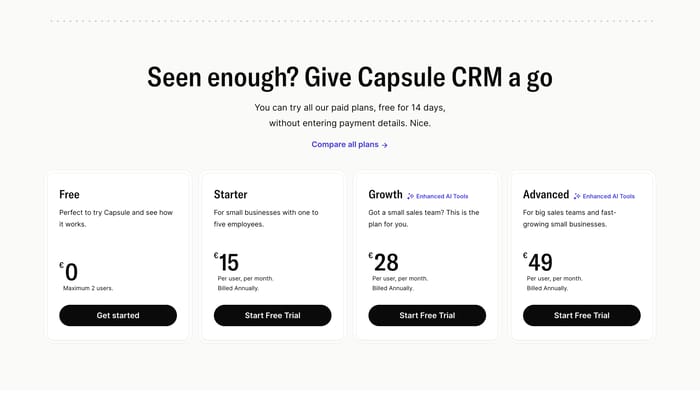

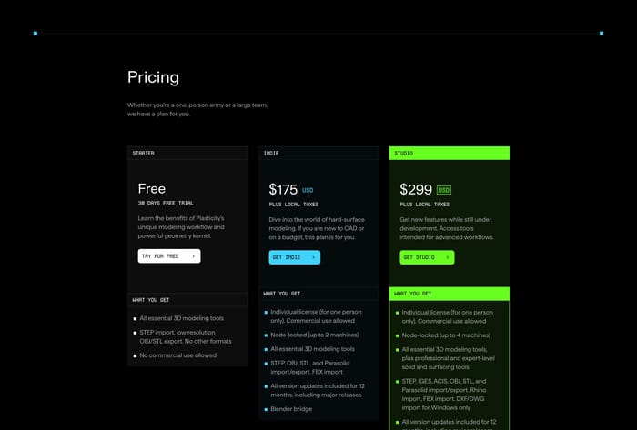
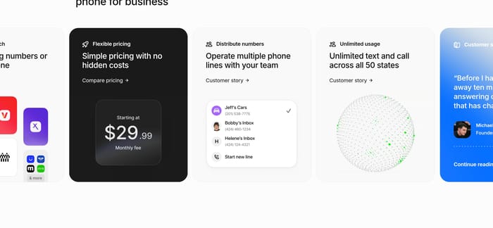



Tiered plan cards
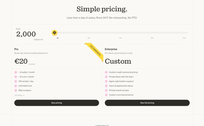
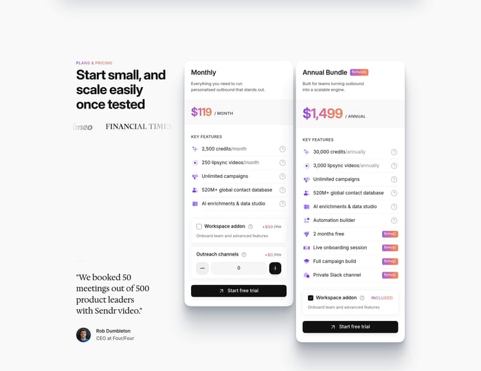
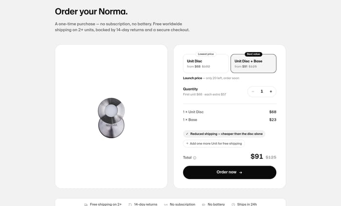
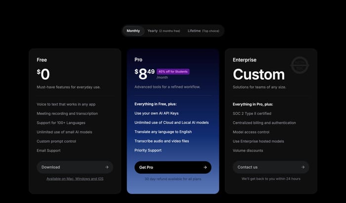
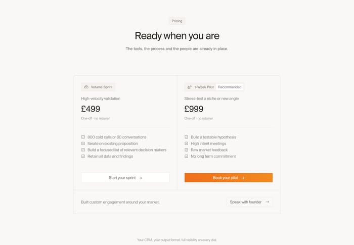
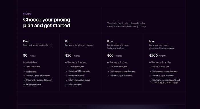
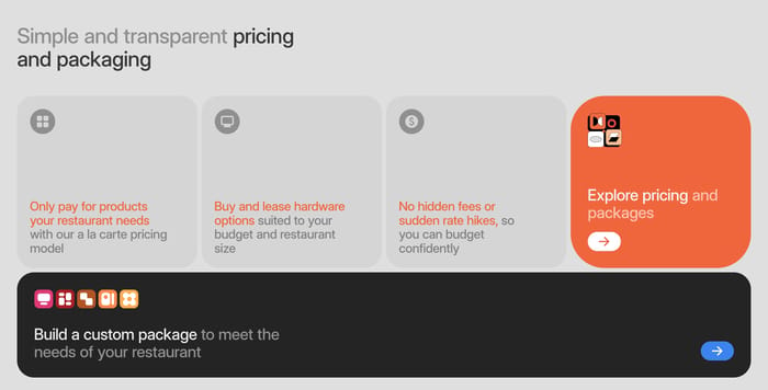
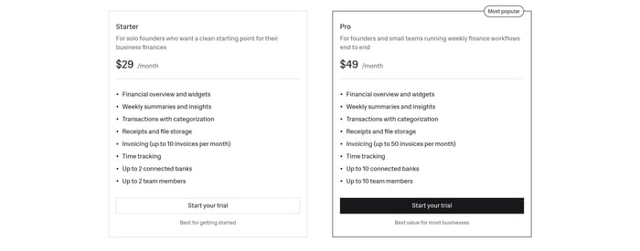
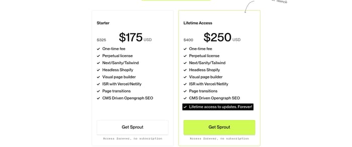
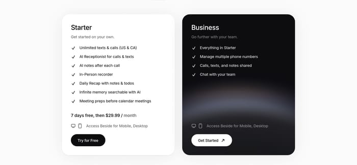
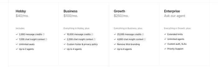
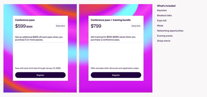
Side-by-side columns with a price, short audience line, feature list, and CTA. Highlight one recommended tier and keep the remaining cards quieter so comparison stays possible.
61 published examples

Side-by-side columns with a price, short audience line, feature list, and CTA. Highlight one recommended tier and keep the remaining cards quieter so comparison stays possible.
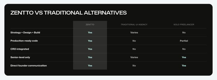
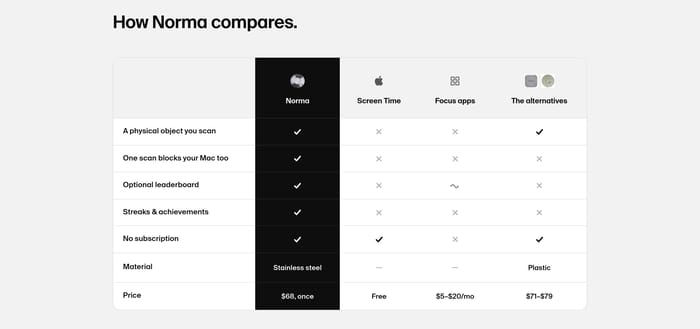
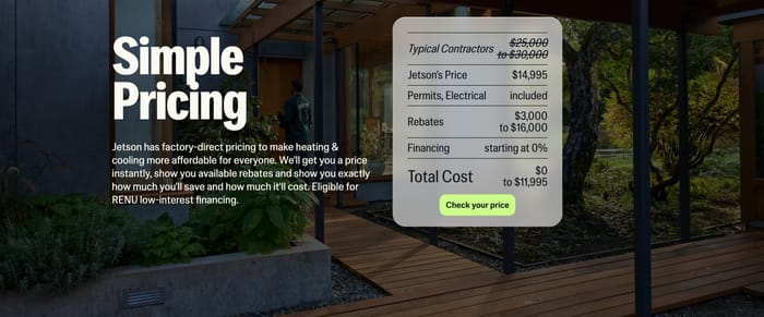
A matrix that prices the product against agencies, apps, or contractors. Rows should be buyer questions, not slogans, and the home column needs a clear visual weight.
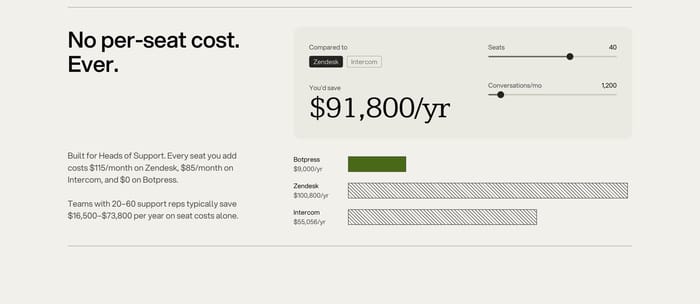
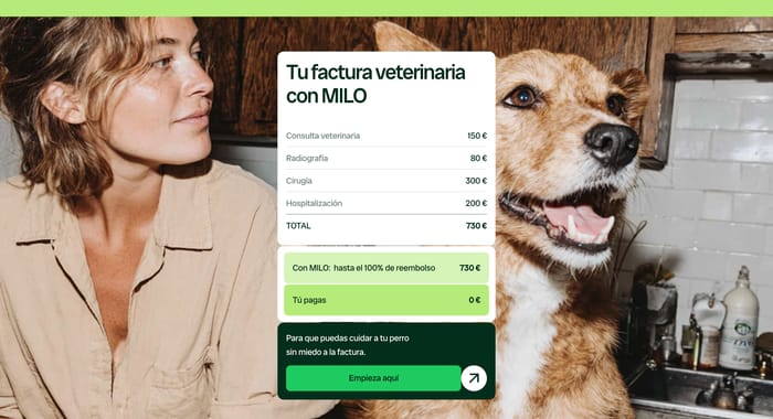
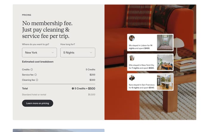
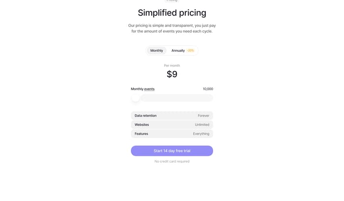
Sliders, seat counts, or usage inputs that turn a pricing claim into a number the visitor can own. The assumptions have to stay visible or the savings figure feels theatrical.
In review I look at the first five seconds, not the feature list. Can you name the recommended path, the unit of cost, and what happens after the click? Plan cards fail when every column is equally loud, or when the middle tier is highlighted but the copy still reads like a catalog. Comparison tables fail when the rows are marketing slogans instead of decisions a buyer already has in mind. Calculators fail when the big savings number moves but the assumptions stay hidden. Watch type scale: the price should outrank the plan name, and the plan name should outrank the bullets. Watch alignment across columns so limits, seats, and licenses can be compared without hunting. On small screens, a four-column grid becomes a long scroll; collapse to two honest options or a sticky recommended card. I tend to ask one practical test: if we removed the highlight color, would a new visitor still know which offer we want them to take? If not, the hierarchy is doing the selling, not the offer.
Use a table when the buyer is choosing you versus something they already know, not Bronze versus Gold. Plan cards explain your packaging. A table explains why the packaging exists. If the rows cannot be phrased as decisions the buyer already has, the table will read as a brochure.
Three is comfortable when the middle path is genuinely different. Four only works if the fourth is a custom or enterprise escape hatch, not another feature stack. Two is enough for one-off sprints, licenses, or products. Extra columns usually hide an unresolved packaging problem.
A unit, a time window, and a consequence. Monthly versus yearly, seats versus credits, one-time versus subscription. Social proof can sit beside the cards if the offer feels risky, but it should not compete with the number. The CTA needs to match the commitment: trial, contact, or buy.
Compare section designs that serve a similar purpose on your page.