


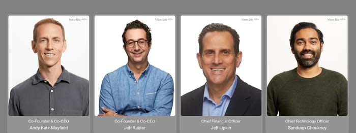
Equal-weight portrait grids
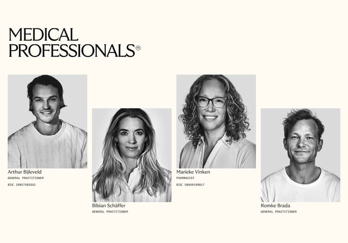
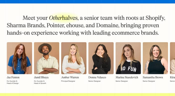
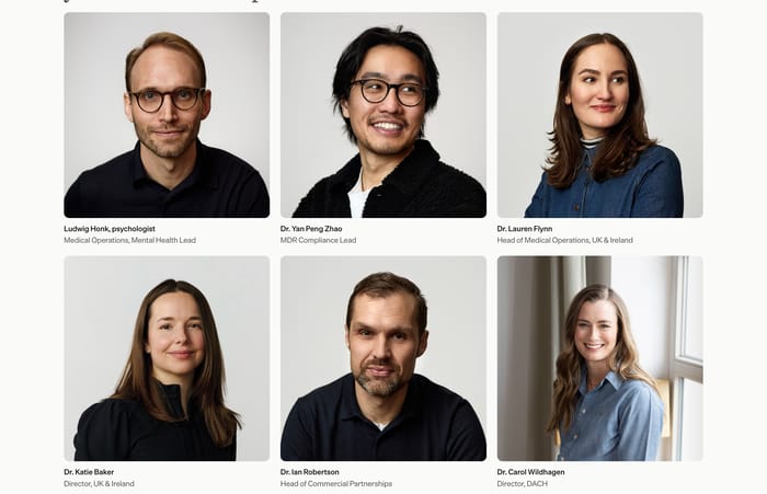
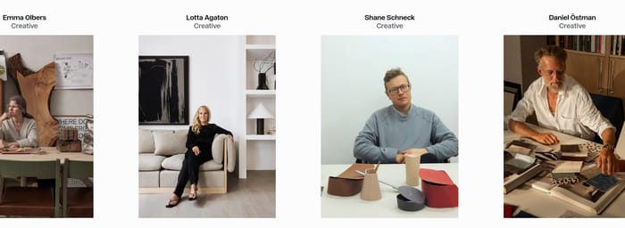
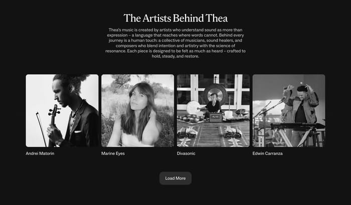
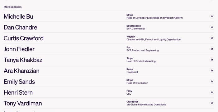
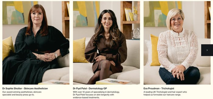
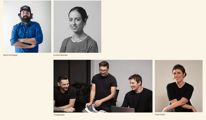
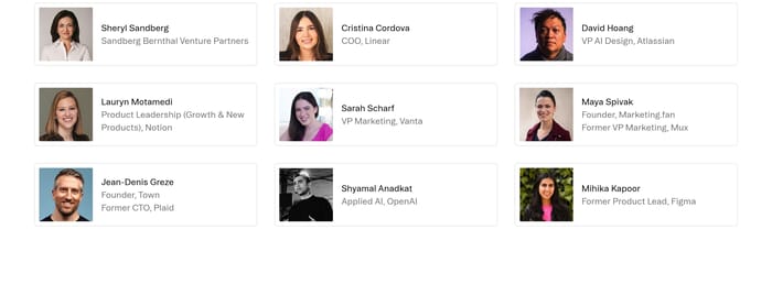
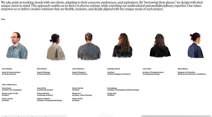
The default roster: matching headshots, name, and role in a row or grid. It reads as a directory and works when the claim is simply 'these are the people.' Hierarchy comes from order and titles, not card size.
82 published examples

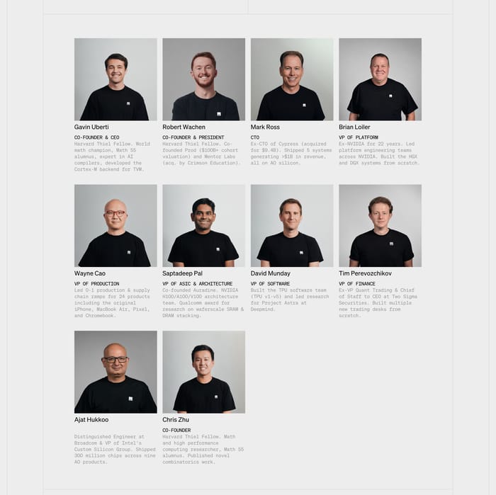
The default roster: matching headshots, name, and role in a row or grid. It reads as a directory and works when the claim is simply 'these are the people.' Hierarchy comes from order and titles, not card size.
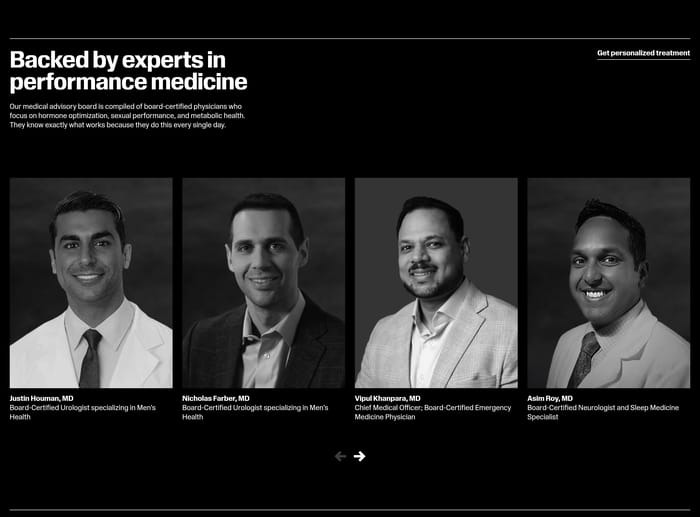
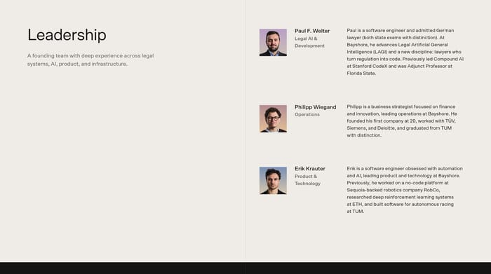
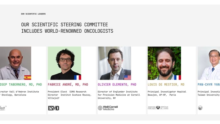
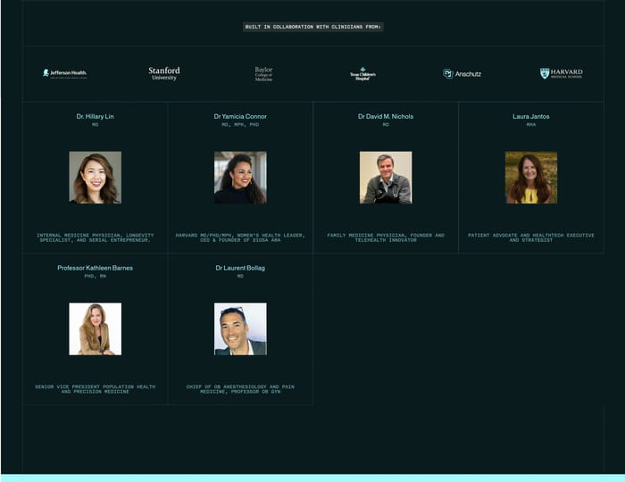
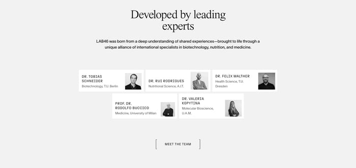
Faces sit under a claim about expertise. Degrees, institutions, flags, and logos do the selling. This pattern fits advisors, clinicians, and scientific committees better than a casual studio team.
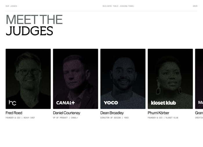
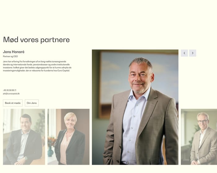
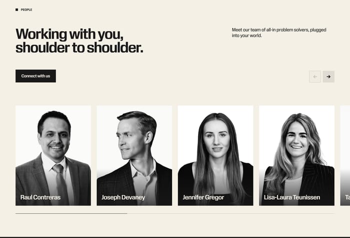
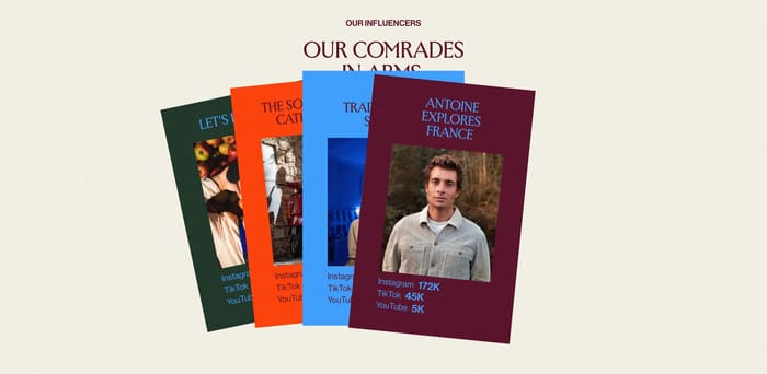
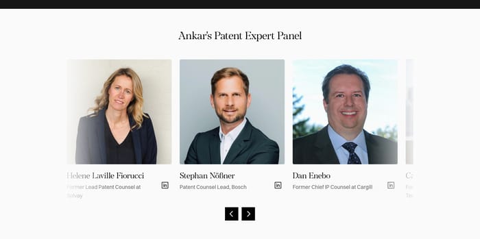
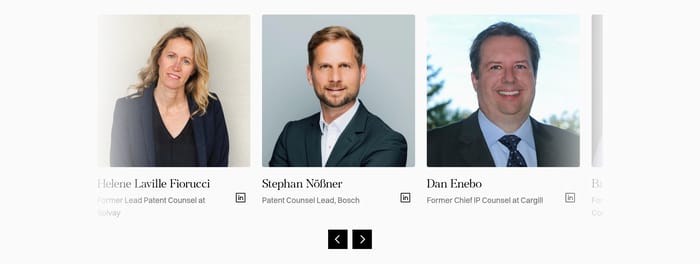
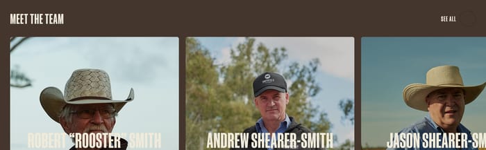
A horizontal track of portraits with arrows, often paired with a connect or careers action. Useful when the list is long. Weak when the visitor never sees the people who matter most.
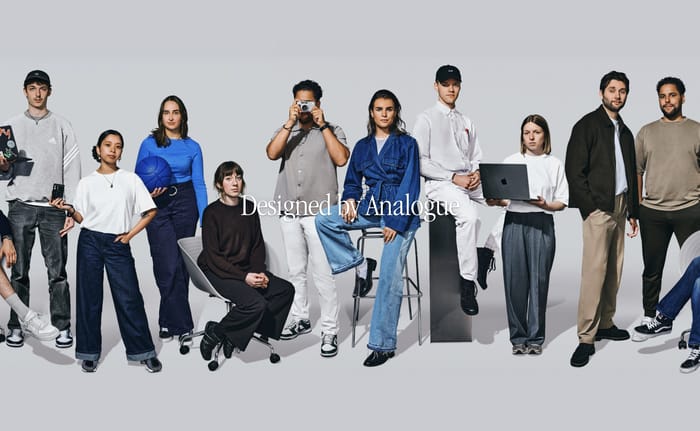
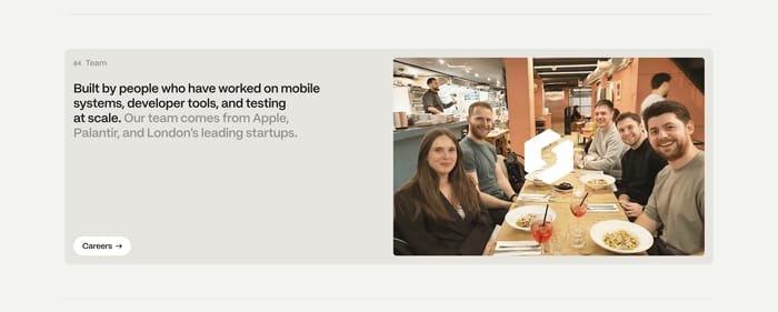
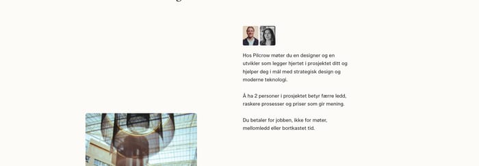
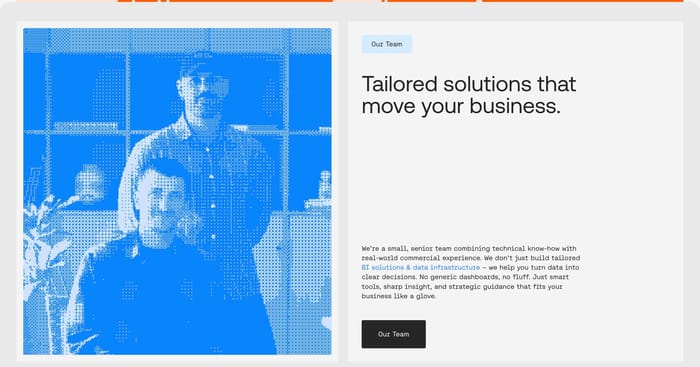
The photo system is the design. Mixed crops, mixed lighting, and mixed formality make a grid feel accidental even when the type is careful. I tend to ask for one lighting setup and one crop ratio first, then decide whether personality can leak in through pose and wardrobe. Equal cards imply equal status. If founders need more weight, give them a different module rather than stretching one card. Name and role should survive a two-second scan. Long bios under every portrait turn the section into homework. Put the proof that matters next to the face: title, one affiliation, maybe a quote if the person is an advisor rather than staff. Institution logos help scientific and clinical teams; they look like decoration on a six-person startup. Carousels hide people. Fine for a large speaker list, risky when the point is 'we are a small senior team.' Count how many faces appear without interaction. If the answer is two and a half, the roster is not doing its job. Group photos and compact avatar clusters work when the story is culture or access, not individual expertise. They fail when a buyer needs to know who will actually run the engagement. Test: cover the headline. Do the faces and labels still argue the same claim?
Enough to support the claim, not the org chart. A senior studio can show six faces. A hospital collaboration may need a larger panel because the institutions are the point. If you cannot name why each person is there, they are padding. Leave room for the roster to change without a redesign.
When the visitor might choose that person: speakers, authors, lawyers, therapists. For a product company, a title and one line usually beat a modal novel. If you do expand, keep the closed state complete on its own. A card that only makes sense after a click is a hidden directory.
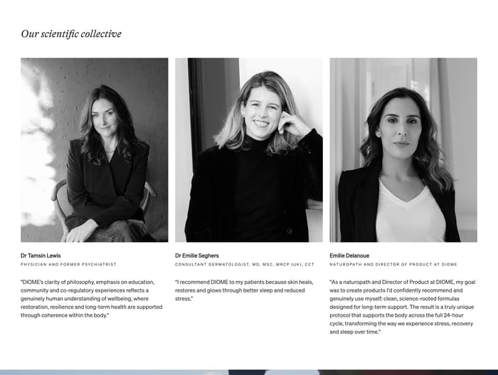
Separate them. Advisors need proof of outside standing. Staff need a sense of who you will work with. Mixing both in one identical grid flattens the distinction and can look like borrowed credibility. A different heading, denser credentials, or quotes under advisors usually solves it without a new visual language.