







Single-outcome openers
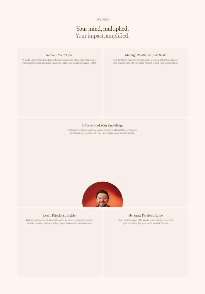
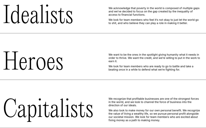
A short eyebrow, one decisive headline, and a supporting line. The section argues one transformation before any grid appears, useful when the rest of the page will unpack details.
21 published examples


A short eyebrow, one decisive headline, and a supporting line. The section argues one transformation before any grid appears, useful when the rest of the page will unpack details.
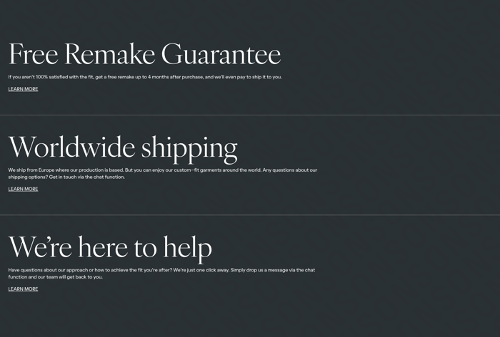
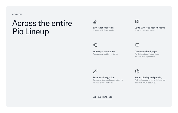
Vertical or two-column lists pair a stat or short label with a one-line consequence. They scan quickly and work when the numbers are specific enough to survive without illustration.
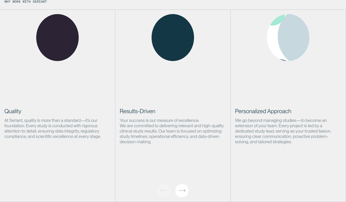
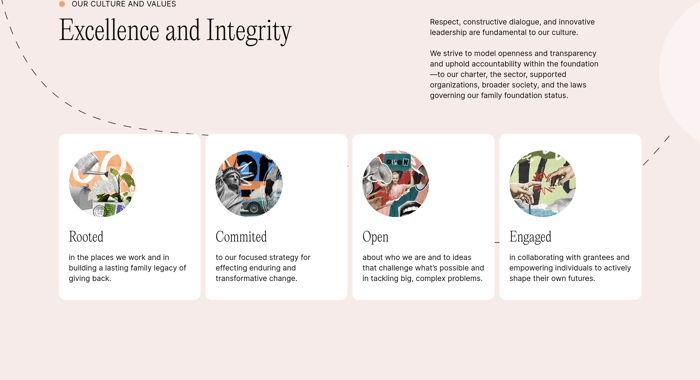
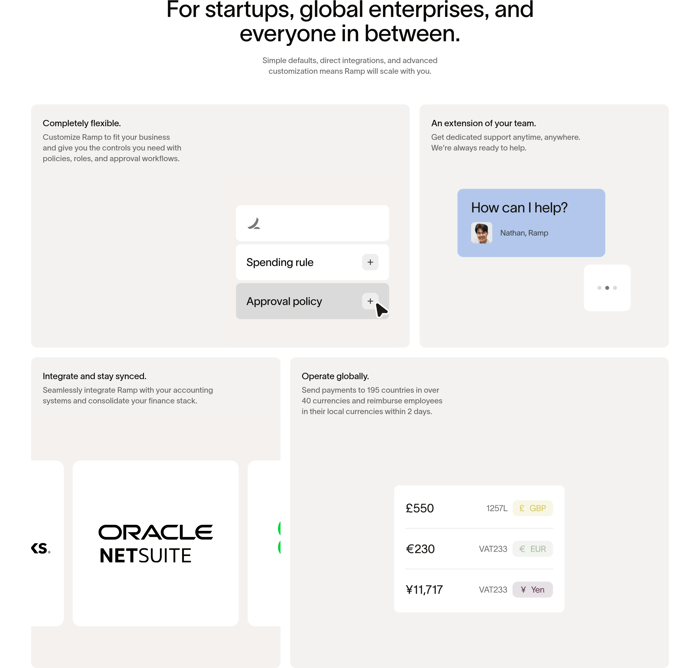
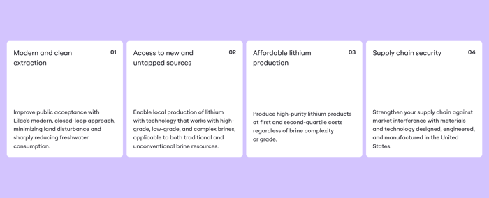
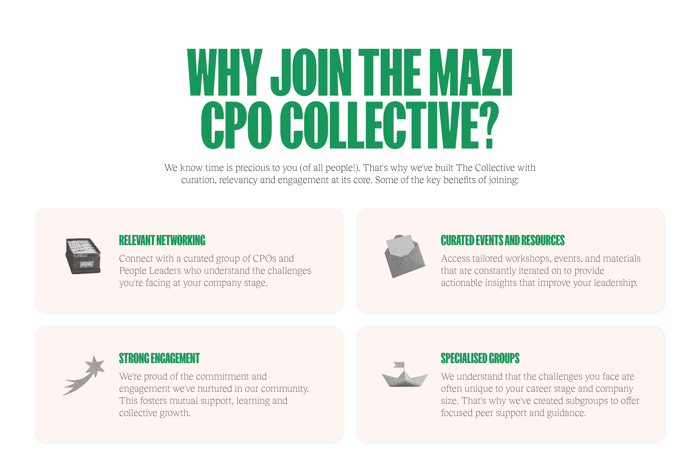
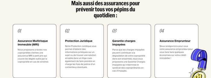
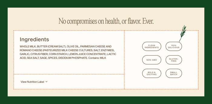
Equal cards hold titles, short copy, and sometimes a product fragment or portrait. The layout invites comparison, but only if each card owns a distinct outcome instead of a synonym.
In review I look first at claim quality, not column count. A benefit that restates a feature ("one user-friendly app") is weaker than one that names a consequence ("80% labor reduction"). If every card could live on a competitor's site, the section is not doing its job. Test the scan path. Can someone name the three strongest outcomes after five seconds? Icon-plus-stat rows work when the numbers are real and the labels stay short. They fail when icons are generic and the supporting sentence repeats the title. Photo mosaics and value cards earn their space when the image actually illustrates the claim; otherwise they become mood boards with captions. Watch hierarchy between the section headline and the items. A poetic opener needs concrete cards beneath it. A blunt metric list needs a frame that explains who those numbers are for. Empty cards, oversized portraits, and carousel arrows often signal that the content was stretched to fill a template. I would rather drop an item than invent a fourth interchangeable virtue. Trade-off: density versus proof. Six tight claims can feel comprehensive and still be forgettable. Three claims with a UI snippet, a compliance badge, or a specific workflow tend to stick. If the page already has a features grid later, this section should not preview it. Make it about the visitor's outcome, then get out of the way.
Use numbers when the outcome is measurable and the visitor already understands the category: uptime, latency, labor saved, countries supported. Narrative wins when the value is qualitative, like taste, integrity, or a way of collaborating. Mixing a vague adjective with a fake-precise stat usually weakens both.
Three to five distinct outcomes is the range that still feels comparable. Past that, items start repeating each other or drifting into features. If you need more, split by audience or job-to-be-done rather than adding another interchangeable card.
Benefits answer what changes for the visitor. Features answer what the product contains. If removing the product name would still leave a true sentence about the reader's work, you are in benefits territory. If the line only describes a module, it belongs later.