




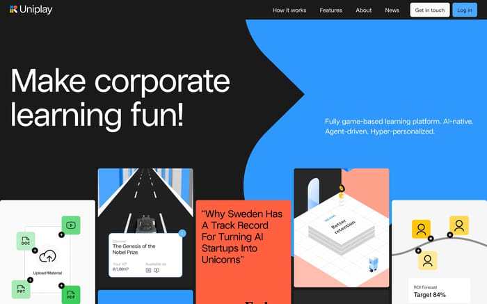
Hero Section Patterns for Web Designers

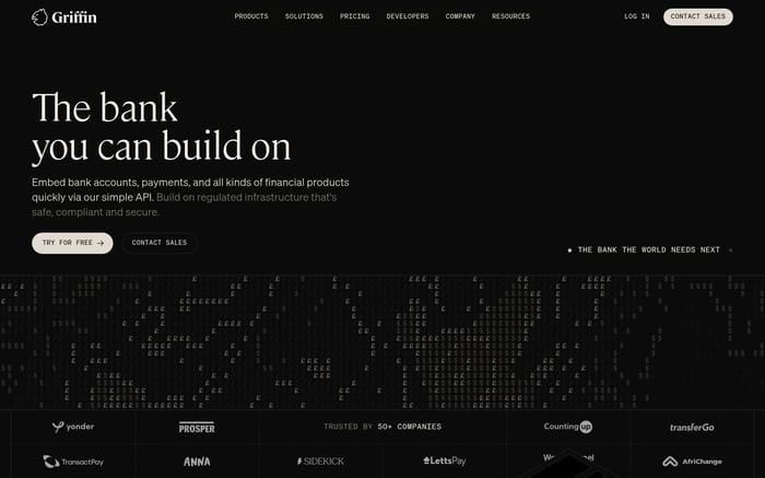
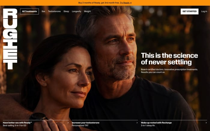
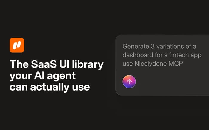
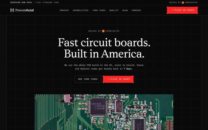
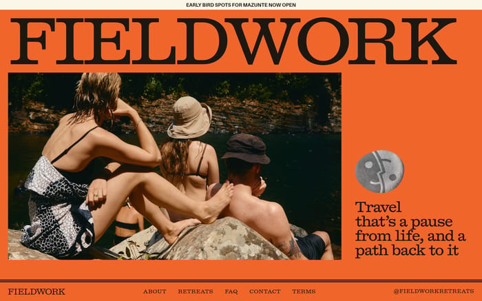
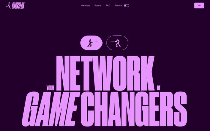
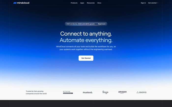
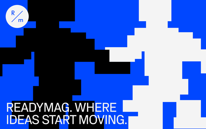
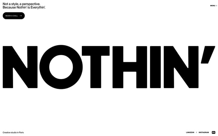
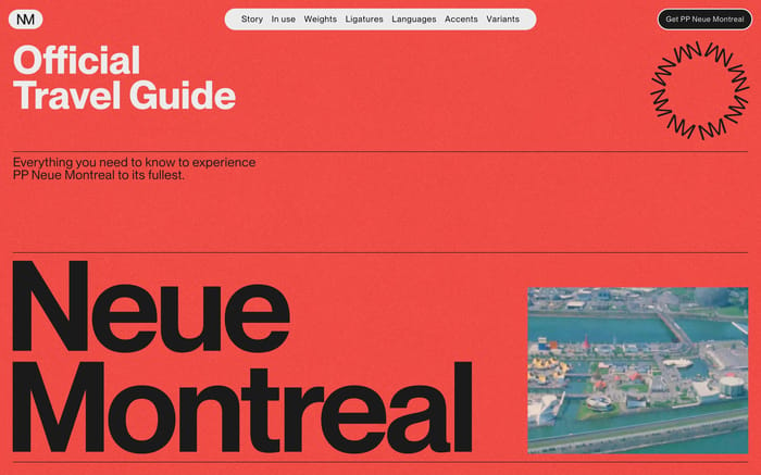
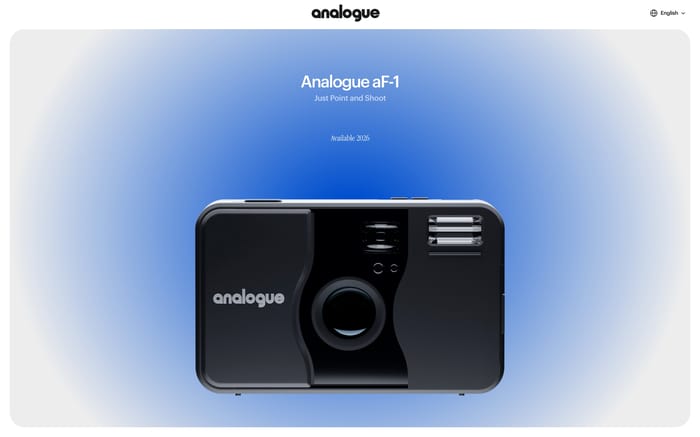
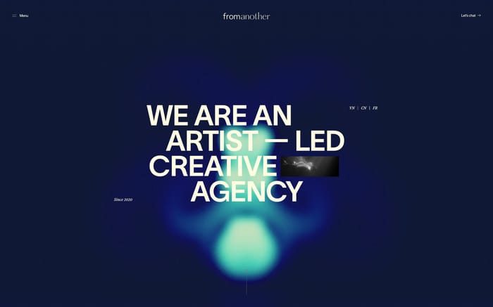
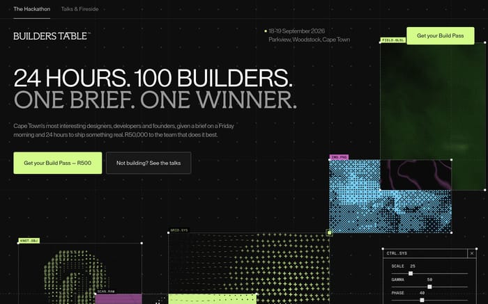
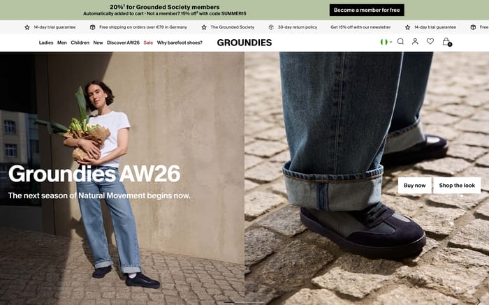
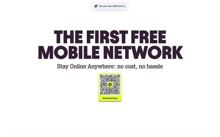
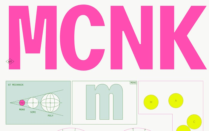
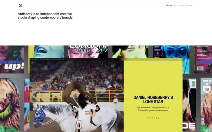
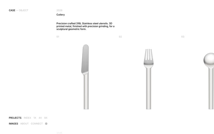
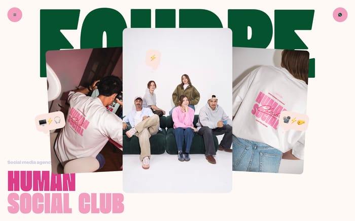
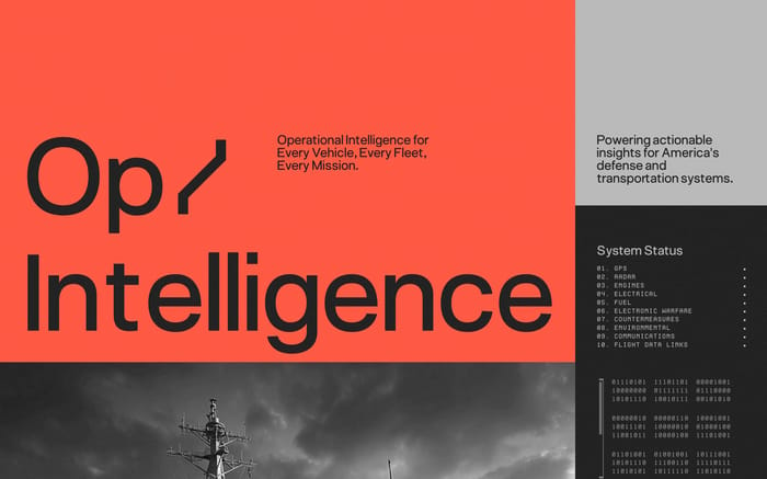
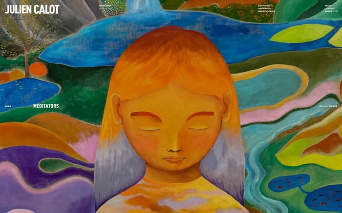
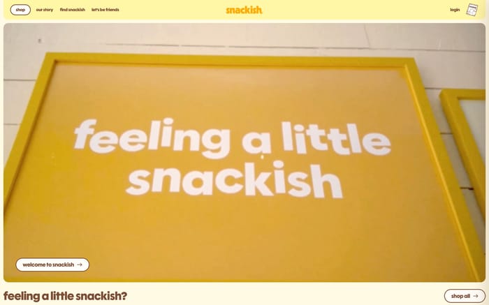
A hero is the opening section of a page: the first complete block after, or including, the header. It orients a visitor. In a glance it should name the offer, set the tone, and point to one next step. Most examples pair a headline with a call to action and a navigation bar. That shared skeleton still leaves a lot of room. Lifestyle brands often put a single photograph under a short editorial line. Agencies and products lead with a claim, then a booking or download button. Some studios treat the image as the identity and write almost nothing. Others open with a personal name, a data graphic, or a product still. The variation that matters is how hard the section sells versus how much it simply establishes a world before the page continues.

795 published examples

How to design a Hero section

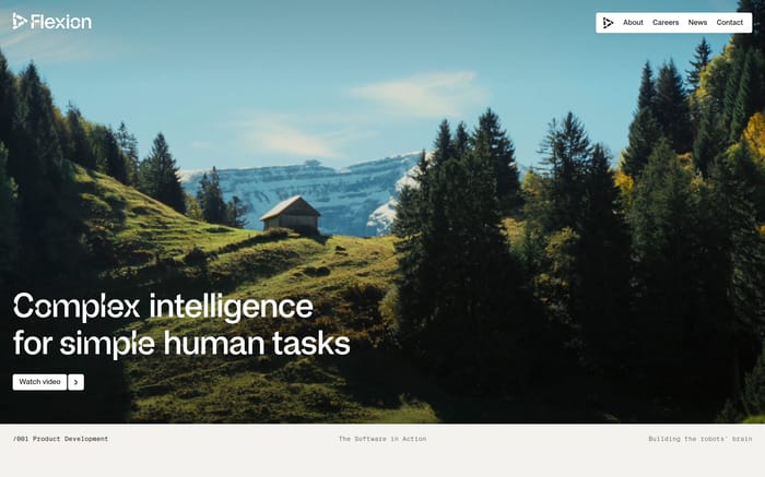
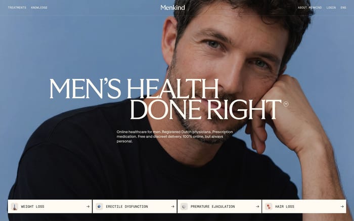
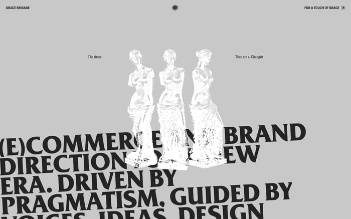
I tend to review a hero by covering the paragraph and asking whether the headline still names a specific offer. If it could sit on any site in the category, the picture is doing unpaid work. Overlay type on a busy crop is the first thing that breaks: faces, foliage, and machinery all compete with letterforms, especially once the image is recropped for a laptop height. Full-bleed motion looks confident until it postpones the claim. Type-only layouts age better when the sentence is concrete; they go hollow when the line is a mood. Two primary buttons usually mean the team could not pick a job for the section. Navigation on the image needs a contrast plan for both light and dark areas of the photo, not just the desktop comp. A useful test is the first 700 pixels of height: if the action or the product face has already fallen away, you designed a poster.

Hero design questions

Does a hero need a call to action?

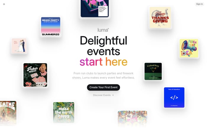
Not always. Campaign and product pages usually need one obvious action because the visitor arrived to buy or apply. Brand and studio worlds can end on a caption or a scroll cue if the next section is the real work. What fails is a decorative button that restates the headline, or two equal buttons that split the decision. If you cannot name the job of the click, drop the control and let the following section earn the action.

How should the header sit on a hero?

Most of these sections treat nav as part of the first screen, not a separate chrome. That means logo, links, and the headline share one contrast problem. A dark bar solves it cheaply and can flatten a cinematic crop. Transparent nav looks better when the top of the image is calm and the logo has a locked color. I look at the logo against the lightest and darkest strip in the photo, not the average.

When should a hero stay type-only?

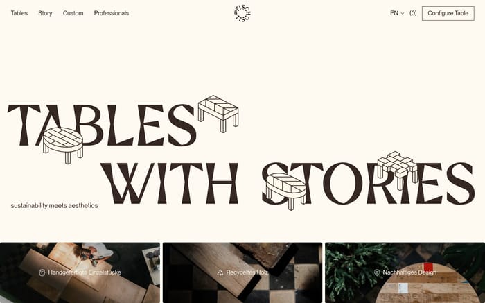
When the sentence is more specific than any stock scene you could license. A sharp claim, a named person, or a product category that photographs poorly all benefit from type first. Photography still belongs nearby, just not as wallpaper. The layout fails when the line is generic and the empty field reads as unfinished. If you need a photo to explain the words, you needed the photo in the hero.

Unlock premium section designs

Go Pro to get instant access to 795 premium section designs + exclusive features

Related section categories

Curating the internet’s finest.