






Value Proposition Sections

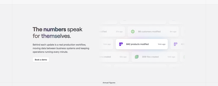
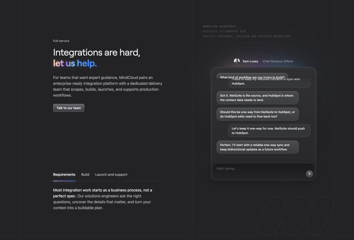
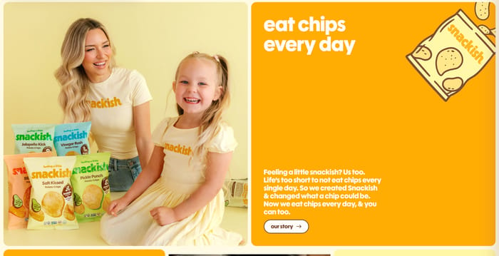
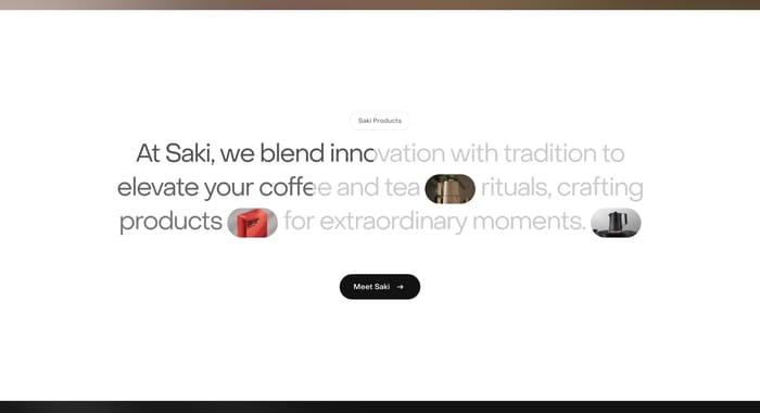
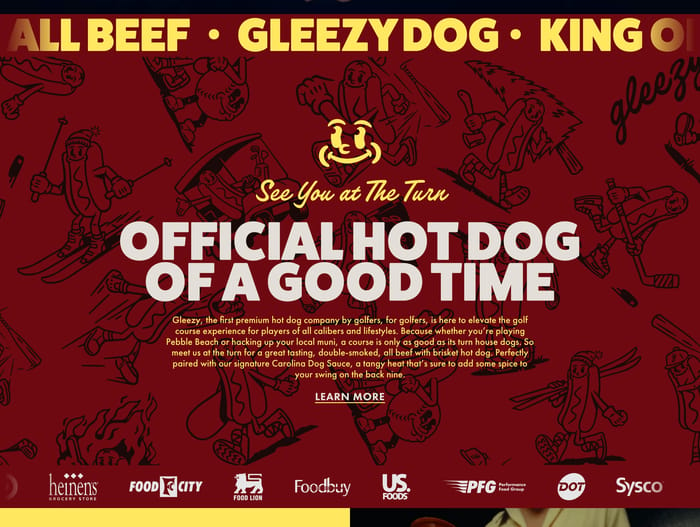
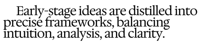
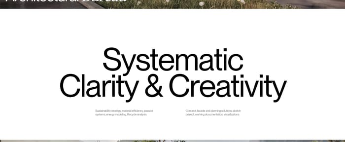
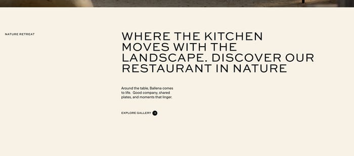
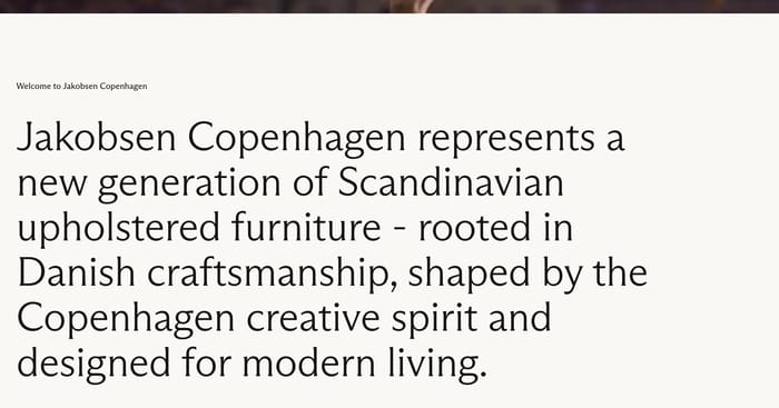
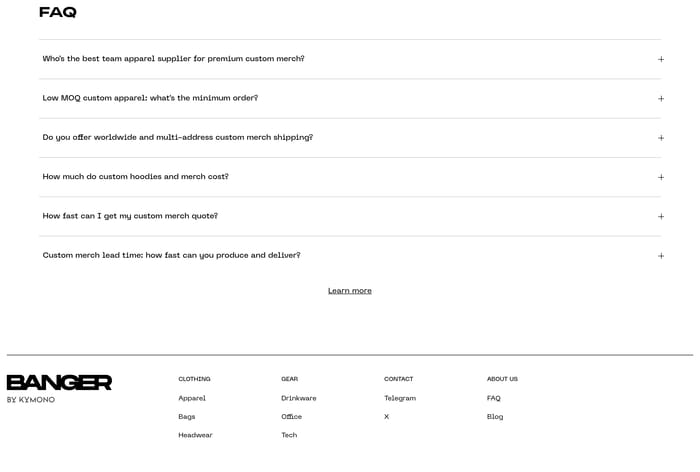
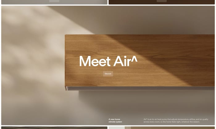
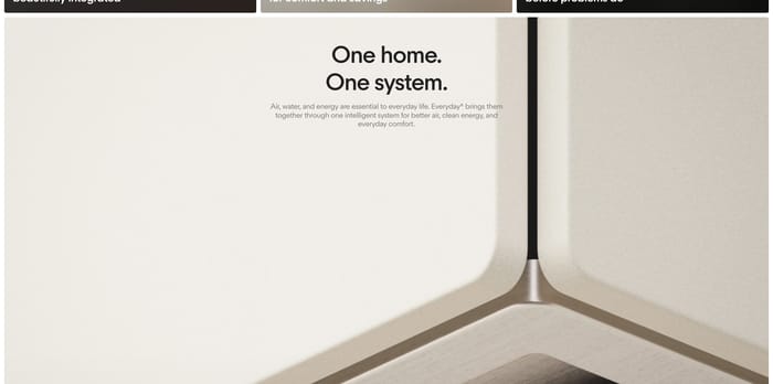
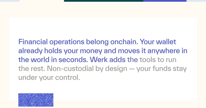
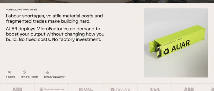
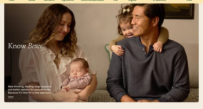
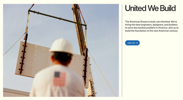
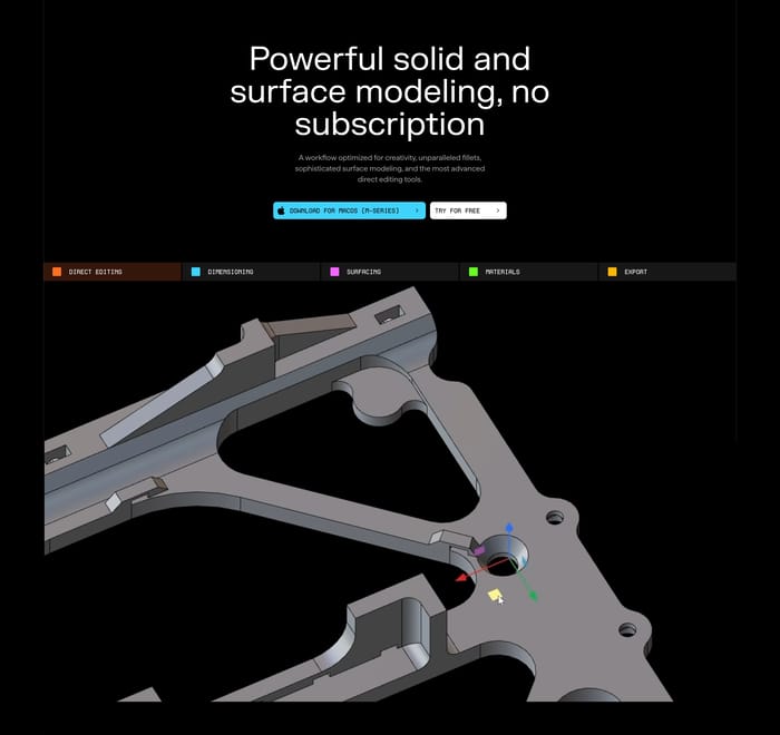
A value proposition section tells a visitor what they get, why it matters, and why this company is the one to deliver it. It often sits in or just below a hero, but it also appears mid-page as a restatement after features, on about pages, and beside forms. The job is orientation: reduce ambiguity before someone invests attention in product detail. Across this collection the same job takes very different shapes. Some teams lead with a single long sentence and almost no chrome. Others name a competitor or a painful status quo, then flip to their alternative. Product companies put the interface or a physical object in the frame so the claim is visible. Brand and consumer sites lean on photography and a short line. The useful variation is not decoration. It is how much proof, contrast, and next action the claim needs before it can stand.

369 published examples

How to design a Value Proposition section

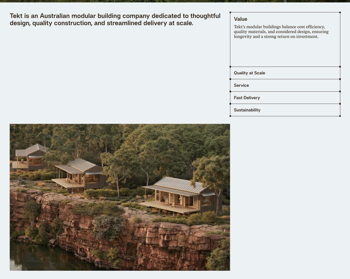
I tend to read these sections with one question: if I cover the logo, can I still tell who this is for and what changes? Vague craft language fails that test even when the type is beautiful. Specificity is the real hierarchy. A headline that names the outcome should stay larger than the mechanism; the mechanism belongs in a supporting line, three proof chips, or the product shot. Watch the relationship between claim and evidence. A lifestyle photograph can carry emotion, but it cannot prove a workflow. A dense UI screenshot can prove capability and still bury the sentence. Comparison layouts work when the difference is one idea, not a feature dump. Forms next to the claim only help when the offer is already clear; otherwise you are asking for a conversation about a sentence nobody understood. A practical review test: shrink the section to a phone width and hide the image. If the remaining copy still states audience, outcome, and a single next step, the structure is sound. If it collapses into atmosphere, rewrite before you polish layout.

Value Proposition design questions

Should a value proposition live only in the hero?

No. Heroes often carry the first version, but restating the claim after a product demo, on an about page, or next to a form is useful. Later placements can be more specific because the visitor has more context. Repeating the same sentence everywhere feels templated. Change the angle: outcome first at the top, mechanism or proof farther down.

When does naming a competitor help?

When the visitor already knows the category and is choosing a method, not learning that the category exists. A contrast works when the difference is one visible behavior. If you need a paragraph to explain the other product, you are teaching, not contrasting. A named pain without a logo is usually safer for early-stage audiences.

How long should the copy be?

Long enough to name the audience, the change, and the constraint you remove. A dense paragraph can work if every clause earns its place. Short lines work when photography or a UI already carries meaning. Length is not the problem. Unowned adjectives are. Cut anything that could sit on a rival’s site unchanged.

Unlock premium section designs

Go Pro to get instant access to 369 premium section designs + exclusive features

Related section categories

Curating the internet’s finest.