






















Stat Section Design Patterns and Layouts

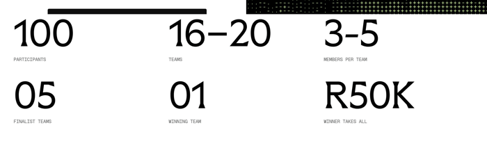
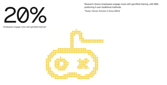
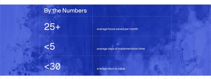
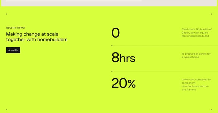
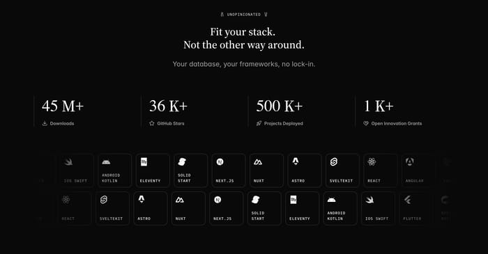
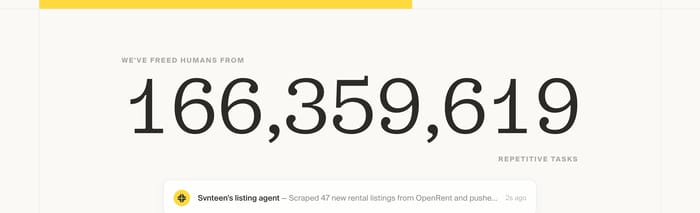
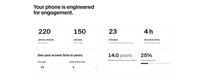
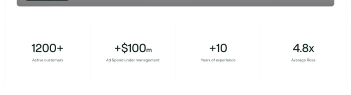
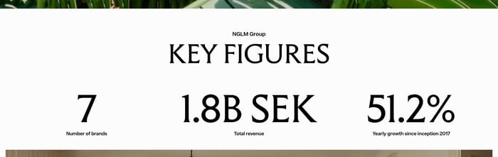
A stat section puts a handful of numbers on the page so a visitor can judge scale, proof, or consequence without reading a case study. It usually sits after a hero or feature block, or it punctuates an about page when the brand needs a quick credibility hit. The job is not decoration. The number has to be scannable, the unit has to be honest, and the label has to answer “so what?” in a few words. The same job takes very different shapes. Some sites run a quiet four-up strip of percentages and plus-signs. Others pair a headline with icon cards, stack figures beside a claim, or blow a single live count across the viewport. A few fold metrics into maps, photo rows, logo walls, or even a small calculator. The useful variation is less about type size and more about whether the stats stand alone as proof, support a story, or become a product moment.

82 published examples

How to design a Stat section

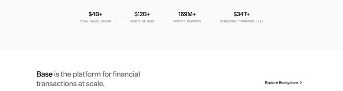
I tend to review these sections by covering the numbers first. If the remaining labels could belong to any company, the section is not doing work. Specificity beats magnitude: “4 weeks average ROI for 8-figure stores” is more persuasive than a lonely “10x.” Watch unit collision too. Mixing $4B, 169M+, and 99% in one row is fine if the labels share a voice; it fails when one figure is a vanity count and the next is a customer outcome. Hierarchy is the other common miss. A four-column strip can feel cheap if every numeral is the same weight and the labels wrap unevenly. Give the figure a clear type ramp, keep labels to one or two lines, and test the wrap at 375 and 768. When you add icons, they should classify the metric, not compete with it. When you add a headline or CTA, decide whether the numbers prove the claim or the claim explains the numbers. Live counters and maps earn their keep only if the figure would still make sense as a static screenshot. If it would not, you are decorating.

Stat design questions

How many stats belong in one section?

Three or four is the comfortable set when they sit in a row. Two can feel thin unless the figures are huge or the copy around them is doing work. Five and up usually needs grouping, a featured number, or a second row. The better test is parallelism: if you cannot read the labels in one breath and compare them, you have too many ideas, not too many digits.

Should every stat use a plus sign or a count-up?

Plus signs help when the figure is a floor, not a snapshot. They hurt when they make every number look like marketing. Count-up animation can signal liveness, but it also delays comprehension and looks odd if the visitor scrolls back. Keep motion for figures that actually change, and reserve “+” for open-ended scale. Static, well-labeled type still reads as confident.

When should a stat section include a CTA?

Include a button when the numbers close a story and the next step is obvious, such as case studies after outcome metrics. Skip it when the strip is only a credibility beat between two longer sections. A CTA next to unlabeled figures feels like a hard sell. The button should continue the claim the stats just proved, not restart the page.

Unlock premium section designs

Go Pro to get instant access to 82 premium section designs + exclusive features

Related section categories

Curating the internet’s finest.