Best coding fonts for programming

Compare the same code in different programming fonts. Inspect character shapes, spacing and punctuation, then choose a font to try in your editor. Each screenshot uses VS Code Dark+ syntax colors, regular weight at 18 px and ligatures off.

Monospace fonts in use

1. JetBrains Mono

Our starting point for comparing a dotted zero and tall lowercase letters.
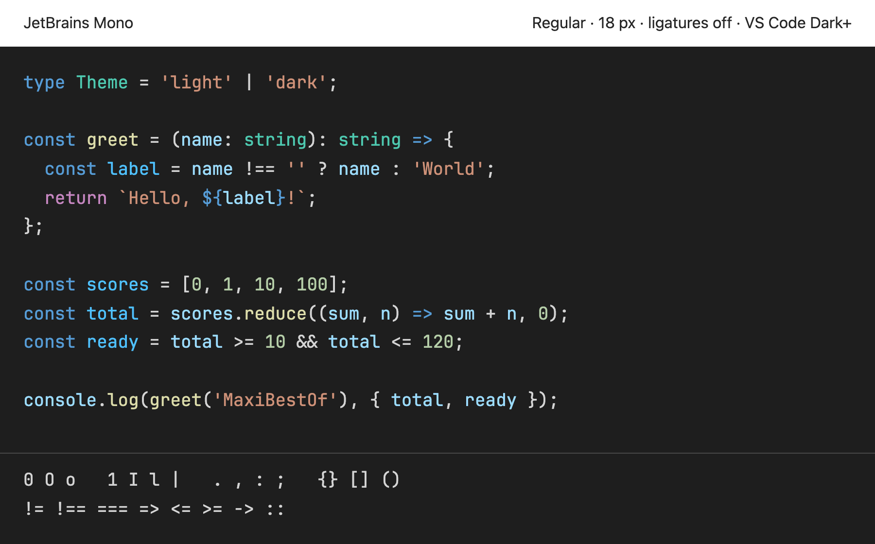
TypeScript code with VS Code Dark+ syntax colors and a character comparison rendered in JetBrains Mono Regular, with ligatures off
JetBrains Mono Regular · Open the image to view it at full size.

Compare 0 with O, then compare 1, I and l. Look at the height of the lowercase letters beside the capitals.

The tall lowercase shapes give the code a compact vertical texture. Try a larger line height in your editor if you prefer more space between lines.

Programming ligatures:
Yes · contextual
Available styles:
Eight weights with matching italics

2. Fira Code

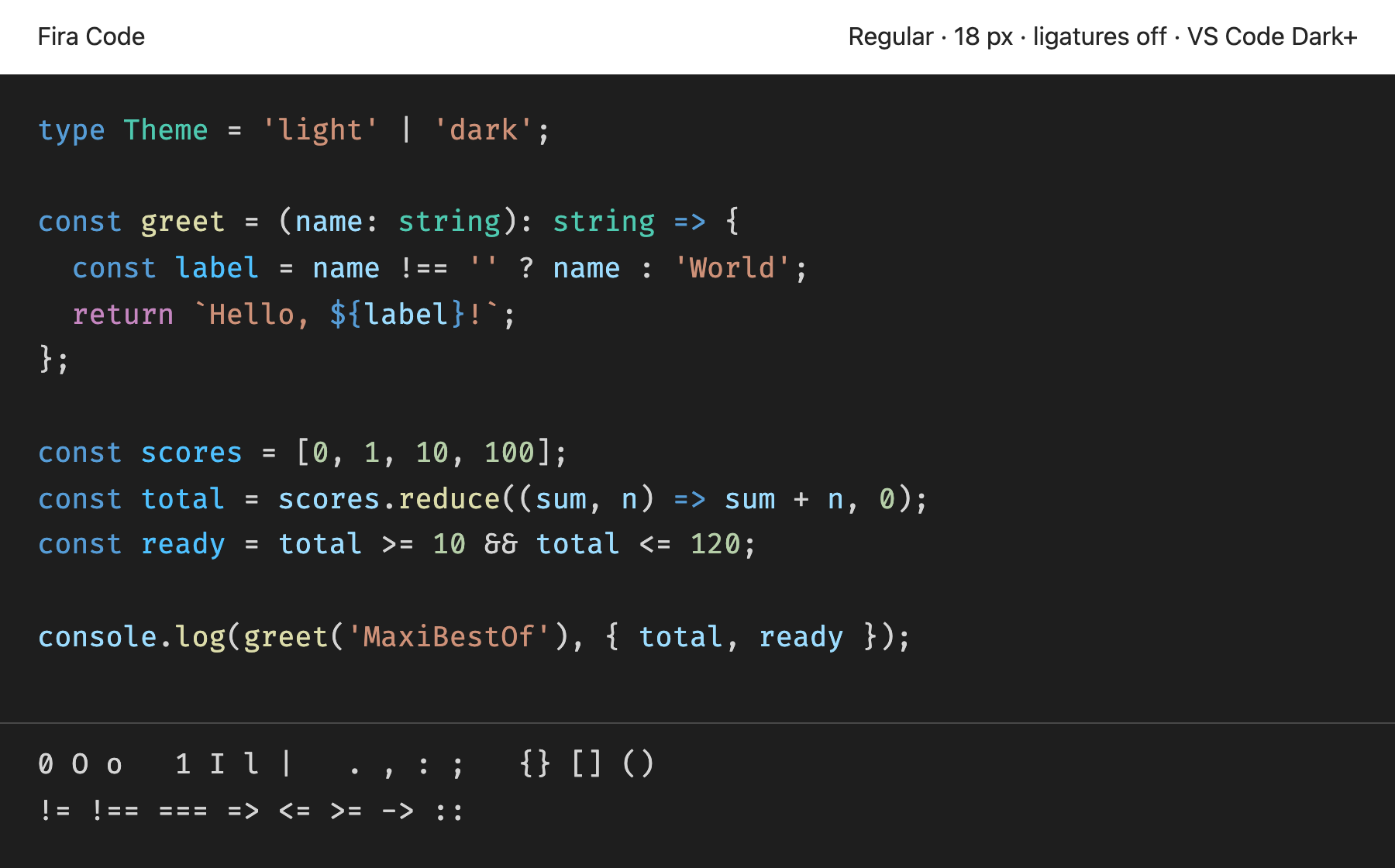
Our choice for exploring how connected operators change the look of a code sample.

TypeScript code with VS Code Dark+ syntax colors and a character comparison rendered in Fira Code Regular 6.2, with ligatures off
Fira Code Regular 6.2 · Open the image to view it at full size.

Compare !==, => and <=. The screenshot keeps the operators separate. Use the official source to see ligature examples.

The release has upright styles. If your editor uses italic comments, check how it handles the missing italic style.

Programming ligatures:
Yes · contextual
Available styles:
Six upright weights; variable weight file

3. Source Code Pro

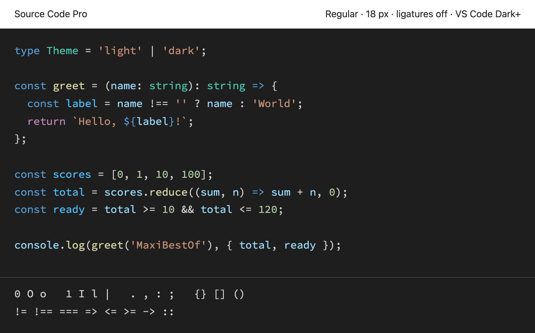
Our reference for comparing separate operators with fonts that join them.

TypeScript code with VS Code Dark+ syntax colors and a character comparison rendered in Source Code Pro Regular, with ligatures off
Source Code Pro Regular · Open the image to view it at full size.

Look at the spacing around braces, the width of m and the separate marks in !==.

Choose another candidate if you want operators to join. Use this one to judge the shapes of each symbol on its own.

Programming ligatures:
No programming ligatures
Available styles:
Seven weights with italics; variable files

4. IBM Plex Mono

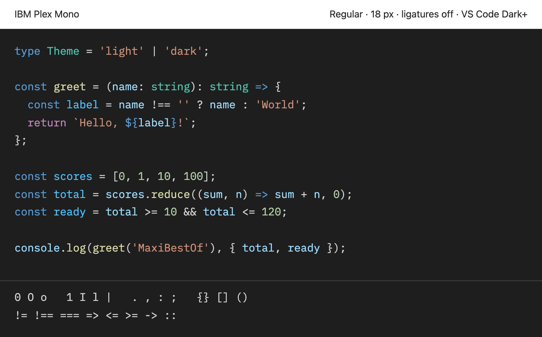
An editorial choice for comparing a font with more distinctive curves.

TypeScript code with VS Code Dark+ syntax colors and a character comparison rendered in IBM Plex Mono Regular, with ligatures off
IBM Plex Mono Regular · Open the image to view it at full size.

Compare the lowercase a and g with the other candidates. Then inspect the curved strokes in the same code.

The letter shapes have a strong visual character. Test them in repeated identifiers before choosing them for a full editor theme.

Programming ligatures:
No programming ligatures
Available styles:
Eight weights with matching italics

5. Hack

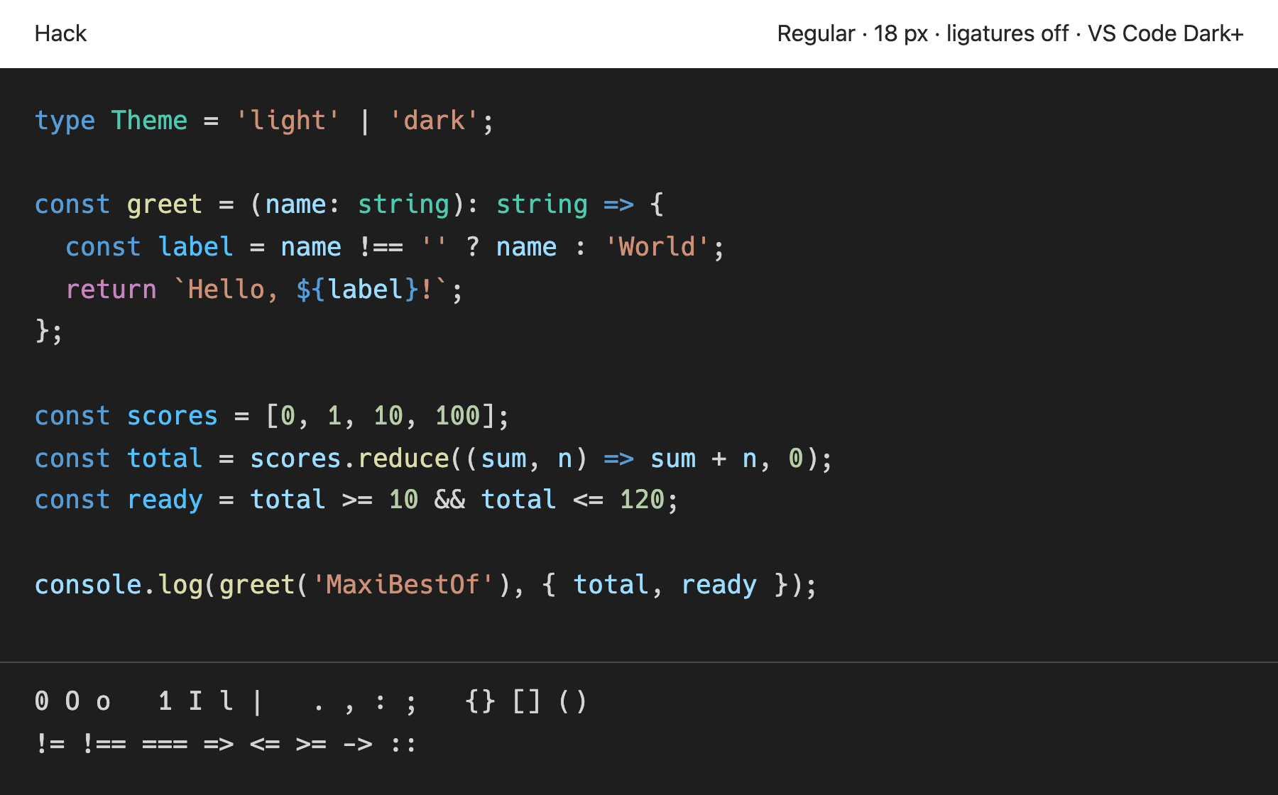
Our choice for a simple family with separate operator shapes.

TypeScript code with VS Code Dark+ syntax colors and a character comparison rendered in Hack Regular 3.003, with ligatures off
Hack Regular 3.003 · Open the image to view it at full size.

Compare the zero, the uppercase I and the lowercase l. Check commas and periods at your normal editor size.

The family has a smaller style range than the variable fonts here. Compare its regular weight before using bold syntax colors.

Programming ligatures:
No programming ligatures
Available styles:
Regular, bold, italic and bold italic

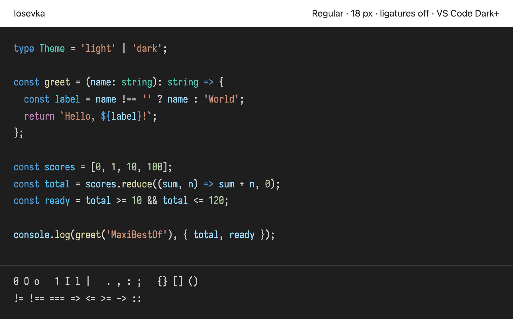
6. Iosevka

Our narrow option for comparing how much code fits on a line.

TypeScript code with VS Code Dark+ syntax colors and a character comparison rendered in Iosevka Regular, standard width, with ligatures off
Iosevka Regular, standard width · Open the image to view it at full size.

Compare line lengths with a wider font in the same sample. Inspect braces and the lowercase m.

The narrow shapes put characters closer together. Try your own long identifiers to see whether you prefer that spacing.

Programming ligatures:
Yes · contextual
Available styles:
Multiple weights; upright, italic and oblique; extended widths

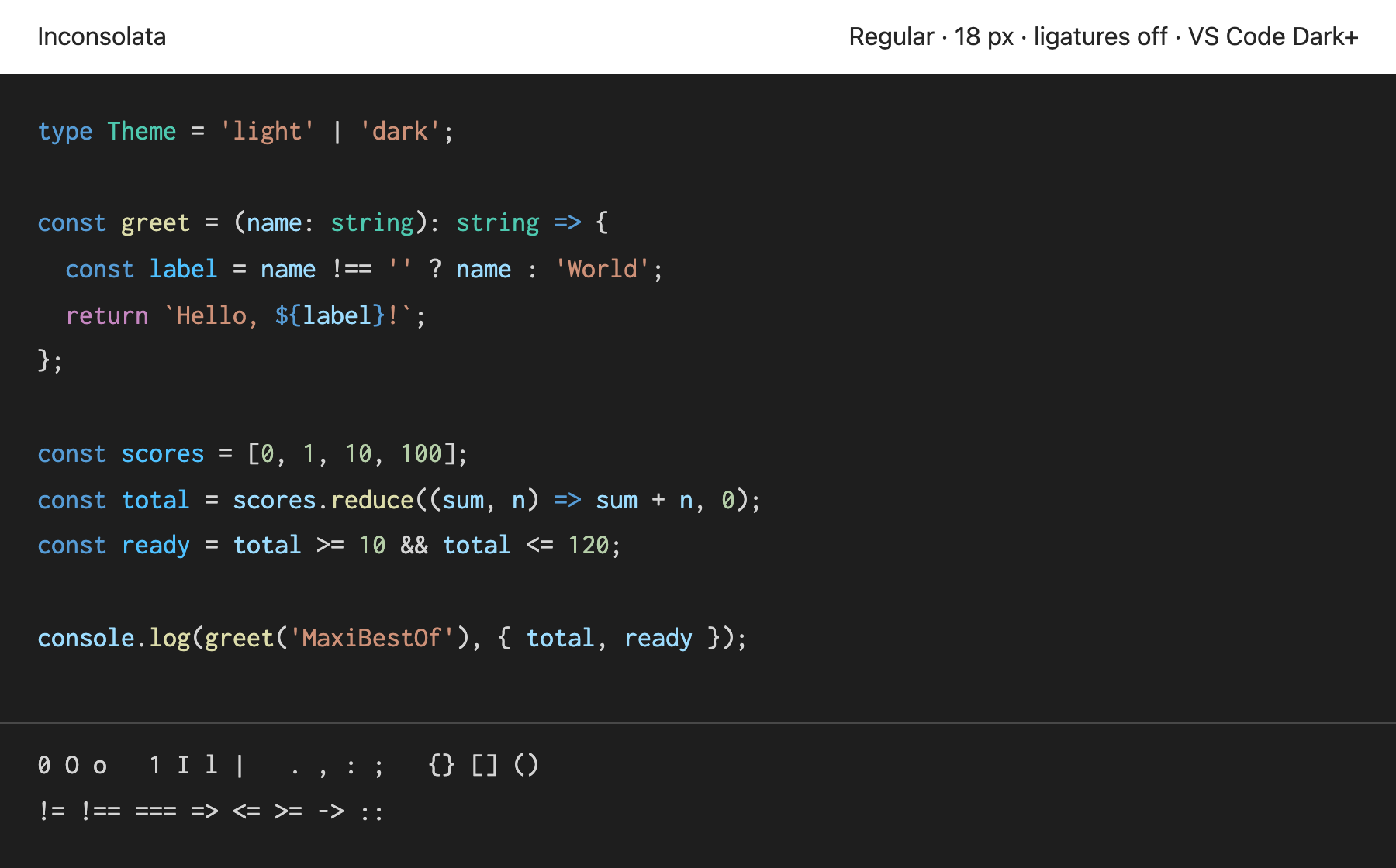
7. Inconsolata

Our choice for testing discretionary ligatures with a different letter texture.

TypeScript code with VS Code Dark+ syntax colors and a character comparison rendered in Inconsolata Regular, normal width, with ligatures off
Inconsolata Regular, normal width · Open the image to view it at full size.

Compare the lowercase letters and the shape of the zero. This screenshot keeps === and -> separate.

An editor that enables only standard or contextual ligatures may leave its operators separate. Check whether your editor can enable dlig.

Programming ligatures:
Yes · discretionary
Available styles:
Multiple upright weights and widths; variable weight and width

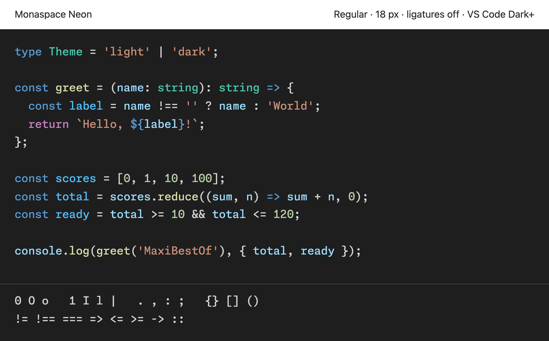
8. Monaspace Neon

Our choice for exploring a font with several explicit OpenType settings.

TypeScript code with VS Code Dark+ syntax colors and a character comparison rendered in Monaspace Neon Regular, static web font, with ligatures off
Monaspace Neon Regular, static web font · Open the image to view it at full size.

Compare repeated operators and the spacing around wide and narrow letters. The screenshot uses the regular font with optional features off.

Your editor may need explicit OpenType settings for its coding ligatures and texture healing.

Programming ligatures:
Yes · stylistic sets
Available styles:
Multiple weights, widths and italics; variable files

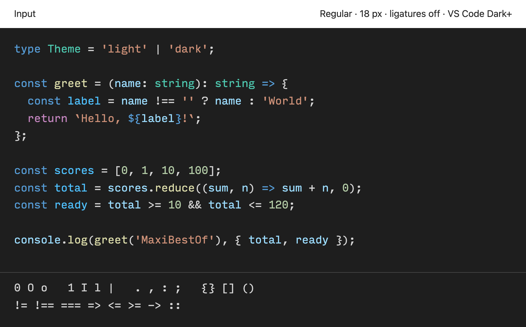
9. Input

Our choice for developers who want to customize specific character shapes.

TypeScript code with VS Code Dark+ syntax colors and a character comparison rendered in Input Mono Regular, normal width, default character forms, with ligatures off
Input Mono Regular, normal width, default character forms · Open the image to view it at full size.

The specimen shows Input Mono. Inspect its punctuation, then use the official tester to compare alternate forms of a, g, i, l and 0.

Input is free for private use in your coding environment. Public font embedding needs a separate license, so this page provides a code screenshot and links to its official tester.

Programming ligatures:
No programming ligatures in this specimen
Available styles:
Mono, Sans and Serif; multiple weights, widths and italics

How to choose a font for coding

  1. Compare similar characters.

    Inspect 0, O and o, then 1, I, l and |. Use a size close to your editor setting.

  2. Inspect punctuation and spacing.

    Compare periods, commas, colons and semicolons. Check nested braces and long identifiers in your own code.

  3. Try ligatures both ways.

    Try operators with ligatures on and off in your editor. Each font supports a different set. Use the setting you prefer.

  4. Finish in your editor.

    Install your preferred font and test it with your theme. Browser rendering can differ from your editor because of font settings, screen scale and rendering software.

For design references, browse monospace fonts used on websites. That collection shows real font uses. This guide compares fonts for your coding environment.

Coding font questions

What should I look for in a coding font?

Compare similar character shapes, punctuation, spacing and the styles your editor uses. Test your own code at your normal size. Choose the shapes and spacing you prefer.

What are programming ligatures?

Programming ligatures show a character sequence, such as != or =>, with a combined visual form. They change the display, while the text keeps its original characters. See the Fira Code source for examples.

Should I enable ligatures?

Try both settings with code you know. Enable them if you prefer the combined operators. Leave them off if you prefer separate symbols. Some fonts or editor settings do not support them.

How do I change my editor font?

Install the desktop font from its official source, then select it in your editor. Restart the editor if the font does not appear.

In Visual Studio Code, open User Settings (JSON) and set editor.fontFamily to the installed family name. Set editor.fontLigatures to true for standard ligatures, or use explicit feature settings when needed. Follow the official VS Code instructions.

In IntelliJ IDEA, open Settings → Editor → Font. Select the font, then adjust its size, line height and Enable ligatures setting. Follow the official IntelliJ IDEA instructions.

Curating the internet’s finest.