




Shopable product collections
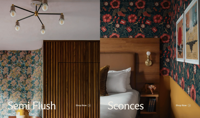
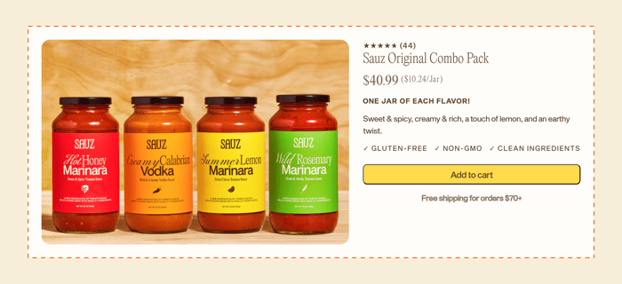
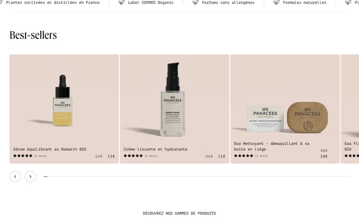
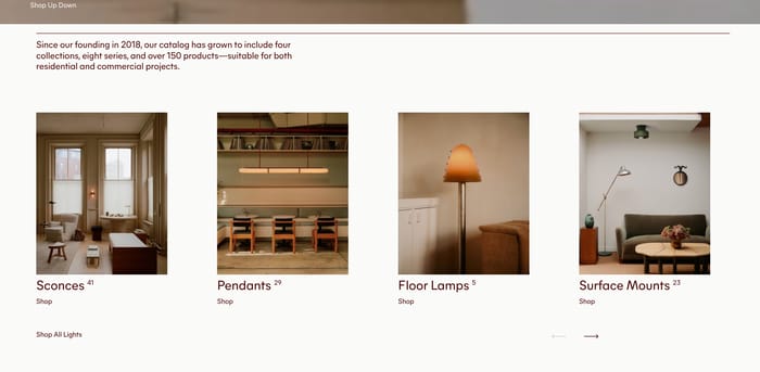
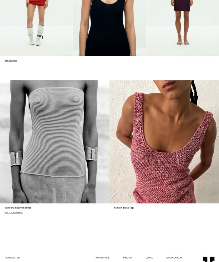
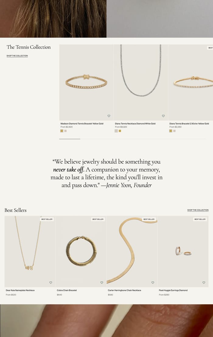
These rows put a handful of SKUs on stage with editorial crops, prices, and a collection link. Photography stays large; metadata sits in a thin band. They read as a merchandiser’s pick, not a full catalog.
22 published examples


These rows put a handful of SKUs on stage with editorial crops, prices, and a collection link. Photography stays large; metadata sits in a thin band. They read as a merchandiser’s pick, not a full catalog.
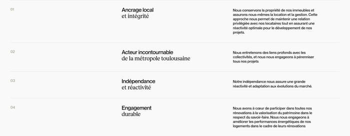
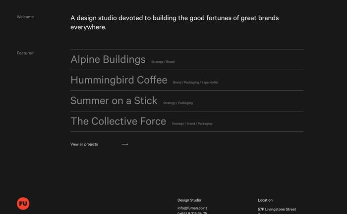
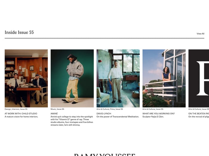
Names do the work. Projects, properties, or clients stack as a roster, sometimes with a city, discipline, or one preview still. The feature is the list itself, scannable when those names already mean something.
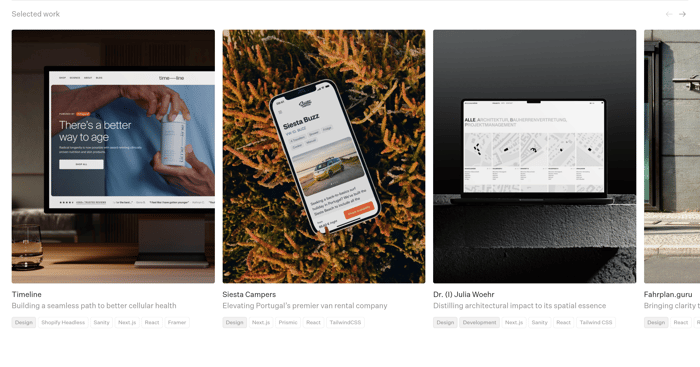
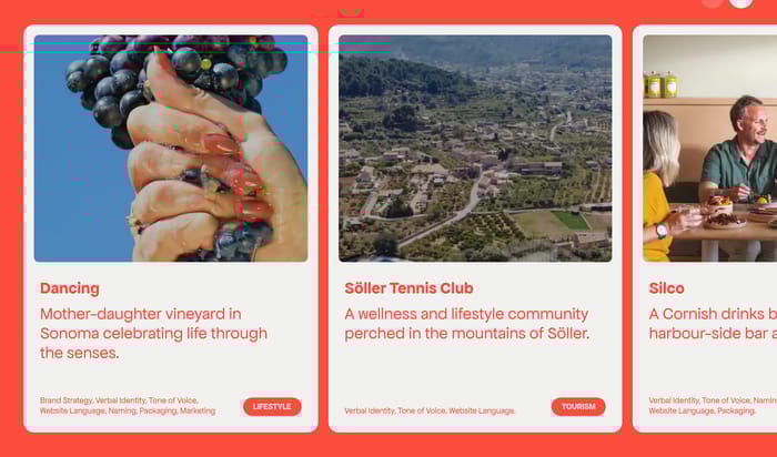
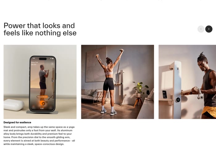
Case-study tiles pair a device or lifestyle still with a short outcome and service chips. Three or four visible cards prove range. Overflow implies a deeper archive without turning the section into a dump.
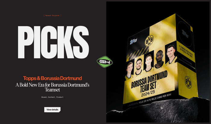
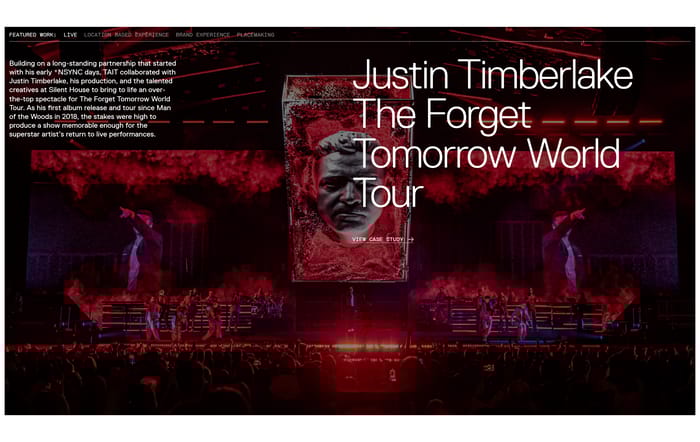
In review I look at whether the featured set actually feels chosen. Equal cards with the same crop and type size read as a dump. One pattern I keep seeing is a strong first item—full bleed, split, or oversized type—then a quieter supporting row. That holds when the lead piece can carry the brand. It falls apart when every item is equally important and the leftover cards look like leftovers. Watch the width where a three-up becomes a two-up. Studio packshots can collapse into a stripe of thumbs. Lifestyle crops that cut at a waist, clasp, or building facade need a second pass on a phone; jewelry especially loses the object. Price, color, and wish-list controls want a real information band, not hover-only metadata. Typographic indexes scan quickly and age well, but only if the names already mean something. New visitors need a still, a one-line outcome, or a category chip. A cinematic hero can oversell one project and starve the rest. I ask whether someone can name three featured items after a five-second glance. If they only remember the atmosphere, the feature is mood, not content.
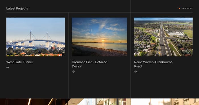
Three to five still feels chosen. One or two work when a still, video, or name can hold a full module. Past five you are designing an index, so label it that way and give people a view-all path. If a sixth card exists only to complete a grid, it is usually weakening the feature.
When the names already carry weight for the audience—known clients, properties, or a studio roster people came to scan. A city or discipline next to each name is usually enough structure. Unknown visual work needs a still. Otherwise the list looks confident to insiders and empty to everyone else.
Change the crop, the count, or the voice around the cards. Editorial photography, a collection title, or a short founder line can sit next to price and cart actions without turning the module into a catalog page. If every card uses the same packshot and type size, it will read as inventory no matter what you call it.