




Blog Sections for Articles, News, and Journals

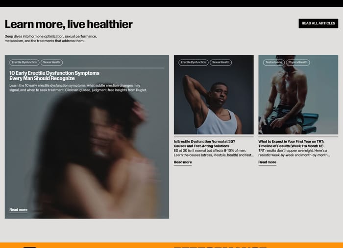
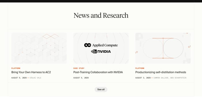
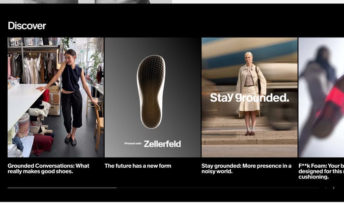
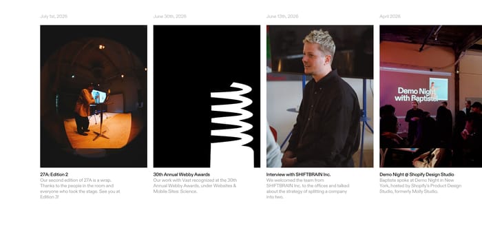
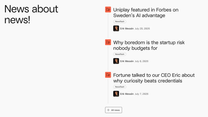
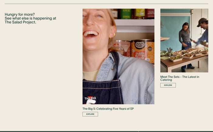
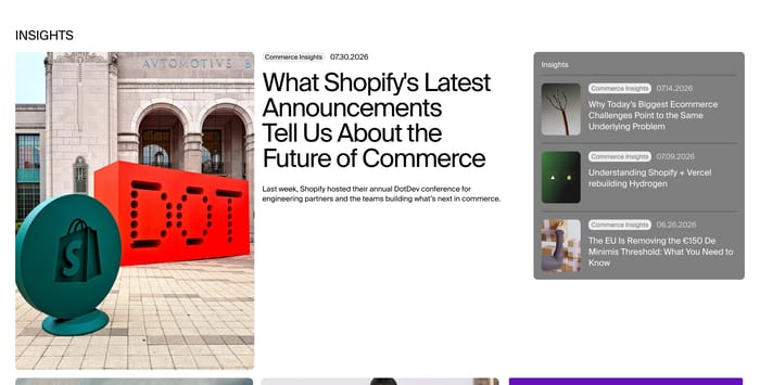
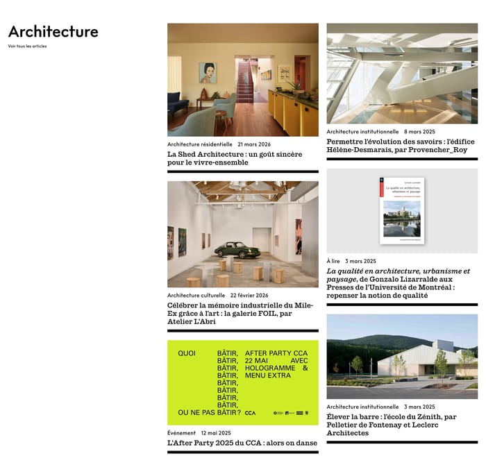
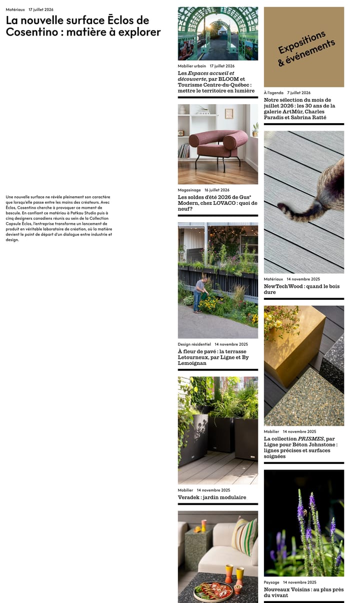
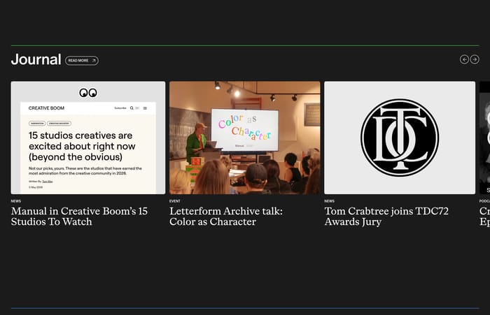
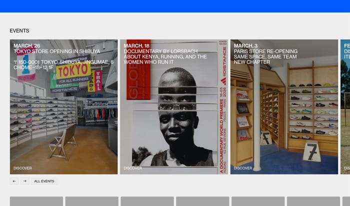
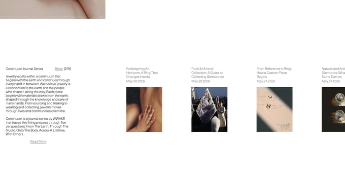
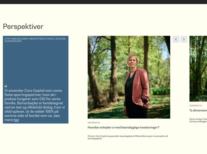
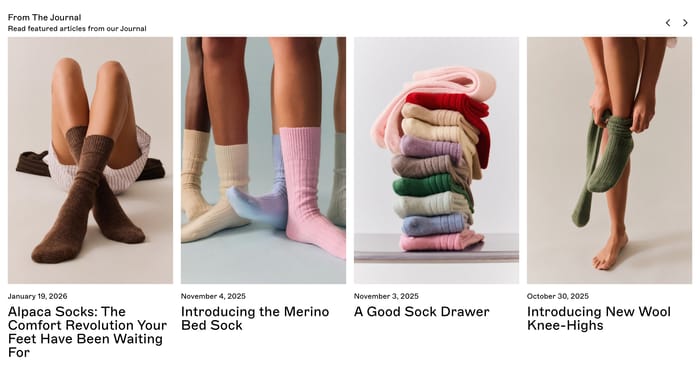
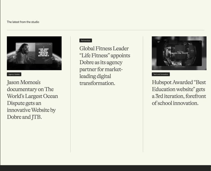
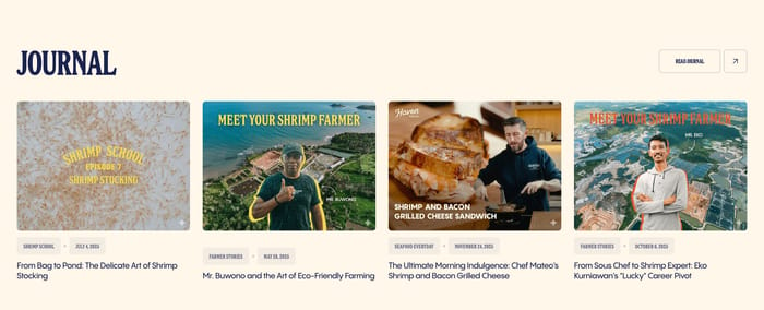
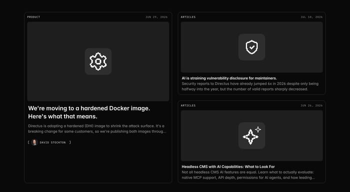
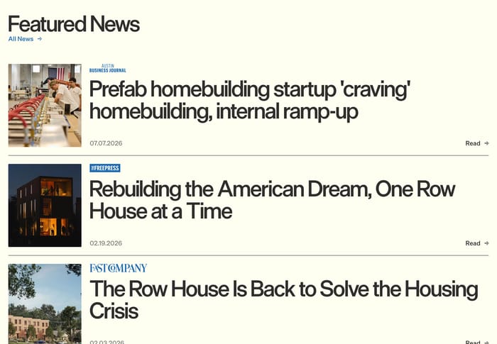
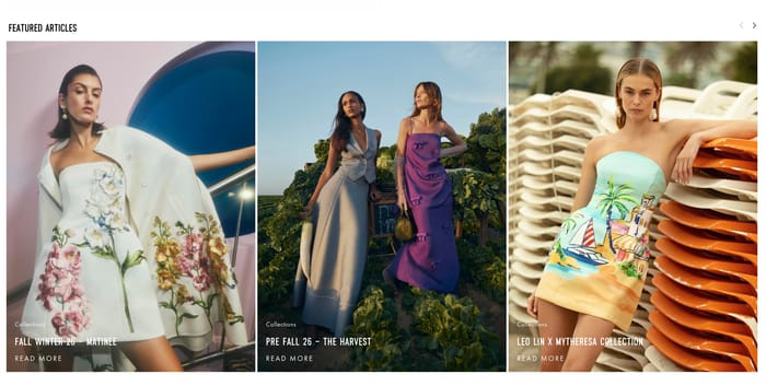
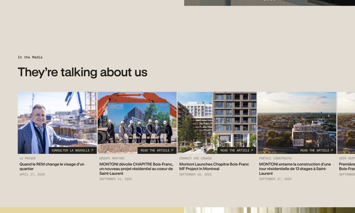
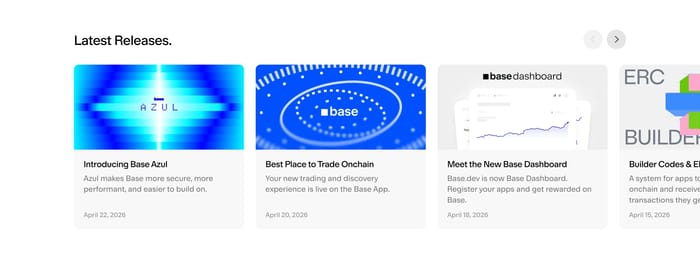
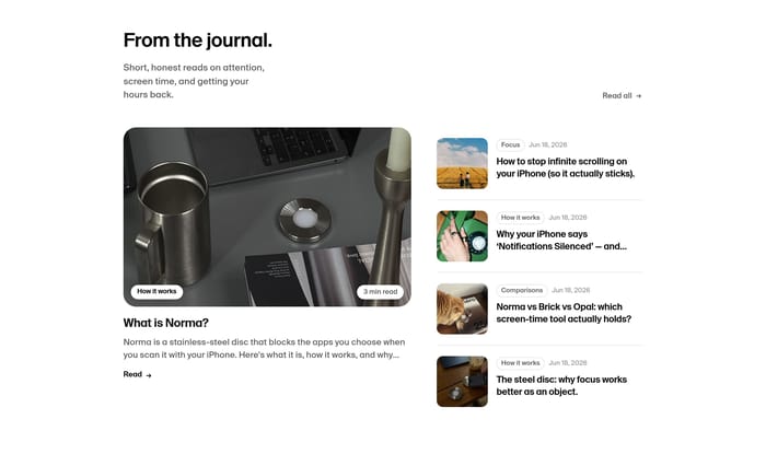
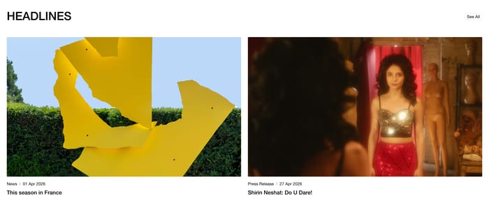
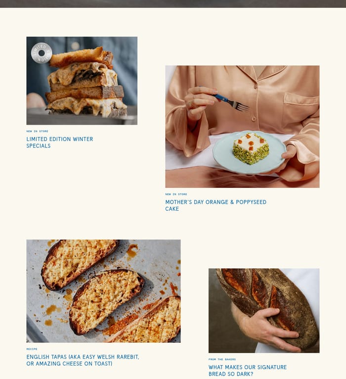
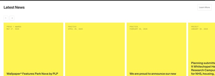
A blog section is a homepage or landing-page module that publishes a short set of recent writing. It is not the archive. Its job is to prove the site is alive, invite a deeper click, and signal what the company wants to be known for talking about. The same job takes many forms here. Product teams lean on dated cards and release notes. Agencies mix long headlines with case-study imagery. Food and fashion brands treat posts like a lookbook. Housing, architecture, and galleries often borrow a press-clipping format, where outlet names and dates work as hard as the title. Single-story interviews and event heroes pause the feed entirely. Hierarchy matters more than decoration. Some sections give every post equal weight. Others pick one lead and tuck companions into a list. Metadata ranges from a quiet date to category pills, authors, and publication logos. Images either carry the story or sit as a small thumbnail under type.

92 published examples

How to design a Blog section

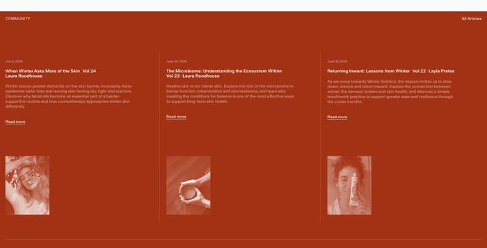
The first thing I look at in review is whether the section can survive a bad week of titles. Long agency headlines blow a three-column grid apart unless one column can go type-only. Equal cards look tidy in Figma, then sag when a 14-word title sits next to a five-word one. Ask what the image is doing. Product icons can sit as placeholders. Fashion and food need the crop to sell the click. Mixed ratios only work when the layout expects them. A forced 16:9 on a portrait interview wastes the person. Carousels keep a homepage calm when the CMS will dump eight posts, but they hide recency. If the newest story can slide off-screen, the section stops proving the site is current. Three honest cards and a clear path to the archive usually beat four-and-a-peek. Featured-plus-list earns its keep when the lead is a different kind of object: a product announcement beside shorter articles. If every item is the same type, the big tile reads as favoritism. Mute the images and read only category, date, and title. If you cannot tell news from journal from changelog, the metadata is decoration.

Blog design questions

How many posts belong on a marketing-page blog section?

Enough to show a pulse, not enough to become an archive. Three to four is the recurring comfortable set: one thought per card, one glance to see the range. Six-plus starts to compete with the page’s primary offer. If the team publishes weekly, rotate the set and keep a single link to the full index. Sparse publishers should not pad with old work just to fill a four-up.

When does a homepage blog section need categories?

When the writing is not one genre. Product blogs mix changelog, thought leadership, and customer stories; those labels help a skimmer skip. A studio journal that is all process notes can live with dates alone. Homepage filters are usually theater. A few persistent labels on the cards, plus a real taxonomy on the index page, is enough. If every post wears the same chip, delete the chip.

Should a blog section look like a magazine or like the rest of the site?

Match the page’s chrome, not a generic magazine skin. Type size, rules, and card radius should feel like the product around them. What can shift is density and photography: a fashion house can go full bleed; a developer tool can use icons and excerpts. The failure mode is a leftover WordPress widget dropped into an otherwise considered site. If the section could be swapped onto a competitor without anyone noticing, the voice is wrong.

Unlock premium section designs

Go Pro to get instant access to 92 premium section designs + exclusive features

Related section categories

Curating the internet’s finest.