

























Quiet logo walls
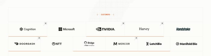
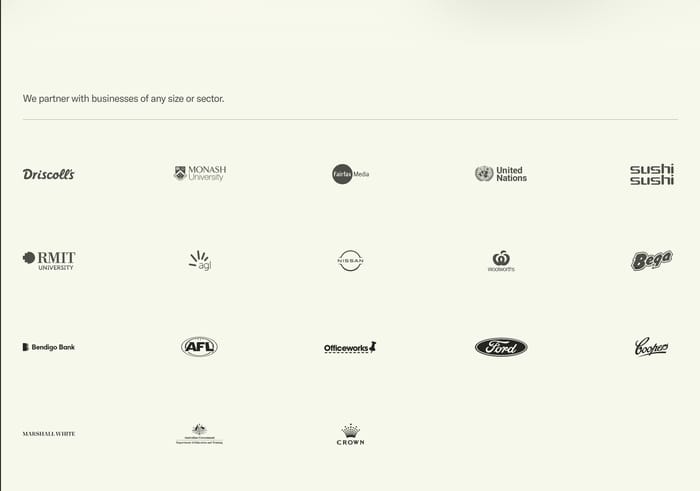
Even grids and single-row strips of client or customer marks. Copy stays short, color is usually reduced, and the section asks to be scanned rather than read. This is the default when the claim is breadth.
120 published examples
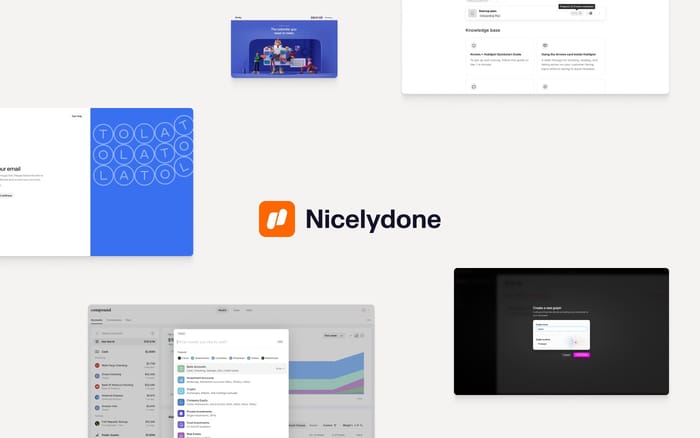

Even grids and single-row strips of client or customer marks. Copy stays short, color is usually reduced, and the section asks to be scanned rather than read. This is the default when the claim is breadth.
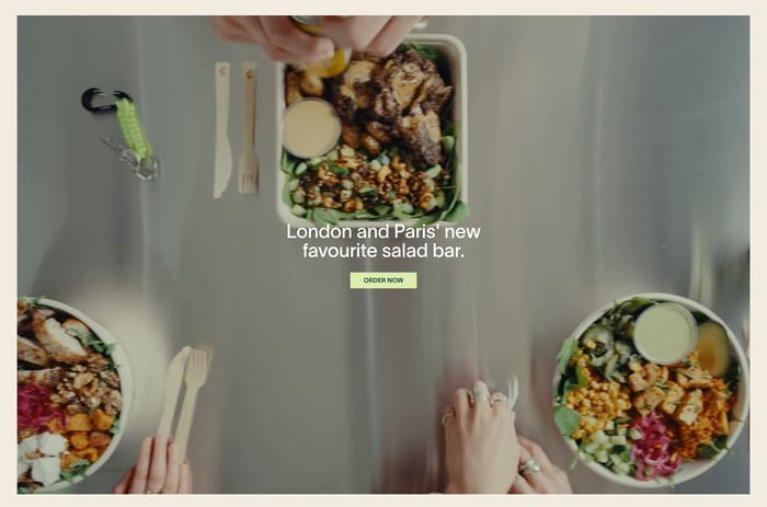
Large photographs, a name, a point of view, and a path into the brand. These sections sell a roster instead of borrowing credibility. They need real art direction; a cropped pack shot on a gray tile will not carry the same weight.
Badges from publications, programs, and award bodies, often in a single row beside a heading. They work when the issuing name is recognizable at a glance. A crowded tray of low-stakes stickers reads as self-congratulation.
The first review question is not layout. It is whether the set of marks matches the promise above them. A line that says “trusted by teams of every size” next to five lookalike startups reads as filler. A short, specific claim next to fewer, more relevant names usually lands harder. Logo treatment is where these sections quietly die. Full-color marks on a busy field fight each other. Forced one-color treatments can erase a brand that only works in its own palette. I tend to ask for a grayscale or single-ink pass first, then restore color only where a mark becomes unreadable. Equal optical weight matters more than equal bounding boxes. Wordmarks and badges never share a true centerline, so optical alignment beats a rigid grid. Watch height. A logo strip that is taller than the headline is doing too much. On small screens, a slow marquee can feel cheaper than a two-row wrap. If you need motion, pause on hover and keep contrast legal against the track. When the brands are yours to sell, stop thinking in logos. Photography, a one-line point of view, and a real destination outperform a mark floating in a tile. When the brands are proof, resist the urge to write a paragraph under every logo. One honest label for the group is enough. If a relationship needs explanation, promote that name into a partnership card and leave the rest of the wall quiet.
Enough to make the claim feel earned, not encyclopedic. Six to twelve well-known or clearly relevant names usually beat a wall of twenty obscure ones. If you cannot explain why a mark is in the set, cut it. A second row is fine. A third row is a signal that the section has become a dumping ground.
Only when the destination helps the visitor. A client mark that opens a case study or a featured brand that opens its shop earns the click. A logo that jumps to a third-party homepage is a leak. If legal or relationship rules block deep links, keep the marks static and put the action on the section label instead.
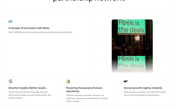
When you have three names, a story, or a catalog to sell. Three logos look lonely in a five-column grid. A partnership that needs context wants a card, not a glyph. A house of brands wants photography and a point of view. Use the wall when recognition is instant and the job is proof, not narrative.