



Invitation banners and named people
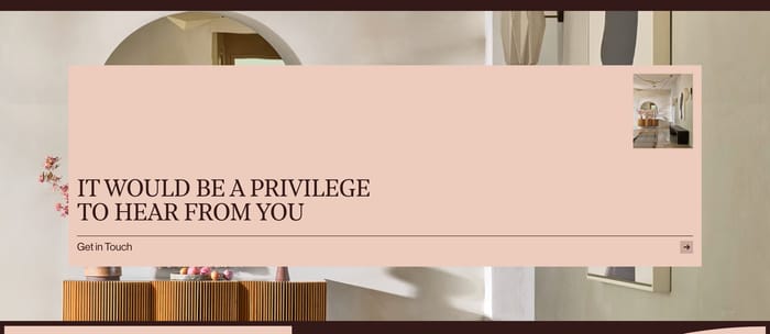
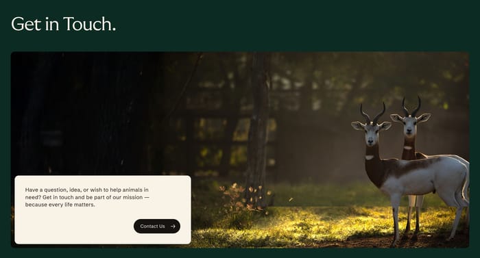
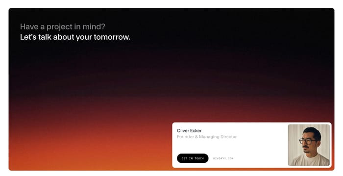
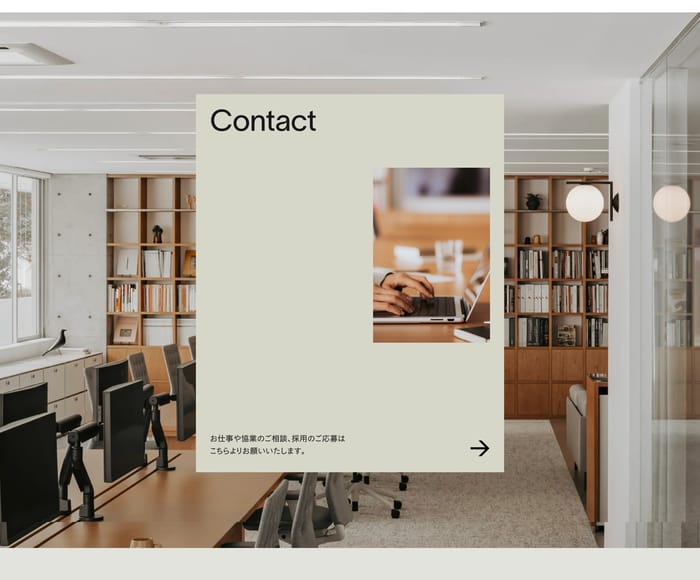
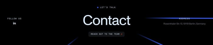
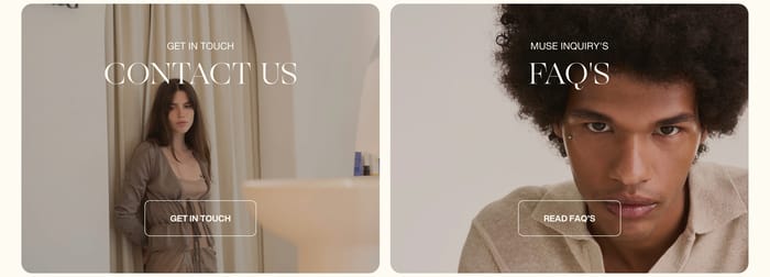
These sections sell the conversation before they collect anything. A headline, a short promise, and a button or named contact do the work. They fit brands that want warmth more than intake.
107 published examples

These sections sell the conversation before they collect anything. A headline, a short promise, and a button or named contact do the work. They fit brands that want warmth more than intake.
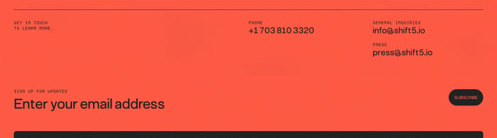
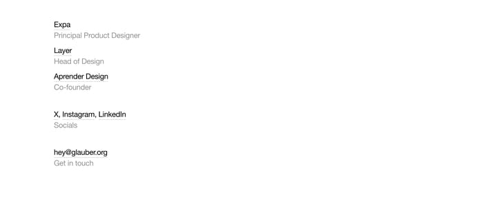
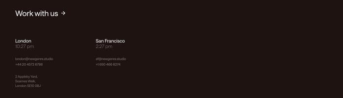
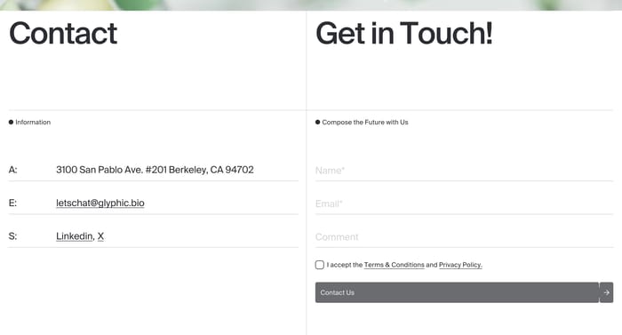
The contact method is the interface. A large address, a reply promise, or a short stack of roles and socials keeps the path short for studios and independents.
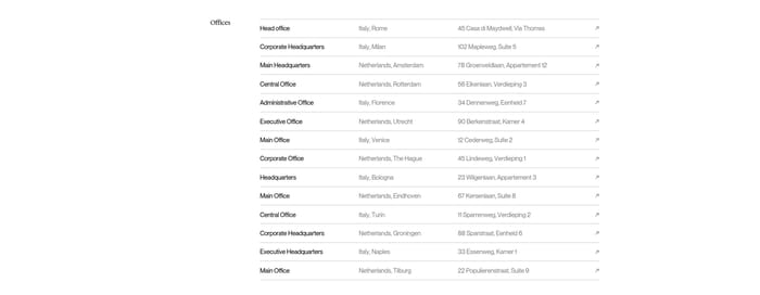
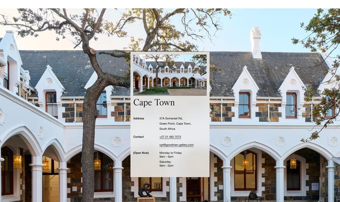
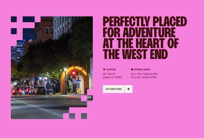
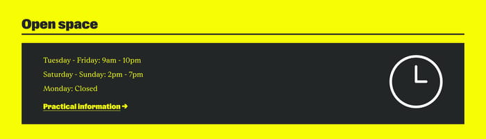
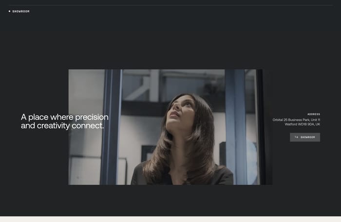
When the destination is physical, the section behaves like wayfinding. Address, hours, phone, and a photo or map sit together so a visitor can decide whether to come.
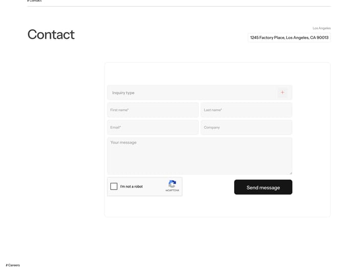
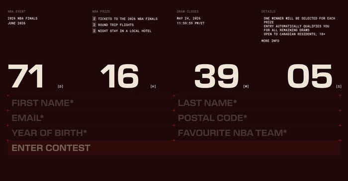
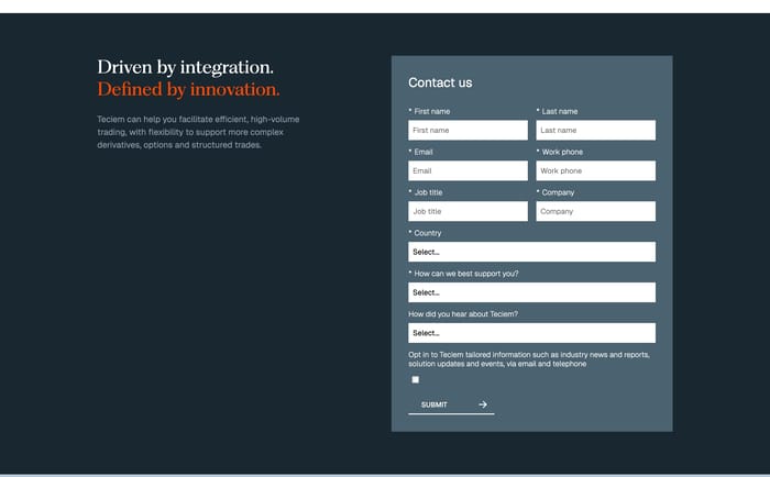
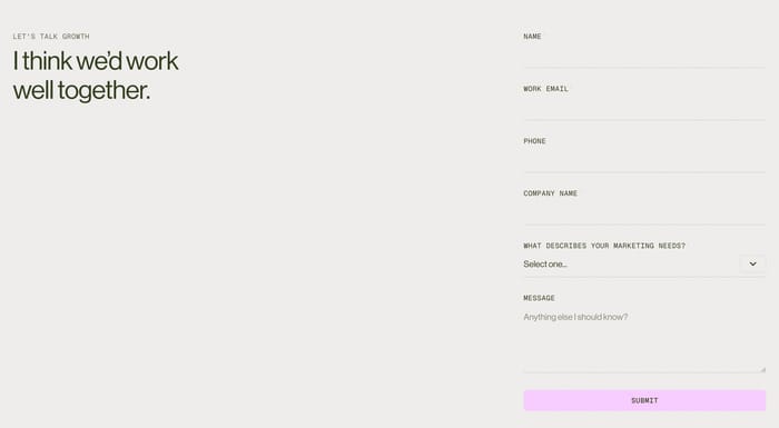
In review I look first at the promised action, then at how much work it asks for. A giant email with a reply-time note can outperform a ten-field form if the brand is small and the inbox is real. A long form only earns its keep when someone on the other side will actually route by inquiry type, country, or need. Watch contrast and tap targets on overlay cards. Photography behind a location card looks rich until the address, phone, and hours start to compete with the building. If people need to visit, hours and a directions action matter more than atmosphere. If they need to write, the email or submit control should be the loudest object on the screen. One pattern I keep seeing is the invitation that never names the channel. “Get in touch” is fine as a headline, weak as the only instruction. Pair it with an email, a form, or a named person. Also test the empty state of every field: stacked labels, required marks, and a submit that still reads after a keyboard is open. Forms fail quietly when the last field and the button collapse into the same visual weight. Trade the extra field for a clearer promise. If you would not use the answer this week, do not collect it.
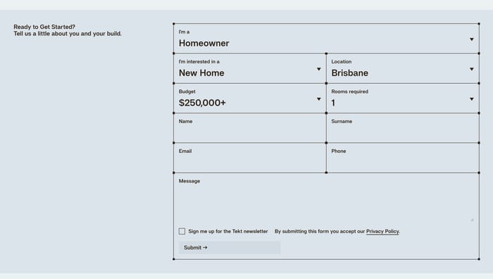
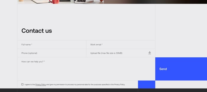
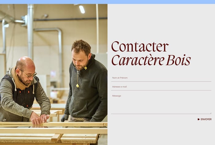
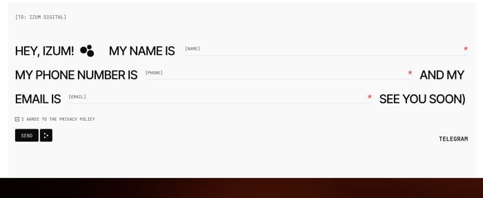
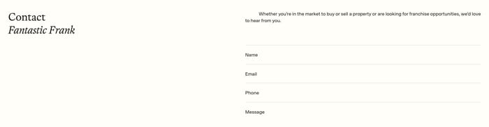
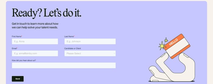
Use a form when messages need routing, legal consent, or a shared inbox. Publish an email when one person will answer and speed matters. If the form only recreates an email with extra fields, the extra friction rarely pays off.
Give people enough to arrive: address, hours, and one action such as directions or a phone number. A photo helps only if the type stays readable on top of it. Skip the map pin theater if the hours are missing.
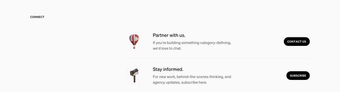
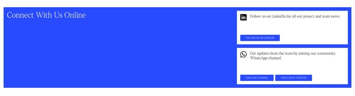
Name the next step in the control or the line beneath it. “Contact us” needs an email, a person, or a form destination. A reply-time note or a visible address makes the invitation feel staffed instead of decorative.
Compare section designs that serve a similar purpose on your page.