











Newsletter Sections: Patterns and Design Notes

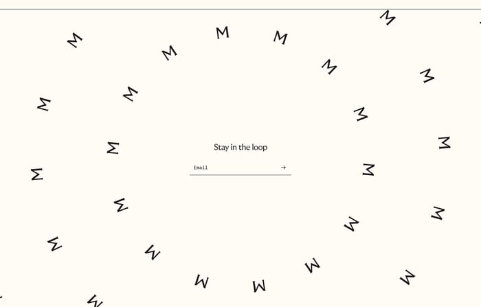
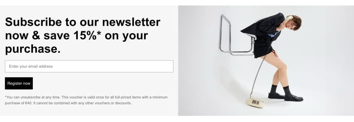
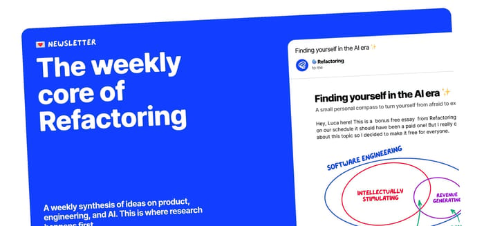
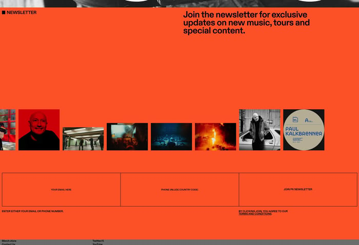
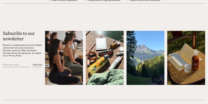
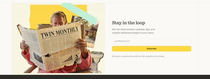
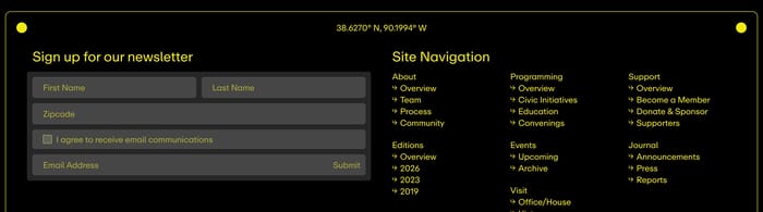
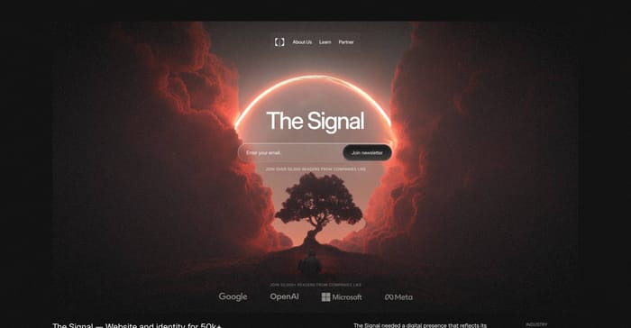
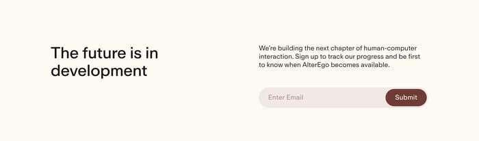
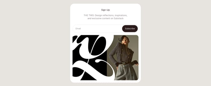
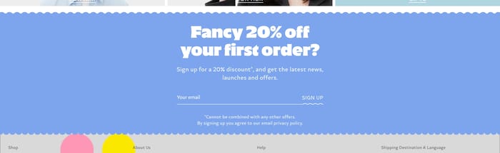
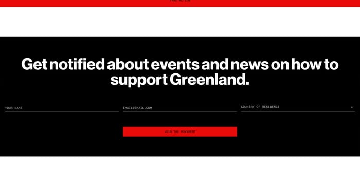
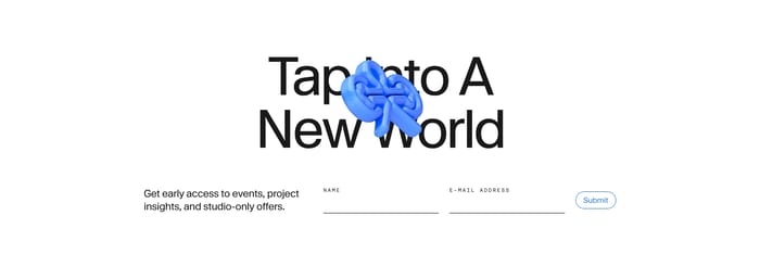
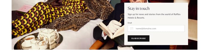
A newsletter section is the page’s standing invitation to stay in contact. It usually pairs a short promise with an email field and a submit action, then sits wherever residual interest is highest: after a story, beside a product grid, or as the last beat before the footer. Its job is simple and unforgiving. Convert attention that is not ready to buy, book, or apply into a permissioned relationship. What you see across sites is how elastic that job can be. Some treatments are almost invisible utility bars. Others behave like campaigns: lifestyle galleries, collage art, or a full-bleed hero where the list is the product. Copy ranges from a single stay-in-the-loop line to a concrete offer, a waitlist, or a named publication. Forms stay mostly one field, then occasionally expand into names, consent, and zip codes when the organization needs more than an address.

111 published examples

How to design a Newsletter section

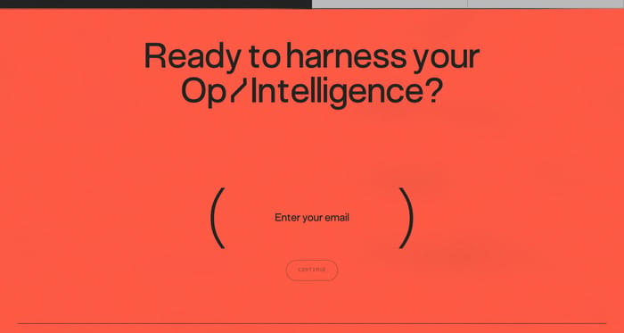
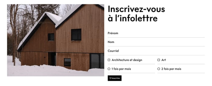
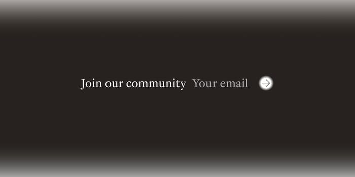
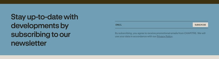
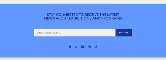
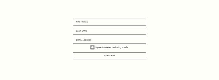
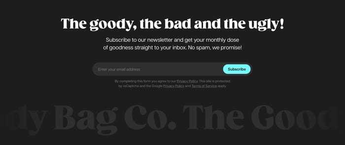
I tend to judge these in three seconds: can I say what arrives in my inbox, and can I complete the form without hunting? Vague community language looks elegant and converts poorly when the rest of the page is already atmospheric. Specific cadence or value—monthly, first access, a named issue—gives the field a reason to exist. Watch the form as an object, not a decoration. Underline-only fields disappear on pale grounds. Pill inputs with a high-contrast button read faster, especially in slim bars. If the submit is an arrow, the field still needs a visible label; placeholder-as-label fails the moment someone types. Multi-field blocks with consent checkboxes belong next to navigation or legal, not mid-story. Imagery is a trade-off. A gallery or collage can make the list feel like the brand, but it also competes with the button. If the photos are the point, keep the form flush left and short. If the section is a color poster, the type is doing the selling—do not sneak a tiny field into the corner. And give privacy copy a real type size. Hidden legal text next to a loud CTA is the first thing a review will flag.

Newsletter design questions

Should the newsletter live in the footer or higher on the page?

Footer is fine when the list is a courtesy. Move it up when the list is the relationship: a publication, a waitlist, or a drop calendar. Mid-page works after a complete thought, not after a half-read feature. Repeating the same module in hero and footer usually means neither was given a real job.

When do extra fields help a newsletter form?

Extra fields help when you will actually use the data in the first send: a name for a personal letter, a zip for local programming, a checkbox when counsel requires explicit consent. Otherwise they are friction dressed as professionalism. If every subscriber would get the same first email, keep a single address field.

How do you write a headline that does not sound generic?

Name the thing people receive. A monthly, a club, a named dispatch, first access to a collection. Stay-in-the-loop and join-our-community lines only work when the surrounding brand is already specific. If you cannot mention cadence, content, or a privilege, the section is asking for an email it has not earned.

Unlock premium section designs

Go Pro to get instant access to 111 premium section designs + exclusive features

Related section categories

Curating the internet’s finest.