





















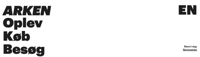








Header Layouts for Navigation, Brand, and CTAs

A header is the persistent top band that orients someone the moment a page loads. Its job is orientation first: brand, wayfinding, and a next step. Everything else is optional pressure. Across this collection, most headers still run a familiar left-to-right grammar: mark, primary links, then utilities or a button. The interesting variation sits in how much they absorb. Retail bars add search, account, and cart. Product sites pair a quiet Sign In with a louder demo request. Editorial and studio sites often float a thin strip over photography, or collapse the map into Menu. Some headers stay one row. Others stack a promo or announcement above the nav, which buys campaign space at the cost of first-screen height. A few treat the bar as an object: a centered capsule, a dark slab, a translucent film. The useful question is not which look is current. It is whether the header still reads as a system after the hero, the announcement, and the primary action all compete for the same strip.

555 published examples

How to design a Header section

In review I look at three collisions: contrast on the hero, competing actions, and what happens when the bar sticks. If the header sits on photography, white type is not a strategy. Test the same crop in bright and muddy frames. When the logo disappears, a scrim, a solid bar, or a darker lockup is the fix. Translucent bars look refined until a pale sky or a white product shot arrives. Count the destinations that look like buttons. Sign In beside Request a Demo can work when one is outline and one is filled. Three filled pills next to a cart icon is noise. I tend to ask: if someone only notices one control, is it the right one? Sticky headers fail when they keep the announcement, the full logo, and a tall row of links. After scroll, the bar should get quieter: smaller mark, no promo, same hit targets. Language switchers and icon-only utilities need spacing a thumb can trust, plus accessible names that do not depend on the glyph.

Header design questions

When does an announcement bar belong above the header?

When the message is time-bound or operational: shipping, a launch, a payment option. Permanent slogans belong in the hero. If the promo never rotates, it just steals height. Design both the stacked state and the dismissed state, and decide whether that strip survives once the nav becomes sticky.

How many actions should sit in the header?

One obvious action is usually enough. A secondary text or outline control can sit beside it for returning users. If Login, Demo, Pricing, and Contact all look equal, none of them win. Rank destinations by frequency and commercial weight, then let the visual hierarchy match that ranking.

Is a transparent header worth the extra work?

Only if contrast holds across every hero treatment you actually ship. A single beautiful photograph is a weak test. Check video, light products, and localized headlines that wrap. If you cannot guarantee contrast, a solid or blurred bar is the more grown-up choice.

Unlock premium section designs

Go Pro to get instant access to 555 premium section designs + exclusive features

Related section categories

Curating the internet’s finest.