




Open answer grids
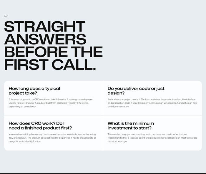
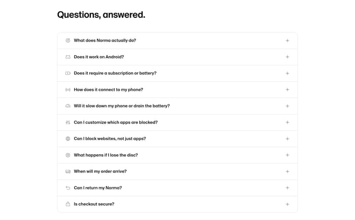
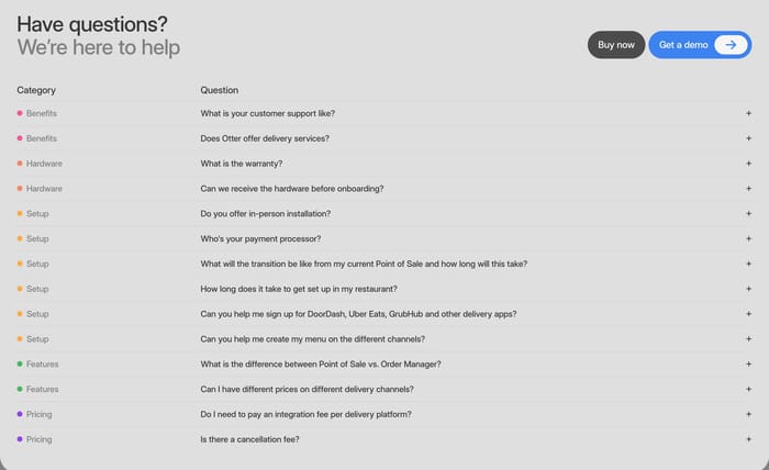
Every question and answer stays visible in a card or two-column grid. Best when answers are short, comparable, and meant to be skimmed before a call.
140 published examples


Every question and answer stays visible in a card or two-column grid. Best when answers are short, comparable, and meant to be skimmed before a call.
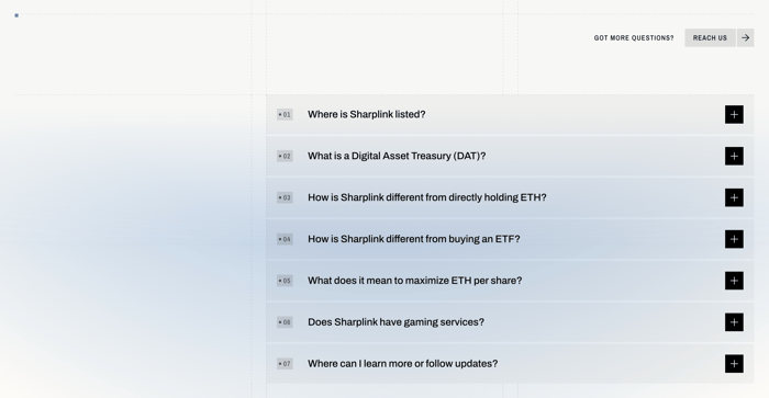
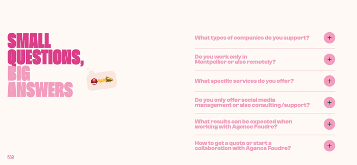
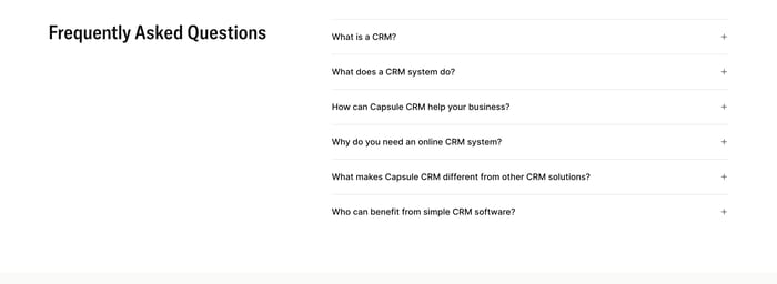
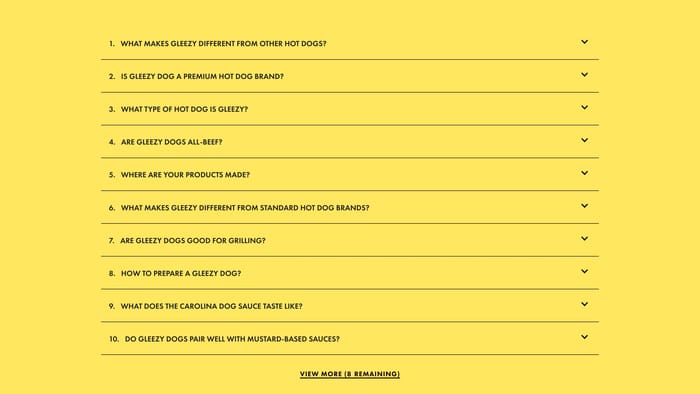
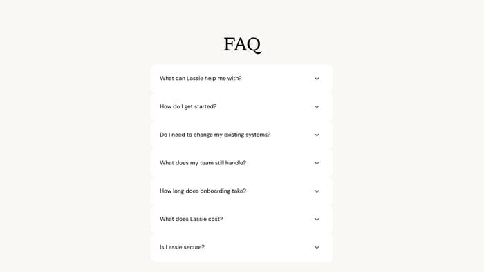
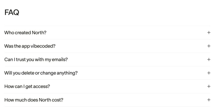
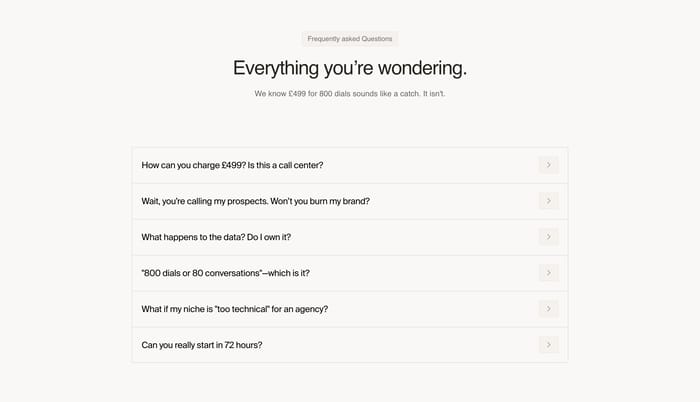
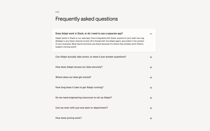
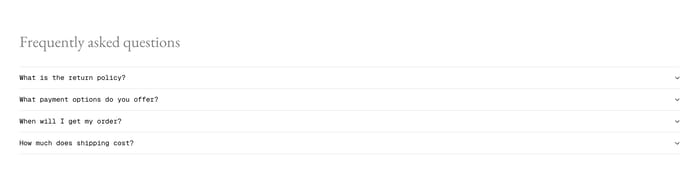
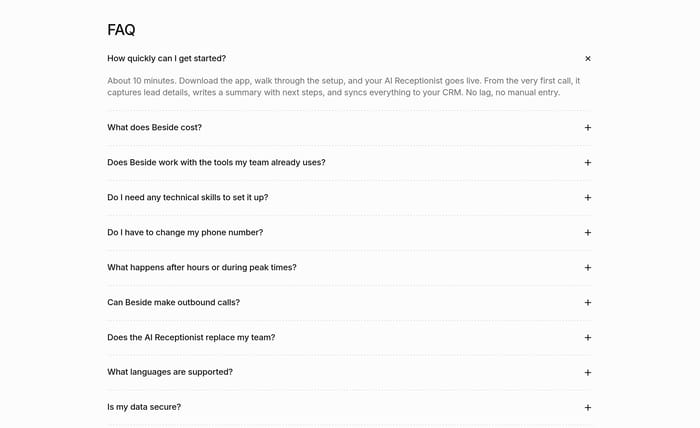
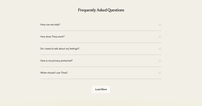
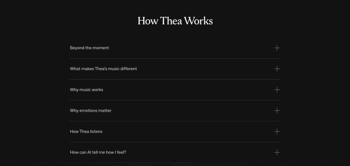
A short title sits above a single column of collapsed items. The scan path is linear, which suits six to ten objections and a quiet page.
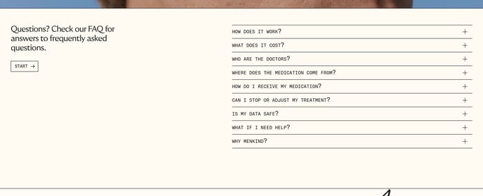
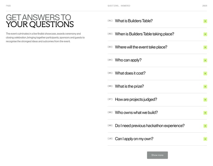
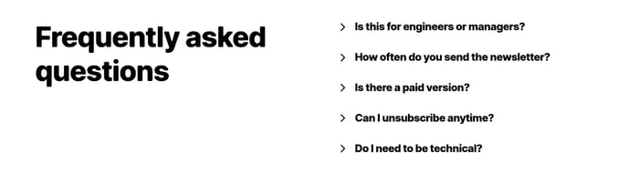
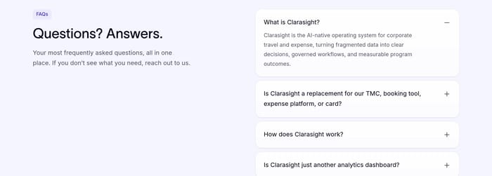
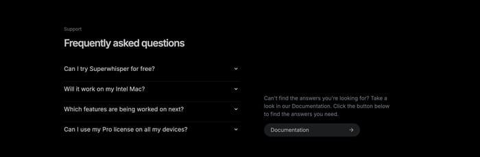
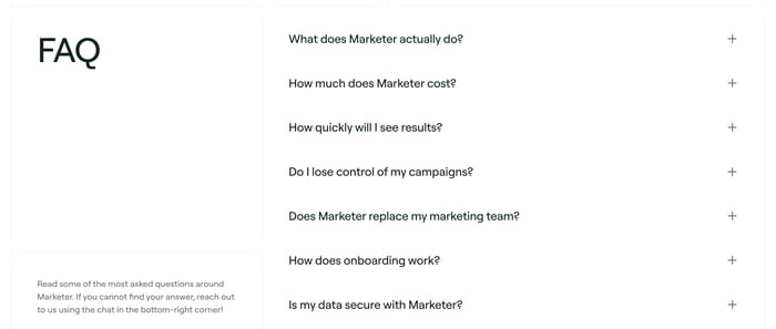
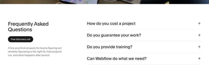
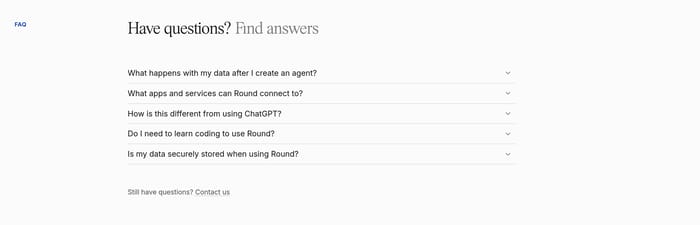
Intro copy, a label, or a short promise sits on one side; the accordion lives on the other. Use the empty column for context, not leftover branding.
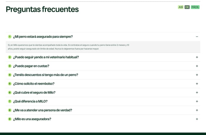
In review I look at the questions first, not the chrome. If the list reads like a brochure, the section is failing. Strong FAQs sound like sales calls: timeline, price, replacement risk, data ownership, onboarding. Vague headings such as “FAQ” are fine when the questions do the work. They fail when the answers stay generic. Accordions earn their keep when answers are long or the list is long. They fail when every item is a one-liner you could have shown open. Open grids work when answers stay short and comparable. Split layouts work when you need a human, a docs link, or a booking action next to the list. They waste space if the left column is only a label. Test the closed state. Can someone scan six to ten questions and find theirs without opening everything? Are hit targets large enough? Does one open item stay readable when the next expands? I tend to keep one item open by default only when it answers the most common blocker. Multiple open items are fine if the page can grow; they become noisy on mobile. Icons and numbers help only when they encode a real category. Otherwise they slow the scan. Leave a path out: chat, docs, or a call. An FAQ that traps leftover questions is just a prettier dead end.
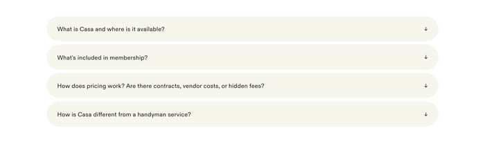
Keep answers open when they are short and people will compare them side by side, like timelines or scope. Collapse when answers run long or the list would bury the rest of the page. If every closed row is a one-line answer, the accordion is mostly theater.
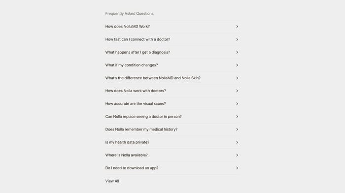
Enough to cover the real blockers, usually a short stack someone can scan in one pass. Once you need categories, search, or a View all link, the leftover questions belong in a help center. A marketing FAQ should reduce sales friction, not archive every policy.
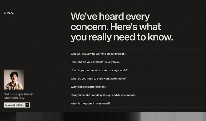
A next step for the questions you did not write: documentation, chat, or a call. A portrait or product still can make that invitation feel human. A leftover label or empty headline column rarely helps. If the side panel does not change what someone does next, cut it.
Compare section designs that serve a similar purpose on your page.