



Quiet product merchandising
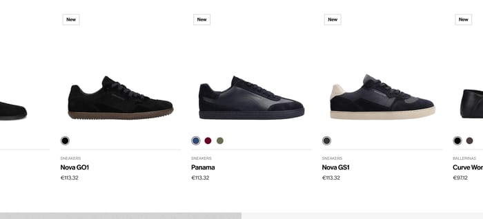
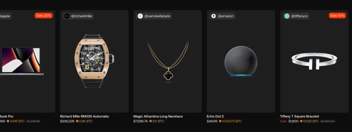
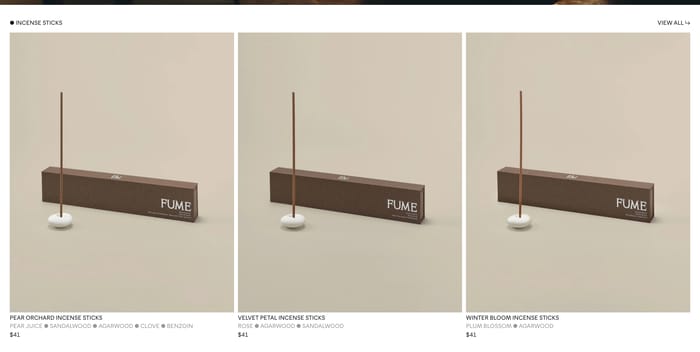
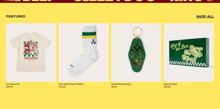
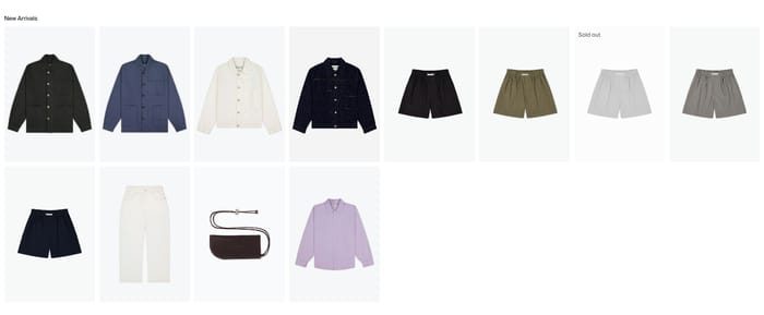
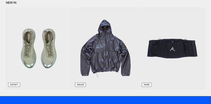
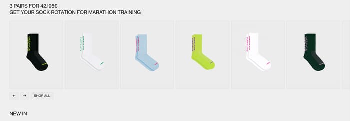
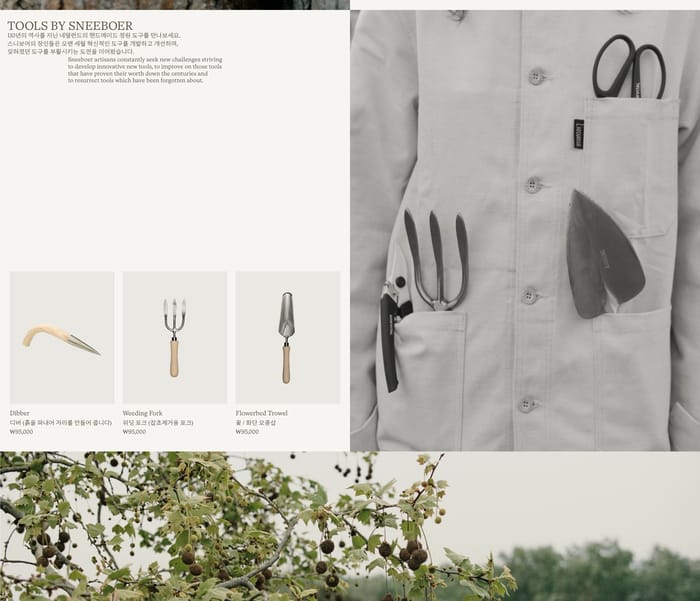
Even object shots, short names, and prices in a calm row or grid. Comparison is the point, so crops stay consistent and type stays secondary.
234 published examples


Even object shots, short names, and prices in a calm row or grid. Comparison is the point, so crops stay consistent and type stays secondary.
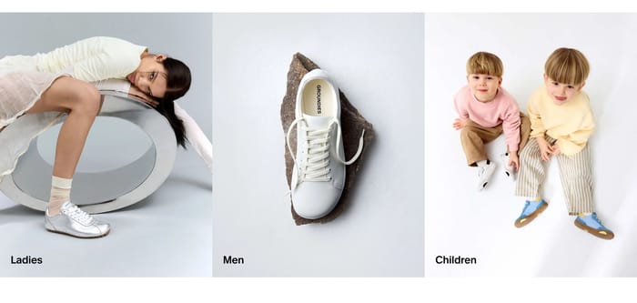
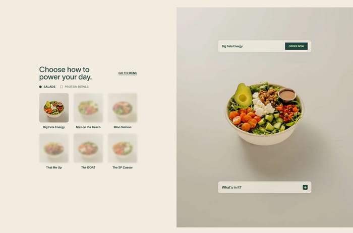
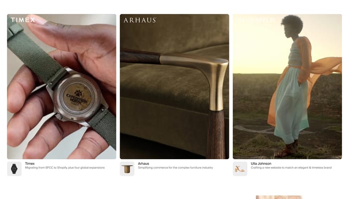
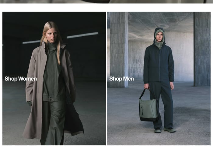
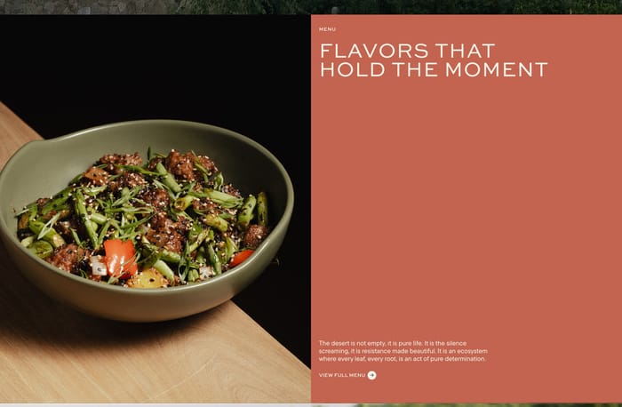
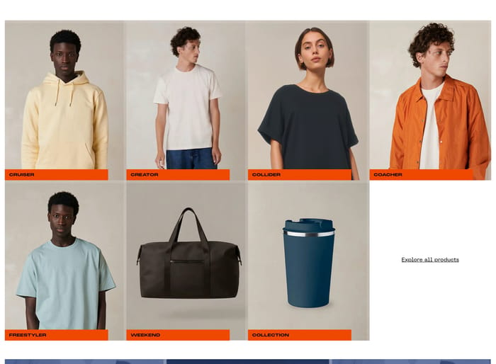
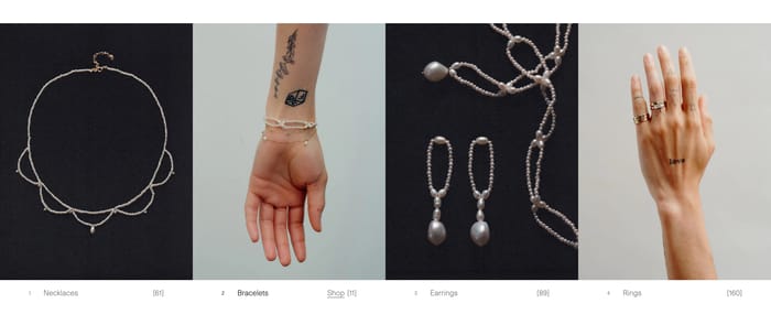
Large lifestyle or still-life tiles that route into a shop area. One label per image does the navigation work; the photograph sells the world, not a SKU.
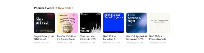
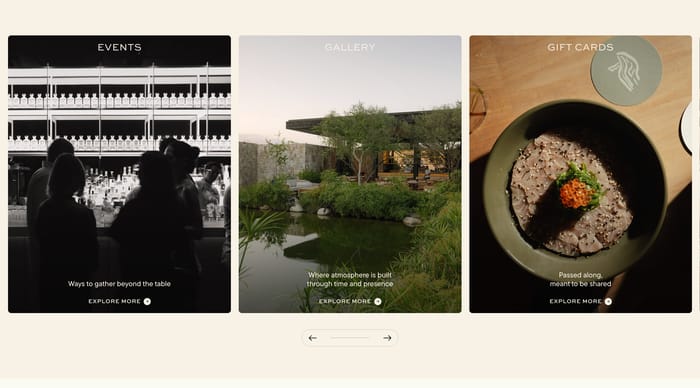
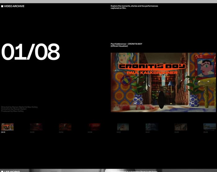
Courses, press, and video episodes in a horizontal run. Dates, tags, and peeking cards tell people this set is current and larger than the viewport.
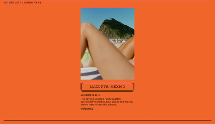
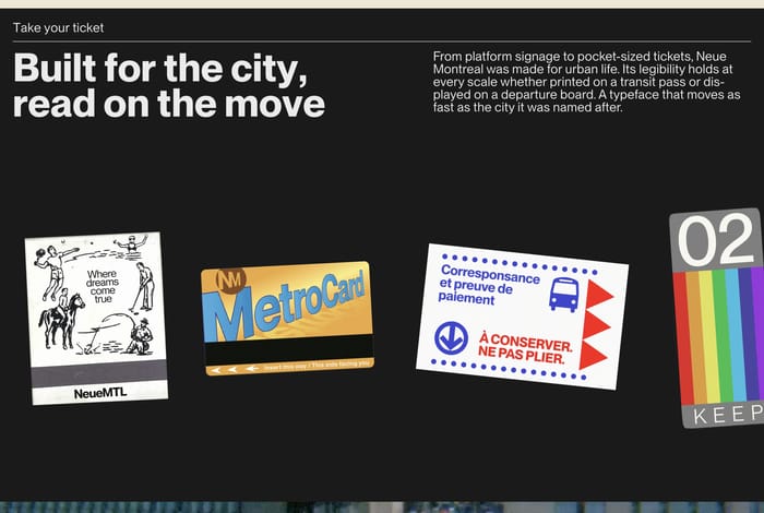
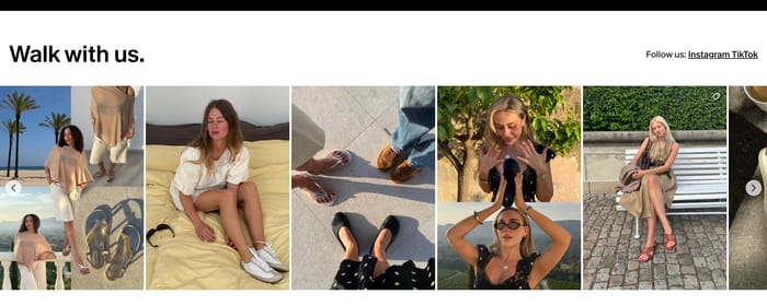
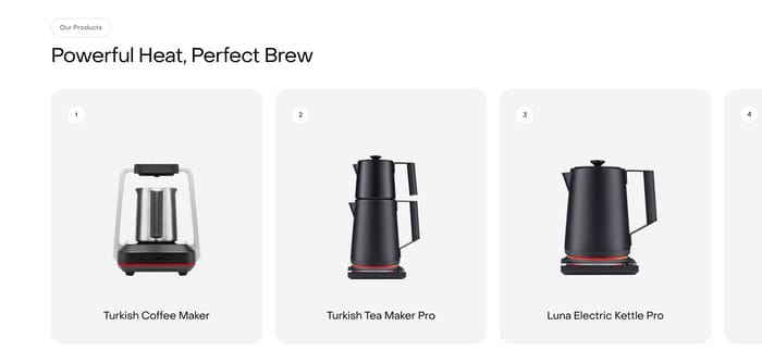
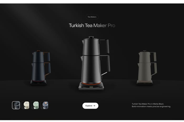
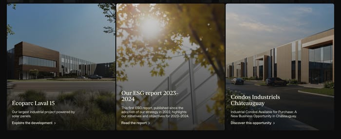
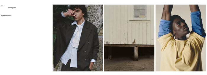
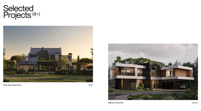
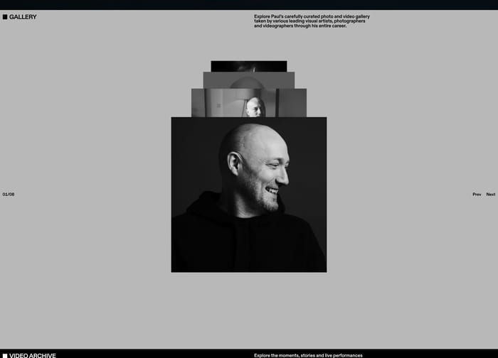
In review I look first at whether every tile answers the same question. If the set is merch, people need a comparable crop, a name they can read at a glance, and a price that does not jump around. Fashion and object grids that keep lighting and scale consistent feel shoppable. Mix lifestyle crops with pack shots and the set starts arguing with itself. Category galleries fail when the label is an afterthought. A word like Tops or Face Care has to survive the photograph. If type sits in the image, test it on the busiest crop, not the quietest one. Carousels earn their keep when the set is long or time-based: courses, press, video episodes. Peeking the next card is a kindness. Hiding the last item behind a chevron with no count is not. Watch density. Four equal product cards can feel generous; ten tiny ones feel like a catalog dump. Social mosaics and scattered portraits can carry emotion, but they still need a caption or a destination. Ask what happens after the click. If the gallery is the shop, the tile is the product. If it is a mood board, give one honest way out.
Use a carousel when the set is long, sequential, or time-stamped: courses, press, video episodes. A grid is better when people need to compare peers, like shirts or bottles. If every item is equally current, a wrap is usually clearer than hiding half the set behind arrows.
Enough to name the thing and decide the next click. A product tile can carry brand, title, and price. A category tile often needs only one word. Extra blurbs, review counts, and dual CTAs belong on a featured stage, not on every card in a dense row.
Shared lighting, shared crop, and a reason the items sit together. New arrivals, a single material, or one collection all read as a point of view. Mixed aspect ratios, leftover sale SKUs, and labels that fight the photo make the same layout feel like leftover inventory.
Compare section designs that serve a similar purpose on your page.