





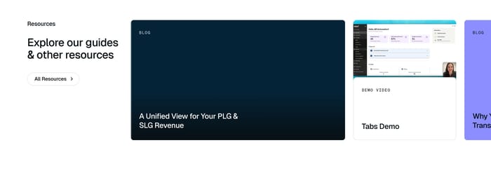
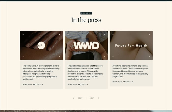

Visual destination grids
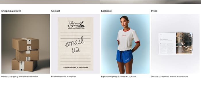
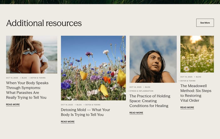
Equal cards or photo tiles that turn each resource into a place you can enter. Titles sit above the image, a short line below explains the destination, and the set reads as a menu rather than a feed.
17 published examples

Equal cards or photo tiles that turn each resource into a place you can enter. Titles sit above the image, a short line below explains the destination, and the set reads as a menu rather than a feed.
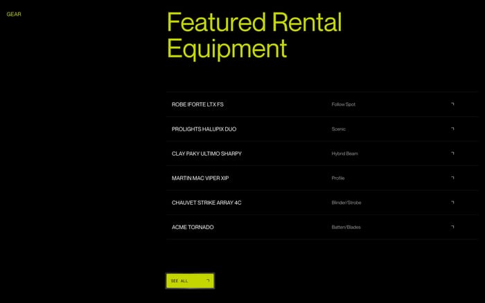
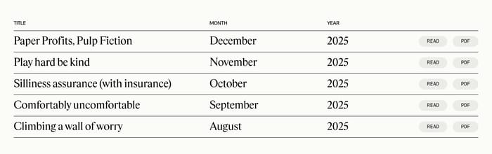
Rows beat cards when items share a format and a date. Titles, categories, and actions stay on one line so people can scan a sequence of letters, gear, or updates without parsing a mosaic.
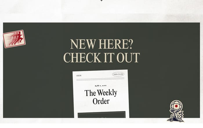
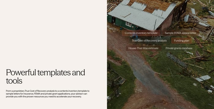
These blocks sell a file or a working aid, not an article. The object is named, the action is a download or a labeled chip, and the surrounding copy explains what the tool is for.
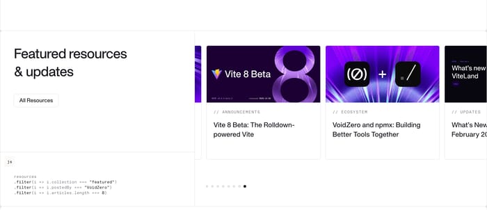
In review I look first at whether the section is a library or a pointer. A library needs scanable titles, type labels, and a path to the full set. A pointer can be one download, one newsletter teaser, or a short list of destinations. Mixing those jobs is where these blocks usually fail. Cards work when the item has a face: a photo, a product shot, a press logo. They collapse when every card is a generic gradient and the title is the only signal. Tables and stacked rows win for dated archives and equipment lists because month, category, and action sit on one line. If you need both Read and PDF, put those verbs on the row instead of hiding them in a hover. Watch the heading. Additional resources and Featured resources & updates only help if the cards actually differ from the rest of the page. I tend to ask: would a first-time visitor know what they get if the images disappeared? If not, the labels are doing marketing, not orientation. Keep the exit cheap. One All resources control, a See all row, or a single download button is enough. A carousel of mixed blogs, demos, and press can look current and still feel like a junk drawer if nothing is ranked. Prefer fewer items with a clear type over a complete catalog crammed into one band.
Use cards when each item has a distinct face or destination: a lookbook, a press mention, a photo-led article. Switch to a list or table when the items are sequential or comparable, like monthly letters or equipment. If every card would look the same without its title, the list will scan faster.
Enough to prove the library exists, not enough to replace it. Three to six typed items plus one All resources or See all control is usually the ceiling. Past that, people stop ranking and start skimming past the section. A single download or newsletter teaser can be the whole block if that is the real next step.
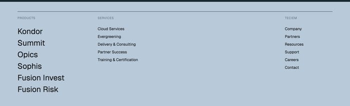
The heading promises a category, then the cards mix blogs, product shots, and footer links with no type labels. Name the format when you can: studies, templates, press, letters. If the set is mixed, put the type on each item so the heading does not have to do all the work.