
















Call to Action Sections

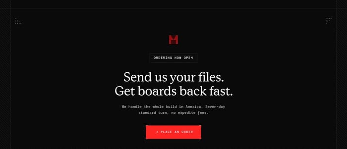
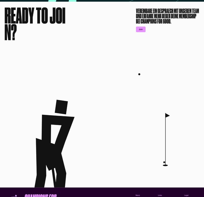
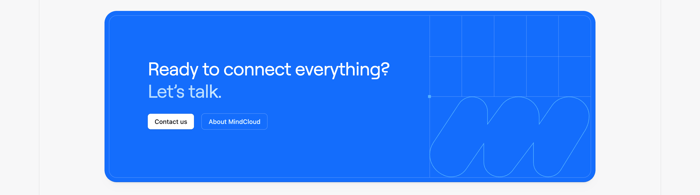
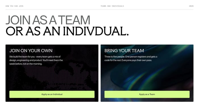
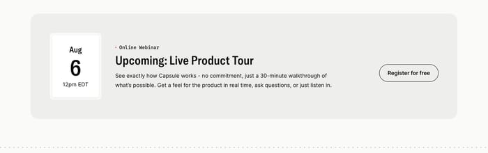
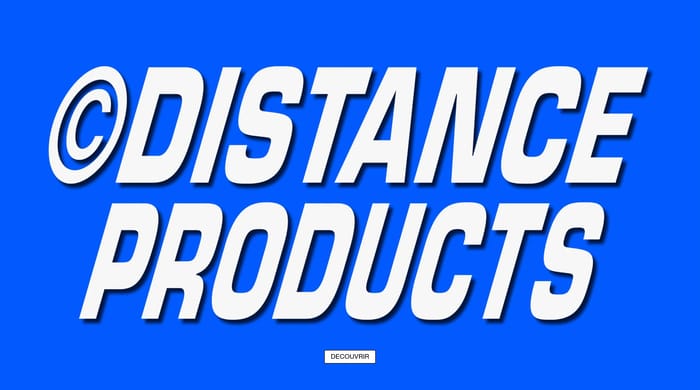
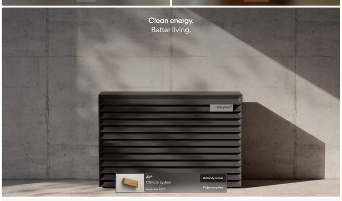
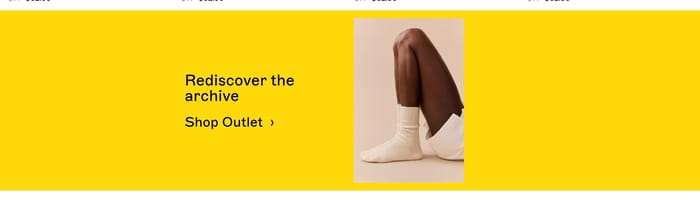
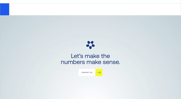
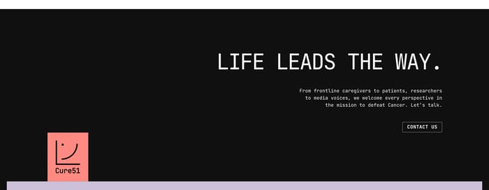
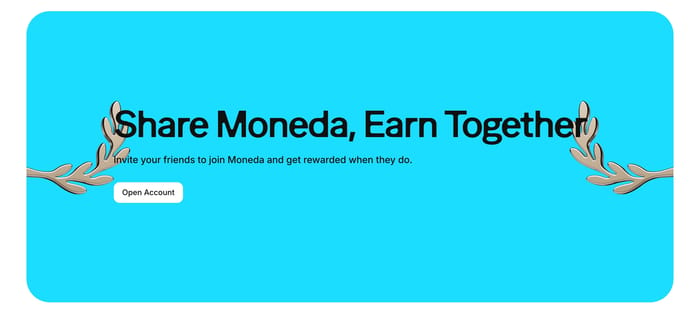
A call to action section is a dedicated block whose only job is to convert attention into a next step. It is not the nav, and it is not a feature list with a button tacked on. On a page it usually arrives after the argument has been made: after product proof, after a story, or as a last stop before the footer. Sometimes it also sits mid-page as a banner that interrupts the scroll with a single ask. The examples show how wide that job can stretch. Some sections are one-line strips with a single button. Others are full-bleed scenes with photography, gradients, or oversized type. Product teams often offer two paths, such as start free and book a demo. Service and brand sites lean toward contact, partnership, or a named person. Forms appear when the conversion is a list, a partner signup, or an email. The useful variation is not decoration. It is how much commitment the section asks for, and how much context it still needs to carry.

217 published examples

How to design a Call to Action section

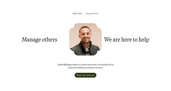
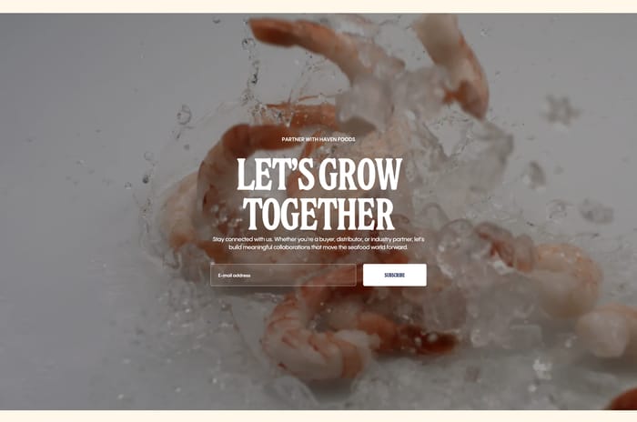
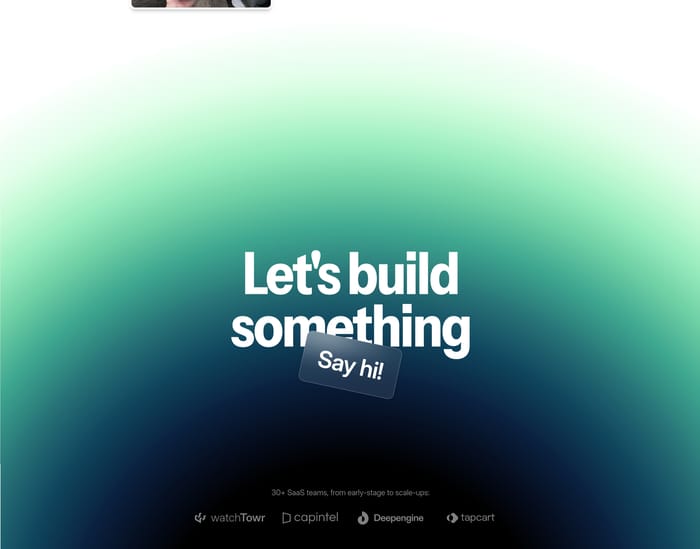
In review I look at whether the section still works if you mute the photography. A truck, a splash of shrimp, or a gradient can sell mood, but the ask has to survive as type and a control. If the headline is a slogan and the button is the only sentence that explains the next step, the section is doing two jobs at once and usually failing the first. Watch contrast on full-bleed images. White type on a moving vehicle or wet product shot looks cinematic in a still, then collapses on a laptop with reflections. I tend to ask for a darker scrim or a solid panel behind the copy before we talk about button radius. Two actions are fine when the paths are truly different, such as self-serve versus a sales conversation. They fail when both buttons say almost the same thing in different chrome. Scarcity lines and a face next to the button can make a service offer feel human, but they also raise the cost of being wrong. If you cannot actually take four projects a month, do not typeset that claim at display size. A practical test: scroll the page at phone width and cover everything except the CTA block. Can you name the offer, the commitment, and what happens after click? If the footer links sit in the same visual field as the primary button, one of them will lose.

Call to Action design questions

How is a call to action section different from a hero?

A hero introduces the page and can include an action. A call to action section assumes the visitor already has context and exists to close. If you find yourself restating the whole value proposition, you are designing another hero. If the block can disappear and the page still makes sense, but conversion would drop, you are in the right category.

When does an email field belong in the section?

Use a field when the conversion is the address itself: a waitlist, partner list, newsletter, or booking start. A button that jumps to a later form is cleaner when the decision still needs a conversation. Overlaying a field on a busy photo looks simple and then becomes a tap-target problem. Keep the field and submit as one unit, and say what arrives after subscribe.

How many call to action sections should a page carry?

One strong closer is enough for most marketing pages. A second is justified when the audience splits, such as buyers versus partners, or when a mid-page banner catches people who will never reach the footer. Repeating the same button three times with new adjectives is not a strategy. If every band is shouting, none of them is the call.

Unlock premium section designs

Go Pro to get instant access to 217 premium section designs + exclusive features

Related section categories

Curating the internet’s finest.