

Articles Section Design Patterns

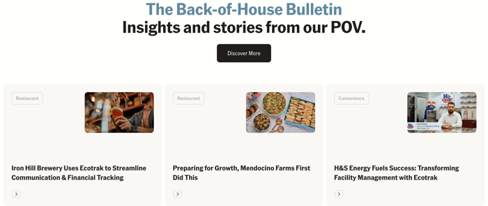
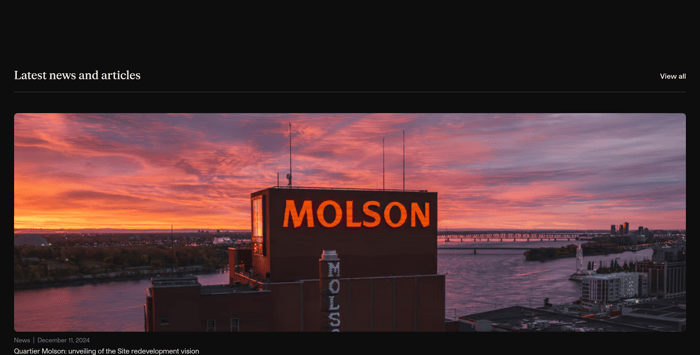
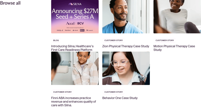
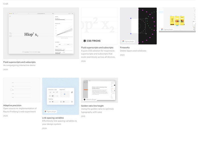
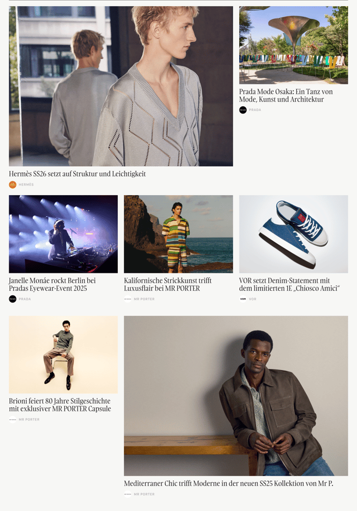
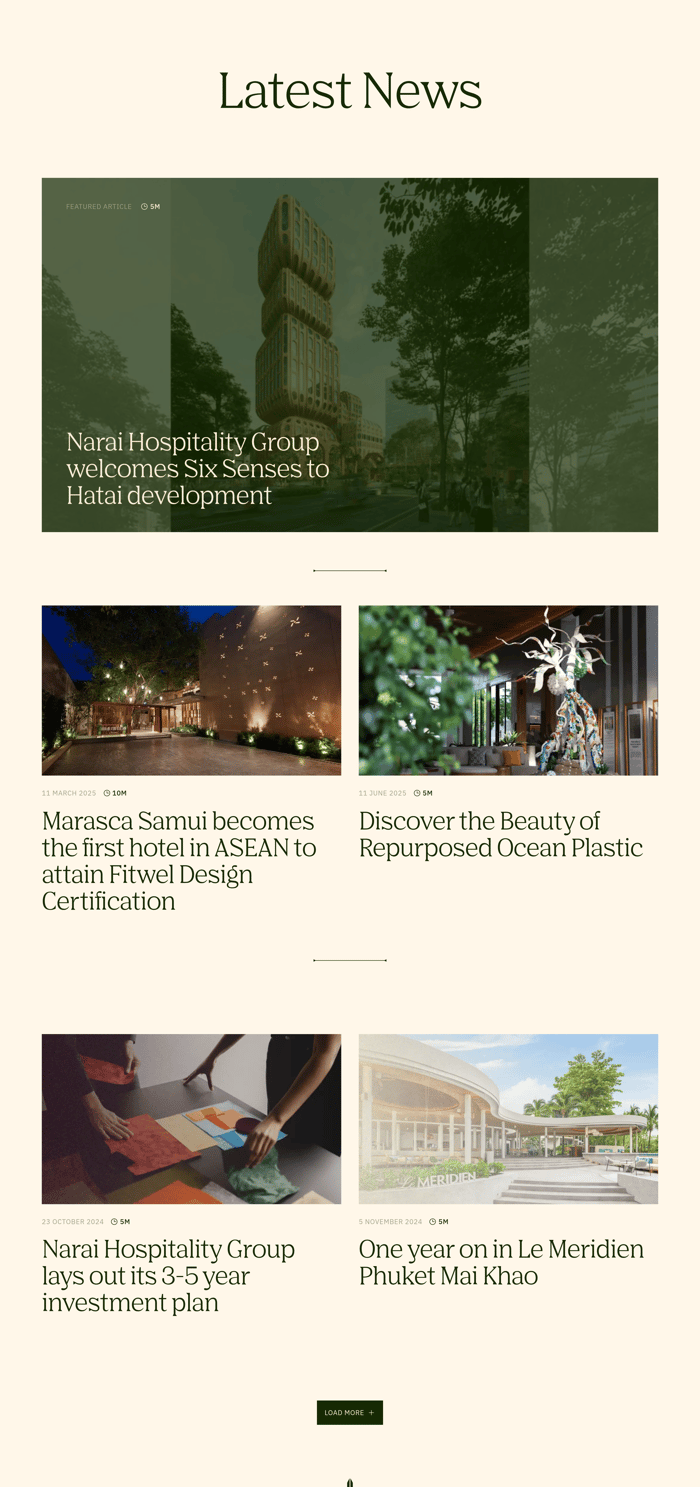
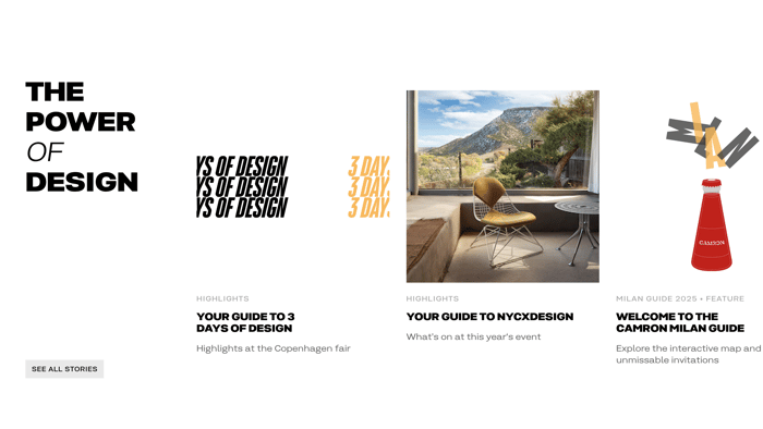
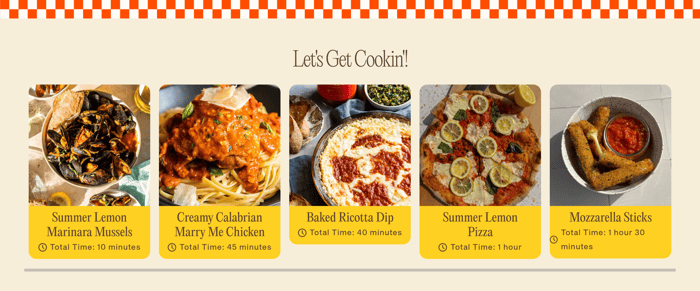
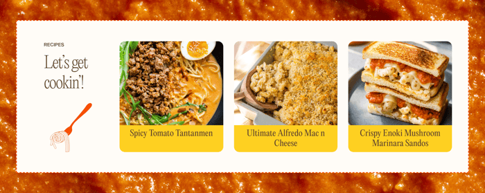
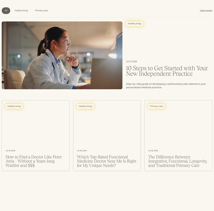
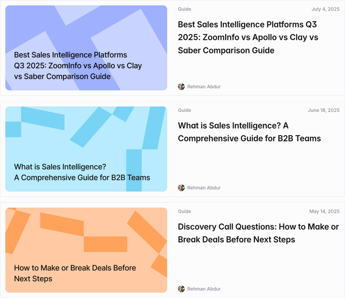
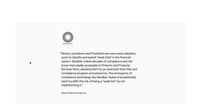
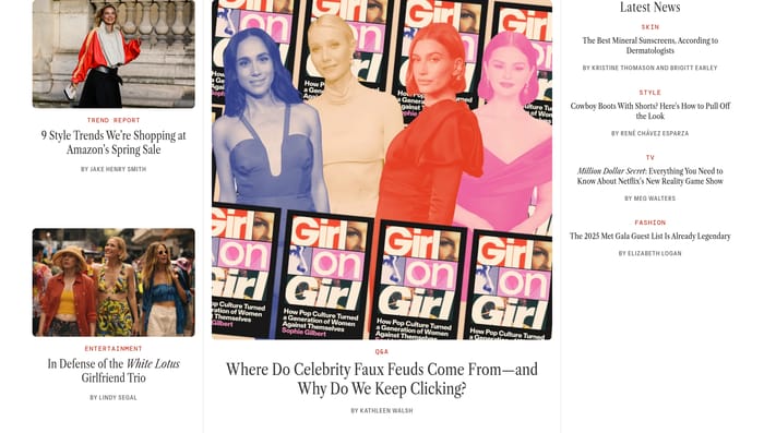
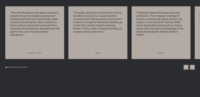
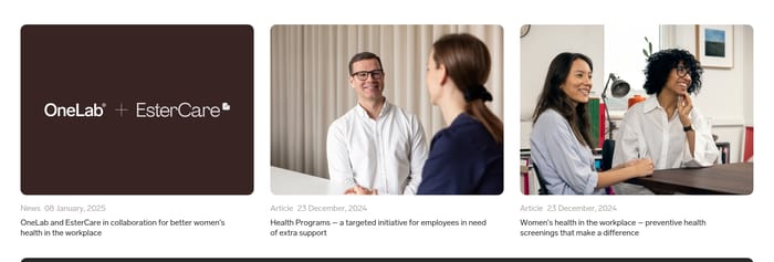
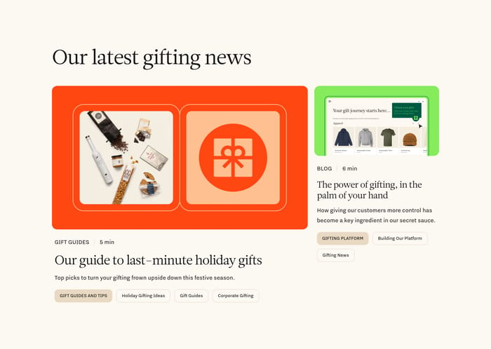
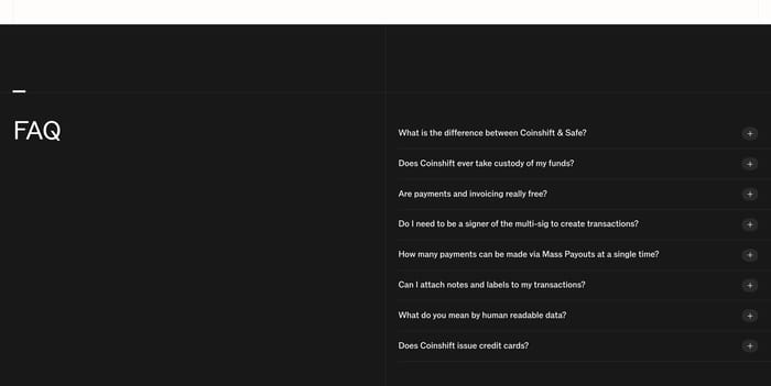
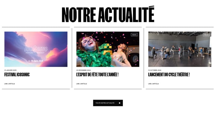
An articles section is a compact index of writing that lives on a marketing page, homepage, or product site rather than only on a dedicated blog. Its job is simple: show that the company publishes, then get someone into a story without sending them hunting. The strongest versions make the next click obvious. They also set a tone. A hospitality brand can lead with a dusk skyline and one long headline. A B2B team can stack customer stories next to product posts. A studio can treat the block like a magazine, mixing scales so one piece feels current. You will also see chronological lists, filter chips for internal knowledge, and recipe-like cards when the writing is practical. The useful variation is not decoration. It is how the section answers what kind of reading this is, and which piece is for me.

34 published examples

How to design a Articles section

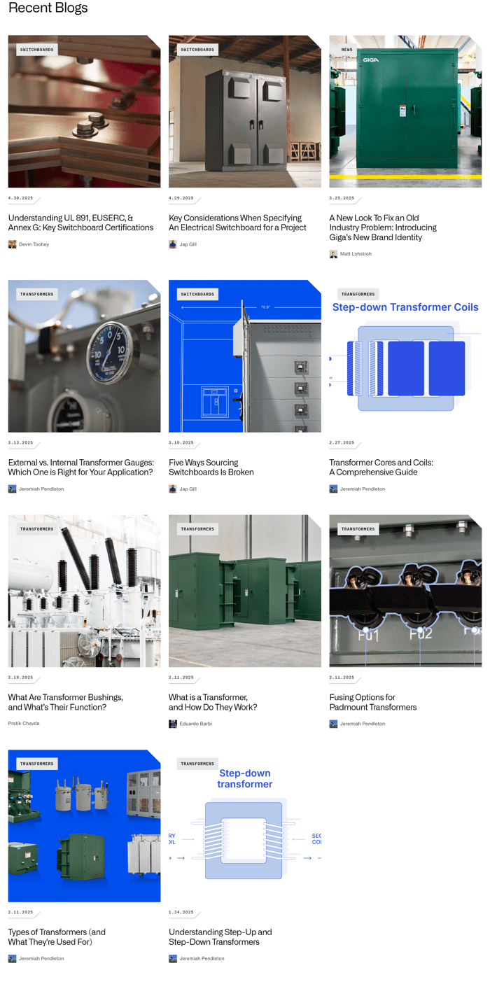
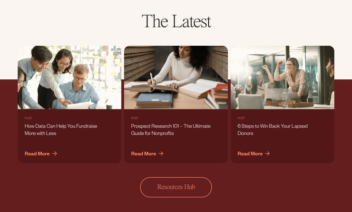
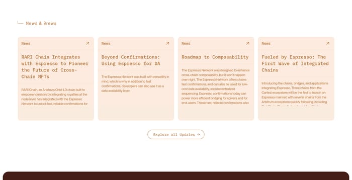
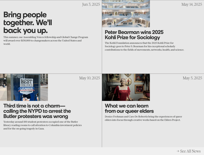
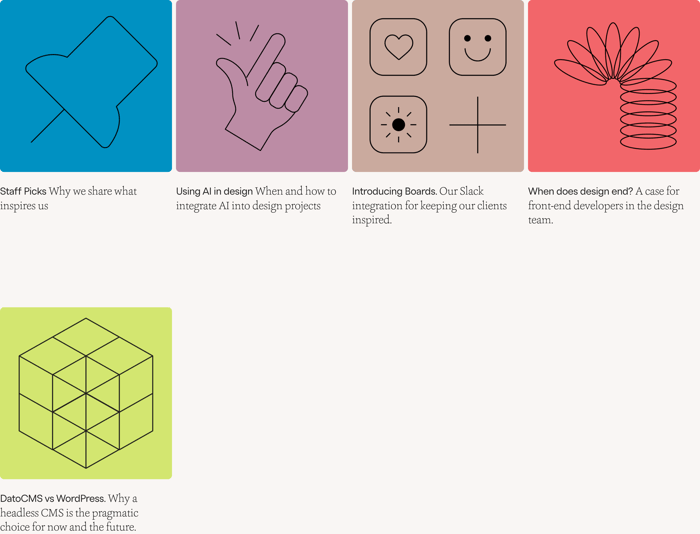
In review I look at scan time first. Cover the section, then uncover it for three seconds. Can you name the newest piece, the kind of writing, and where the full archive lives? If those three answers are fuzzy, the layout is competing with itself. Equal cards are honest and easy to maintain. They sag when every crop, every title length, and every stock photo is identical. Four-line headlines turn a tidy trio into a wall. I tend to keep a single metadata line—type or date—unless the library is large enough that people will actually sort. A featured lead earns its height when you publish in bursts. One wide story says the site is alive. Pair it with a quiet archive link instead of a second row that shouts just as loud. Photography should argue for the click. Abstract color blocks are fine for product education; they look cheap next to a real customer or a real place. Filters and read times only pay off if each bucket will still hold a few pieces next quarter. Empty chips make the section feel unfinished.

Articles design questions

Should an articles section mix blogs, news, and case studies?

Yes, if the visitor’s job is to keep reading about this company. Split them if the jobs differ: proof versus opinion versus product education. When you mix, the type label has to be the first readable thing on the card, not a whisper under a photo. Otherwise people open a case study expecting a point of view and leave.

How many pieces belong above the archive link?

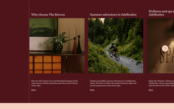
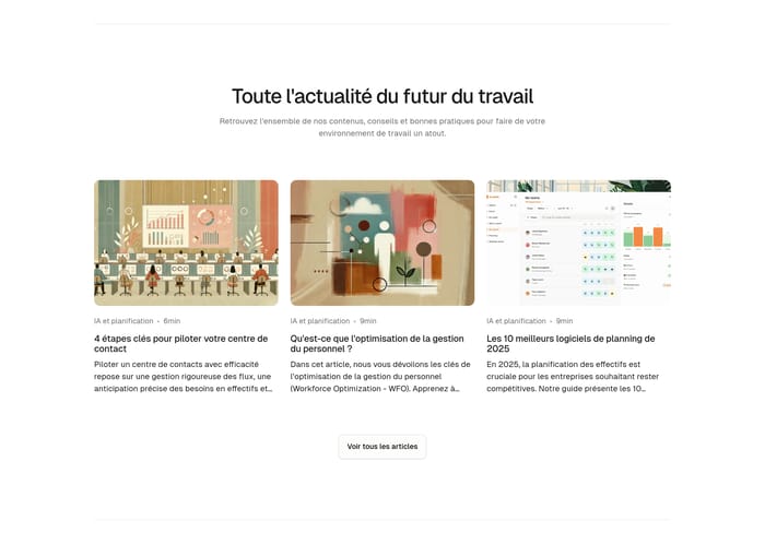
Three is enough when cards are image-led and titles run long. Six to nine suits a denser newsroom grid. A single featured story can carry a homepage if you publish slowly. The last visible item should still look chosen. If you are filling a row with older leftovers, drop the row.

When should this be a list instead of cards?

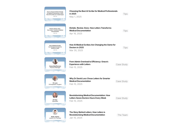
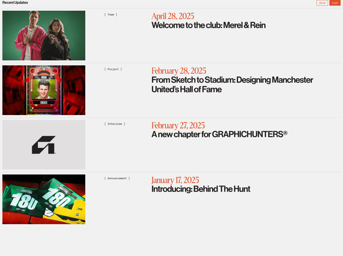
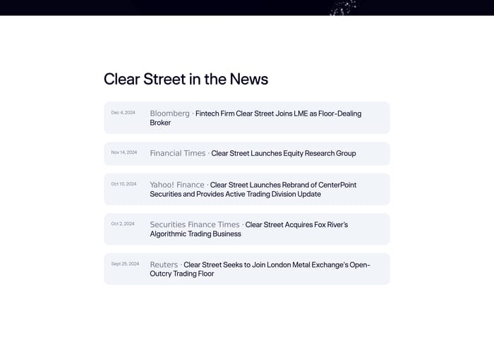
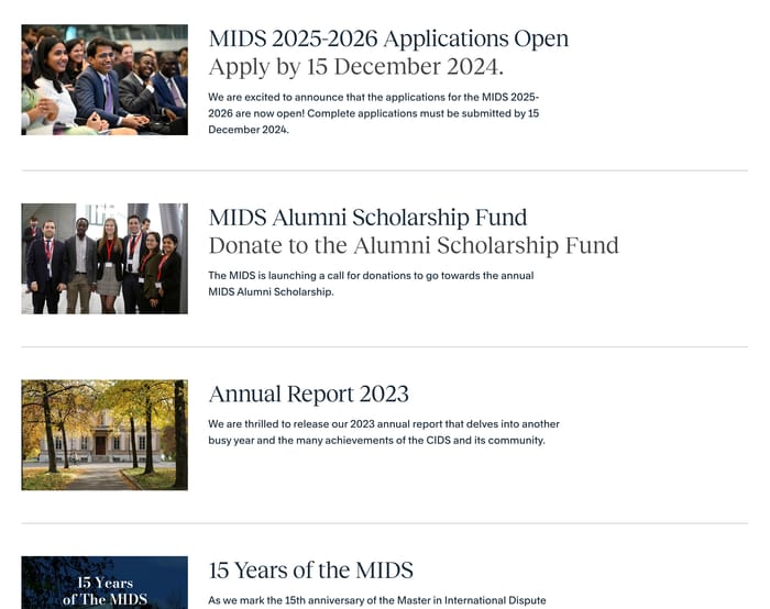
Use a list when recency and type matter more than atmosphere—updates, interviews, announcements, research notes. A thumbnail plus a date-forward headline scans faster than a photo grid, and it stays readable when images are uneven. Cards win when the picture is the hook, as in hospitality, food, or fashion editorial.

Unlock premium section designs

Go Pro to get instant access to 34 premium section designs + exclusive features

Related section categories

Curating the internet’s finest.