



Feature Sections: Patterns for Product and Marketing Pages

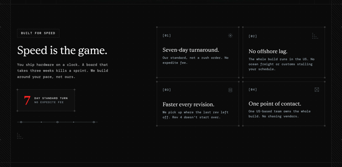
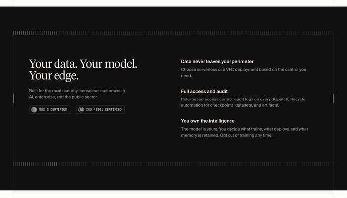
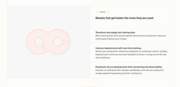
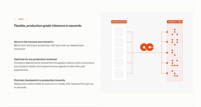
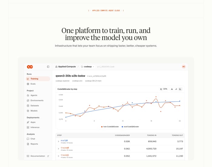
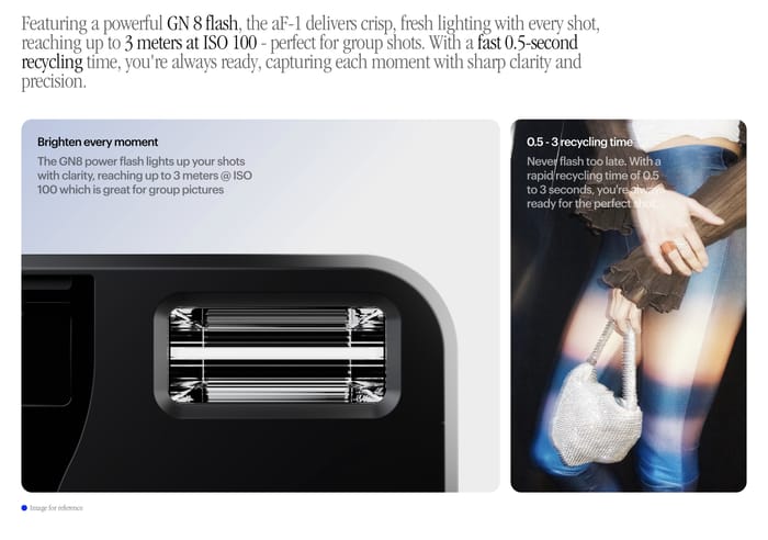
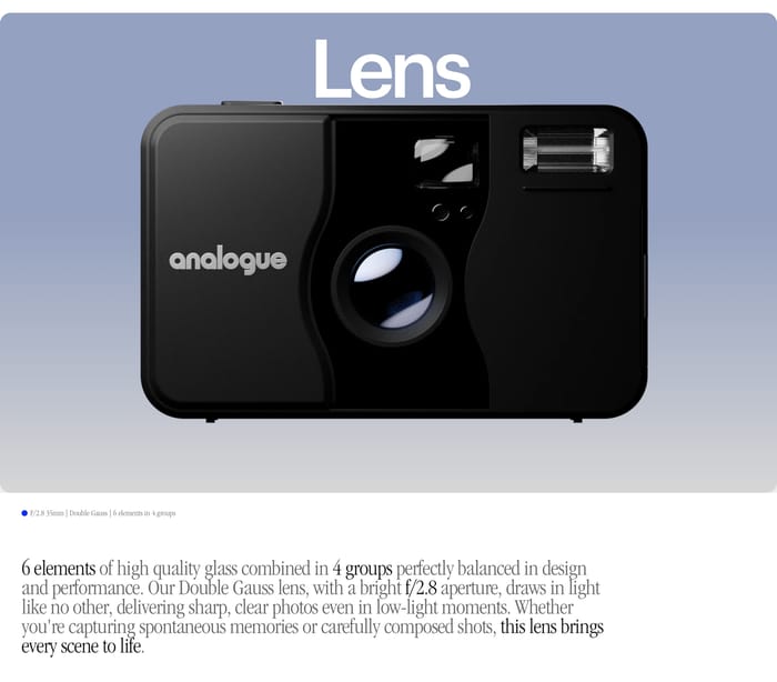
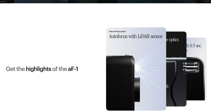
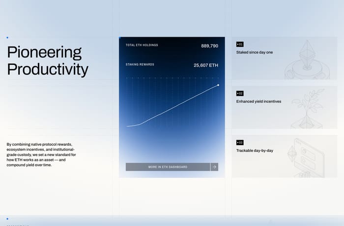
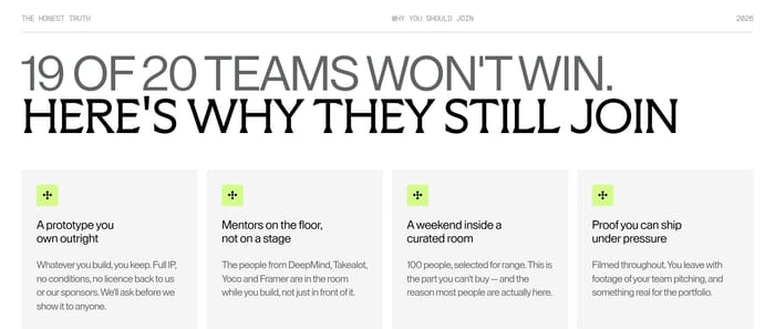
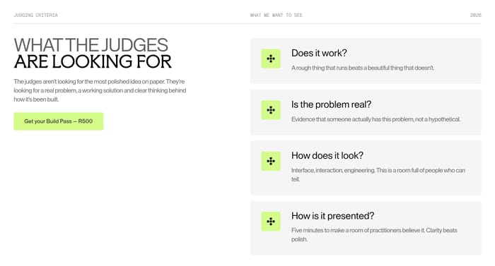
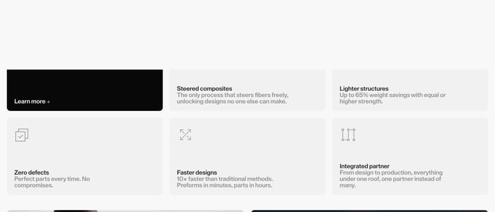
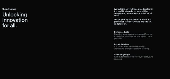
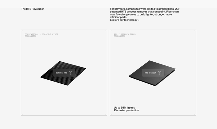
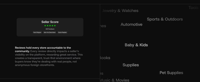
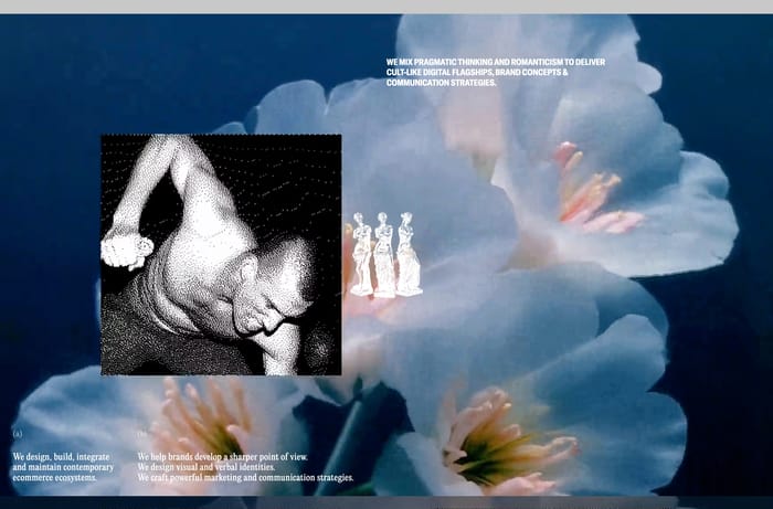
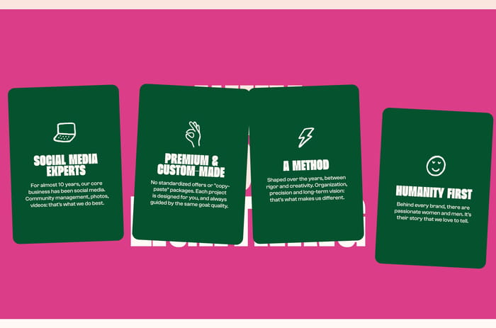
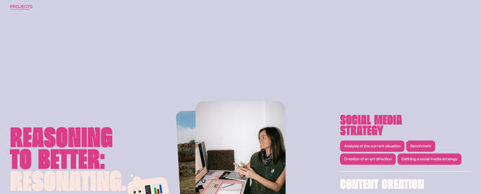
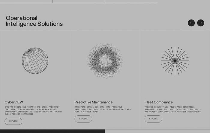
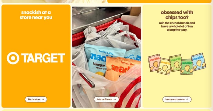
A feature section is where a page stops promising and starts specifying. After the opening pitch, it gives the visitor something they can scan: capabilities, services, product traits, security claims, or a contrast with the usual alternative. The collection shows how wide that job can stretch without becoming a different section type. Retail and service sites often use three equal columns—icon, short line, button—so shipping, samples, or help read as a set. Agencies and consultancies treat the block as a menu: grouped offerings, numbered capabilities, or a long list of standards. Product and platform pages lean harder on proof, pairing a headline with UI collage, a single SKU, or a dense card grid. A smaller group argues by contrast, lining up pain against a fix or their model against a traditional one. Useful variation is mostly about hierarchy and evidence. Equal cards keep claims independent. A split or accordion gives one story room.

482 published examples

How to design a Feature section

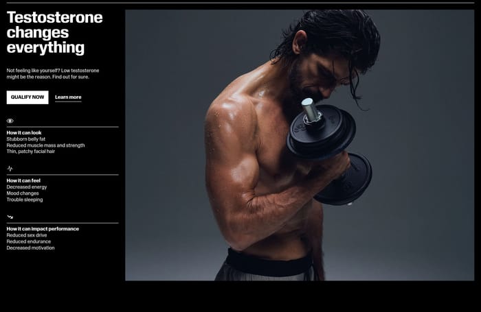
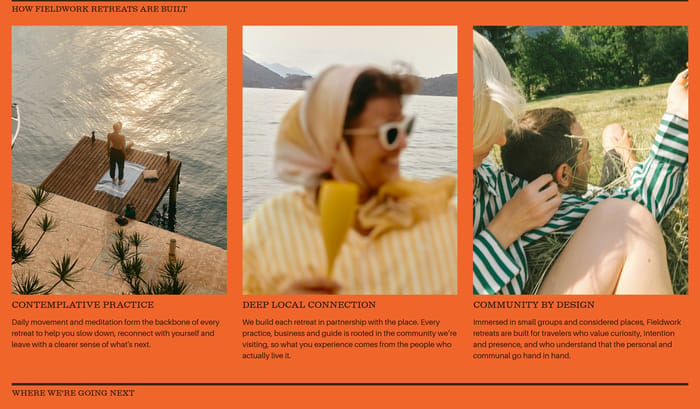
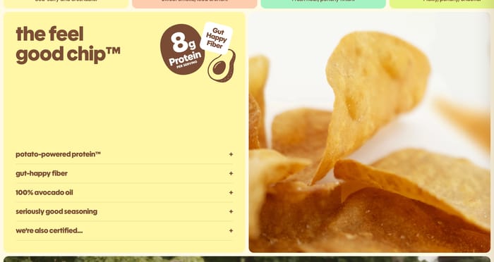
I tend to cover the section with my hand and ask whether the three claims still read. If every card needs a paragraph to make sense, the layout is fighting the content. Equal-weight grids look tidy and fail when one capability is actually the reason to buy. Then a split with a real photograph or UI fragment does more work than four interchangeable icons. The reverse is also true: a cinematic product shot next to three adjectives is just a second hero. Watch headline rhyme. "Fast," "Secure," and "Simple" collapse into one blob. The stronger pages name a mechanism—passkeys, self-custody, no migration, senior hands-on team—so the visitor can disagree. Comparison tables only earn their width if both columns describe a real operating model. Straw-man agencies and vague "traditional" rows make the designer look nervous. Density is a pacing problem, not a brand one. A six-item accordion beside a documentary photo can feel calmer than a 2x3 card grid with UI chrome in every cell. If a card already has a screenshot, the title should not restate what the screenshot shows.

Feature design questions

How many features should one section carry?

Enough that a visitor can name the set after one pass. Three to six independent claims usually hold. Past that, the section is either a catalog and should look like one, or it is a dumping ground. If two items share a headline shape, merge them. If one item needs a screenshot and a paragraph, it wants its own band, not another cell in the grid.

Does every feature card need its own CTA?

Only when the destinations actually differ—docs for one module, a quote form for another, a product page for a SKU. Repeated Learn more buttons on three identical columns train people to ignore all of them. A single section-level action is cleaner when the cards are just explaining. If you keep per-card links, make the labels describe the destination.

When does a feature section start competing with the hero?

When the image is as large as the opening shot and the headline restates the same promise. Feature blocks should introduce a new unit of meaning: a mechanism, a constraint you remove, a module the visitor can picture. If you can swap the section headline with the hero and nothing breaks, cut one of them or change the evidence.

Unlock premium section designs

Go Pro to get instant access to 482 premium section designs + exclusive features

Related section categories

Curating the internet’s finest.