


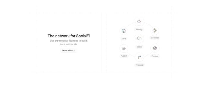

Dense logo fields for coverage
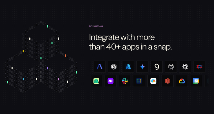
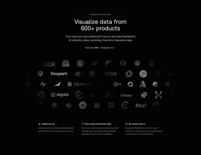
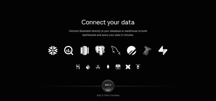
A headline plus a packed grid or row of app marks. The argument is volume: this already talks to the tools you use, so switching cost looks lower.
28 published examples
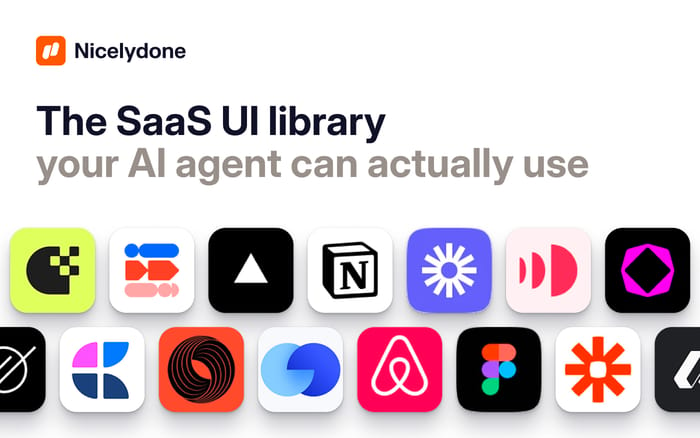

A headline plus a packed grid or row of app marks. The argument is volume: this already talks to the tools you use, so switching cost looks lower.
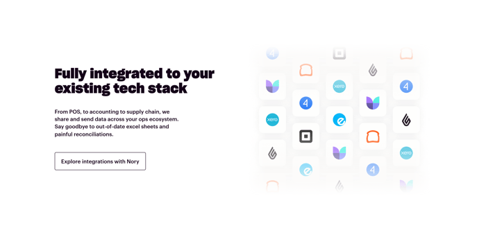
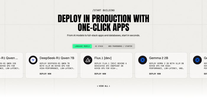
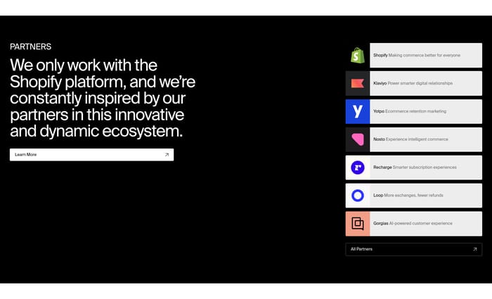
A short list of specific companies, each given a tile or wordmark. Better when the names match the product job instead of filling a generic roster.
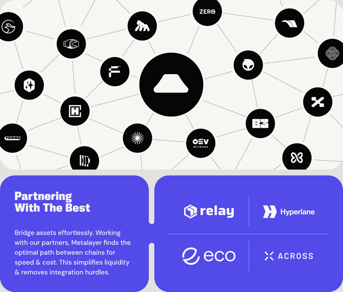
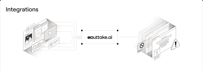
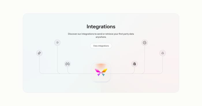
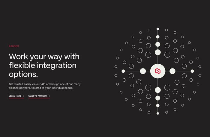
The product sits in the center, with lines or nodes to surrounding tools. The picture is meant to show data moving through one place, not just brand adjacency.
I tend to review these sections by asking one question: after five seconds, can I name the stack this product belongs in? A logo wall works when the marks are recognizable and the claim is about coverage. It fails when the grid is a gray mush, the count is inflated, or the logos look like filler. Named partner tiles work when each mark has a job: Twilio for voice, Xero for books, Shopify for commerce. They fail when every tile says the same generic line. Hub diagrams are persuasive when the product sits in the middle and the connections read as data flow, not as a constellation poster. They collapse when the illustration is prettier than the list of tools. Watch contrast on dark fields. Watch whether the CTA goes to a real catalog or a vague “learn more.” And watch the difference between an integration and a press partnership. One reduces implementation risk. The other is news. If the section cannot tell those apart, I would cut logos until the remaining ones match the headline.
A wall is enough when visitors already know the marks and the headline states a real coverage claim. It looks empty when logos are low-contrast, repeated, or unrelated to the product. If I cannot pick three tools a buyer would actually connect, I would replace the wall with named tiles.
Yes, if the catalog exists and is searchable. A button that only restates “integrations” wastes the click. The in-page section should prove fit; the catalog should let someone confirm their exact tool. Without that second step, a large count reads like marketing, not inventory.
Separate ecosystem proof from news. A Google Cloud announcement can sit nearby, but the integrations block should still show tools a user would connect this week. If the only mark is a strategic partner, say what the partnership unlocks. Otherwise it reads as status, not compatibility.