





Case Study Sections: Layouts That Prove the Work

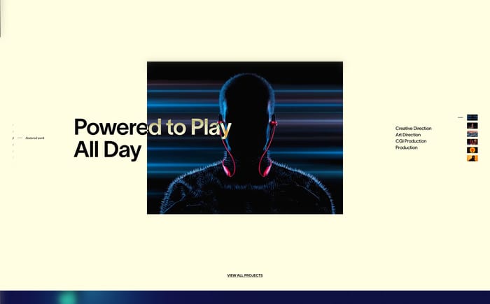
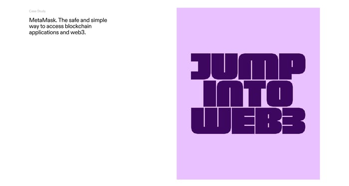
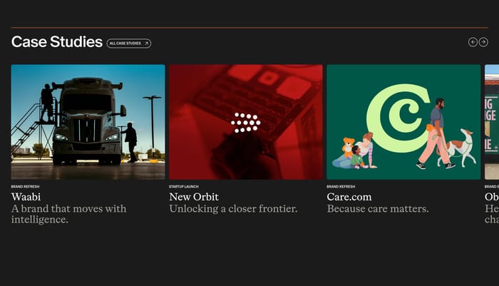
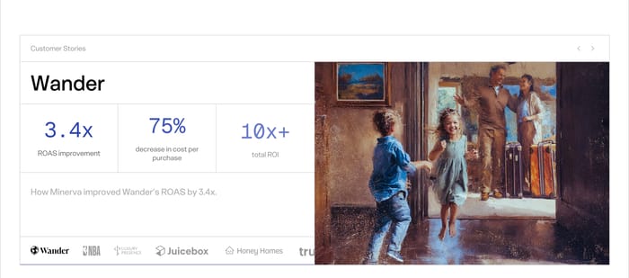
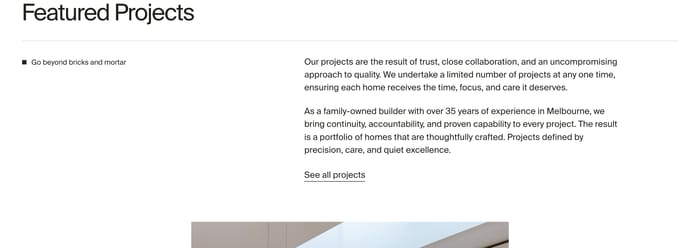
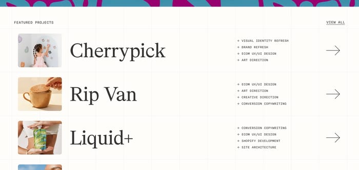
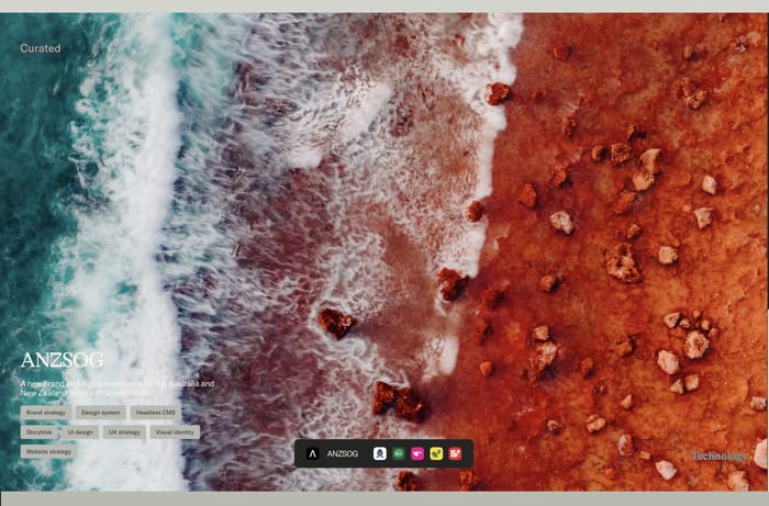
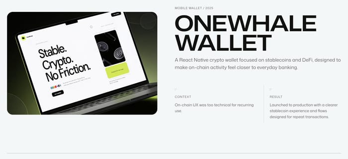
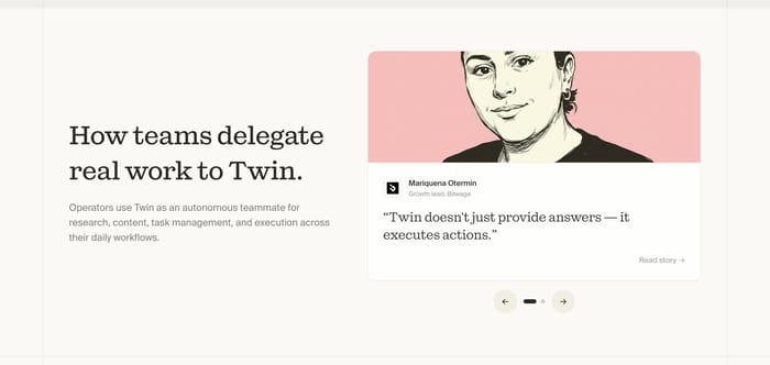
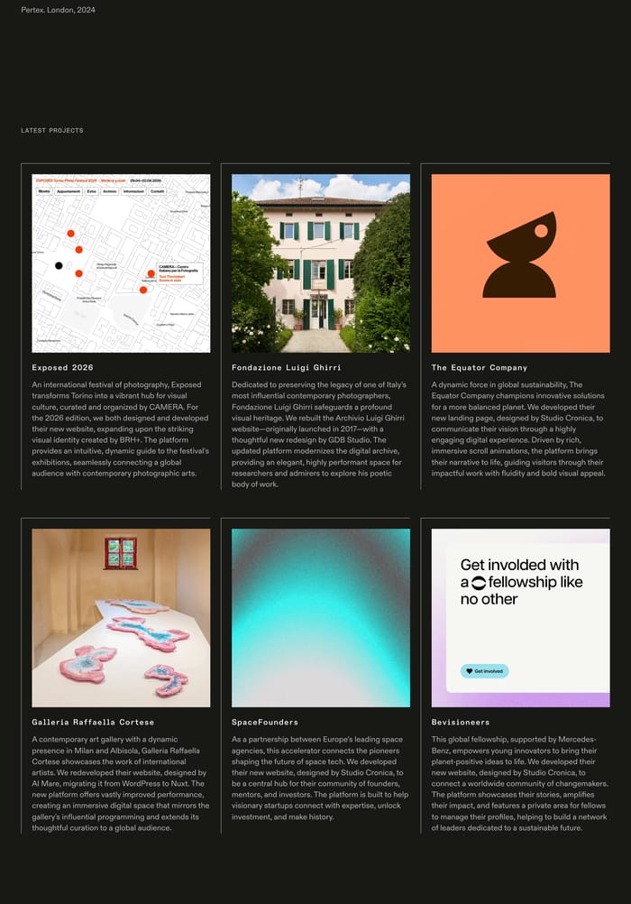
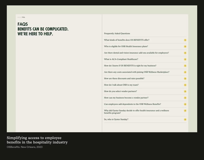
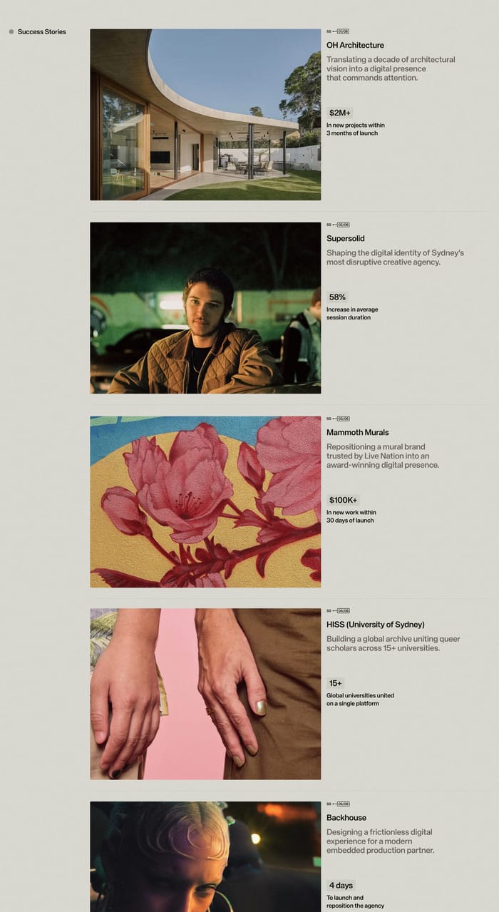
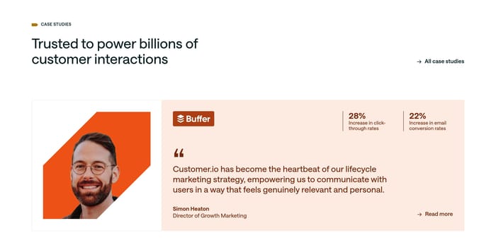
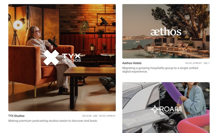
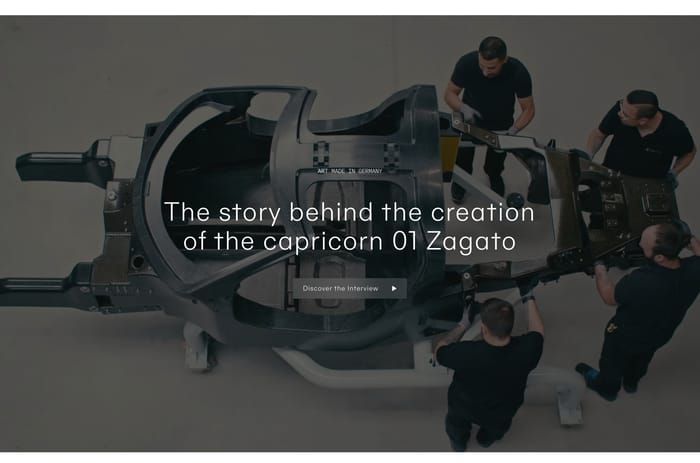
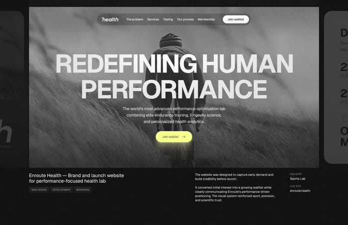
A case study section is where a page stops promising and starts showing a specific piece of work. Its job is to name a client or project, make the outcome legible, and invite a deeper read without dumping the whole narrative on the homepage. Across this collection that job stays stable, while the format shifts. Some sections give one project the full viewport: a photograph, a short brief, and a handful of service tags. Others behave like a selected-work index, stacking names, thumbnails, and arrows so visitors can scan. A third group compresses proof into quotes, stats, or a context-versus-result pair. The most useful variation is how much of the deliverable you actually see. Studio sites often lead with the artifact. Product sites more often lead with a customer and a number. Depth also varies: some teasers are a single line, others already contain the brief.

61 published examples

How to design a Case Study section

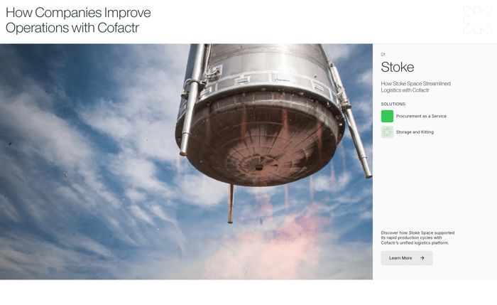
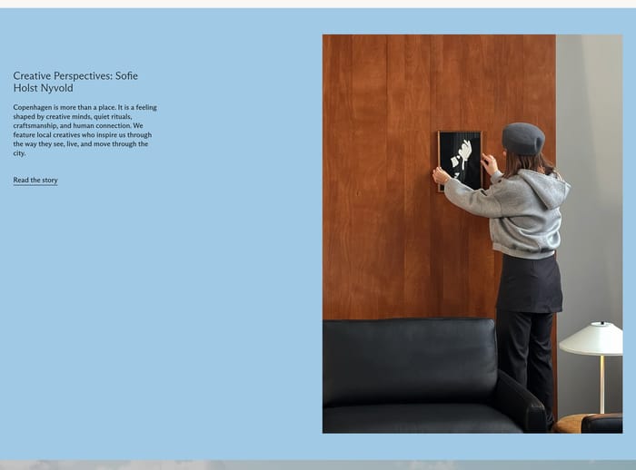
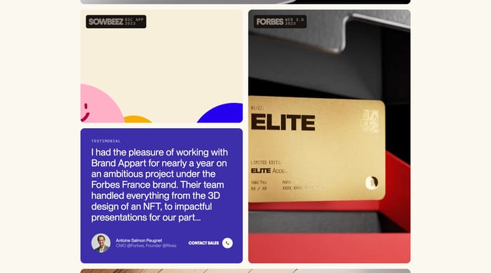
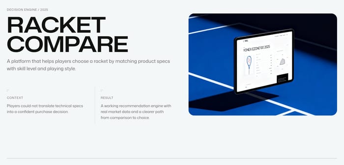
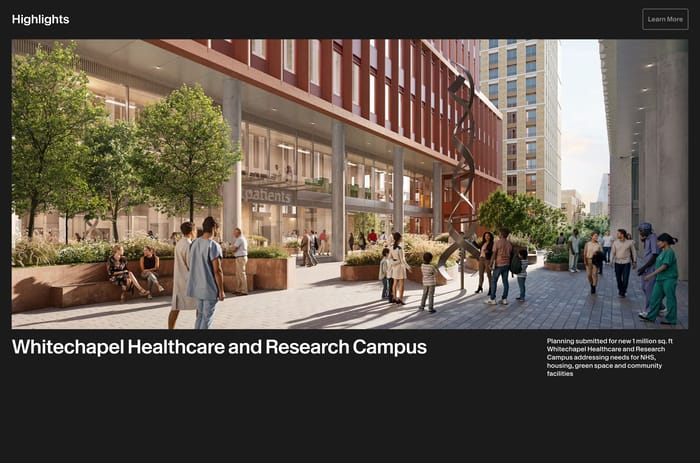
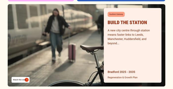
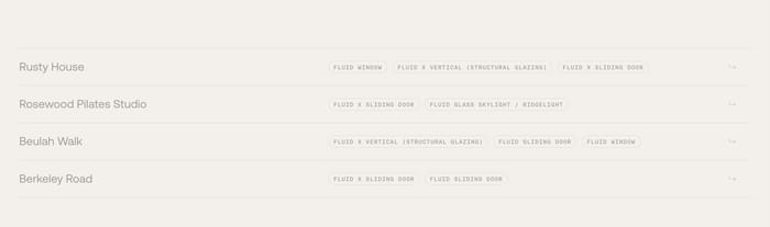
In review I keep asking one question: can a skeptical visitor name the problem and the change after five seconds? Full-bleed photography sells atmosphere, but it fails when type sits on busy sand or glass and the only proof is a logo bar. If the image is doing the selling, the caption still needs a verb. Context and result columns work when each side is a sentence, not a heading with fluff under it. They collapse when both columns restate the same pitch. Grids and lists have a different failure mode. Huge client names with tiny service chips look confident until every row offers the same four services. Then the list is a type specimen, not a filter. I tend to cut a row if I cannot tell why that project is in the set. Quote-plus-stat modules are efficient, but a 3.36% figure next to a warm portrait only lands if the metric is surprising and labeled in plain language. Carousels hide work; they are fine for rotating customers, weak as the only archive. A practical test: cover the pictures. If the remaining text still sounds like three different jobs, the section is doing its job. If it sounds like one agency bio repeated, rewrite the outcomes before you restyle the cards.

Case Study design questions

When should this section feature one project instead of a list?

Give one project the full frame when that artifact should define the next conversation, or when the photography is distinctive enough to halt a scroll. Use an index when visitors arrive hunting for a category, industry, or service and need to match themselves quickly. Pairing a feature with a quieter list works if the featured piece is actually different. Two equal heroes usually cancel each other out.

How much of the story belongs on the listing versus the dedicated page?

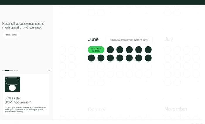
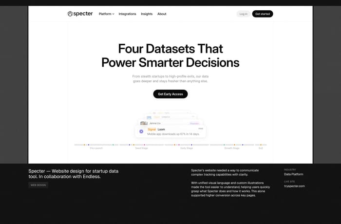
On the listing, stop at who it was for, what kind of work it was, and one proof of change. That can be a metric, a before/after fact, or a single sentence of context. Process notes, team credits, and the long narrative belong on the dedicated page. If a card needs a second paragraph to make sense, the teaser is doing the case study's job and will get skipped.

Should product companies use the same case study patterns as agencies?

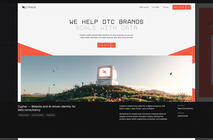
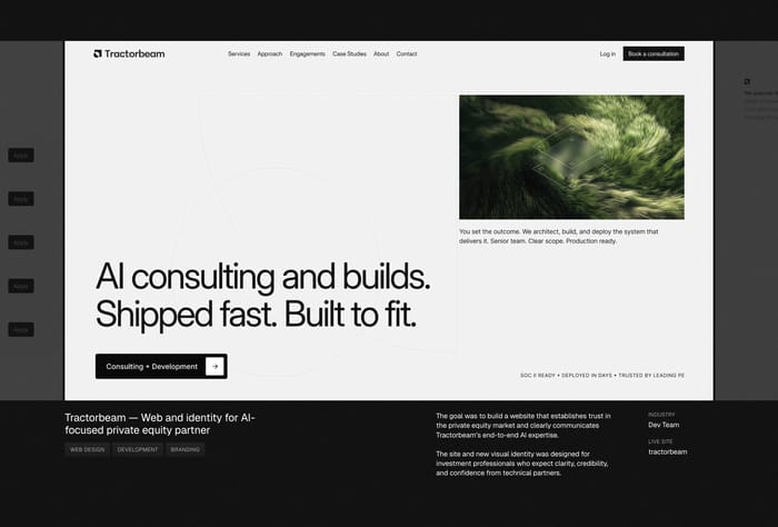
Agency sites can lead with the craft because the artifact is the product. Product and B2B sites often cannot show the customer's internals, so a named person, a bounded metric, and a clear path into the story do more work. Either way, specificity is the bar. A layout full of logos with interchangeable blurbs is a client wall, not a case study section.

Unlock premium section designs

Go Pro to get instant access to 61 premium section designs + exclusive features

Related section categories

Curating the internet’s finest.