
Scto Grotesk A Font
by Schick ToikkaScto Grotesk A is Schick Toikka’s neo-grotesque, designed by Florian Schick and Lauri Toikka as a rational recasting of the mid-century International Typographic Style sans. The designers favored the least quirky choices: strokes cut off horizontally or vertically across all weights, square dots, and capitals matching the ascender height. Matter-of-fact but not sterile, flavor A is the confident, wider companion to the narrower Scto Grotesk B. Italics slope only enough for emphasis in longer text, while the monolinear Thin and more modulated Black suit larger sizes; the name follows the older practice of identifying a type by foundry and style.
Get access to more than 30,000 premium fonts that you can use for your next project
Try Adobe Fonts now
Try Adobe Fonts now
Fonts similar to Scto Grotesk A
Scto Grotesk A font pairings
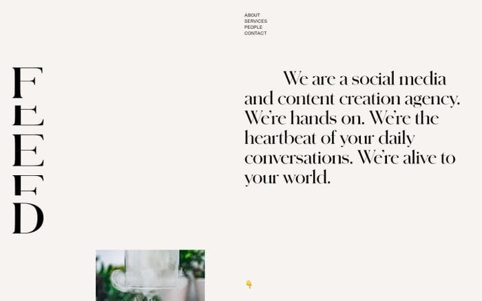
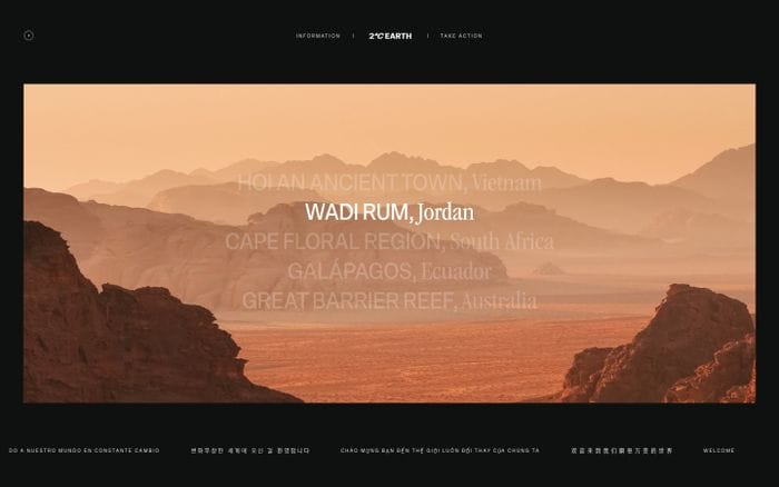
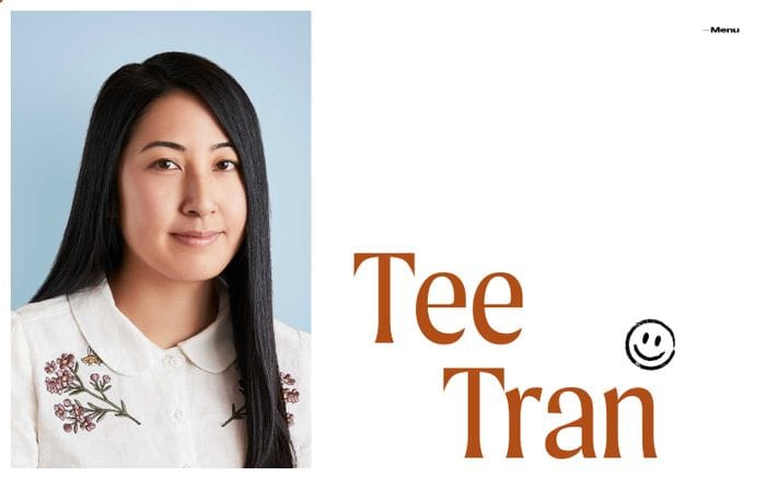
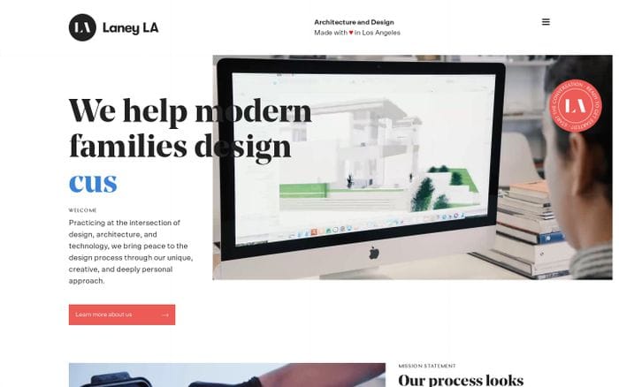
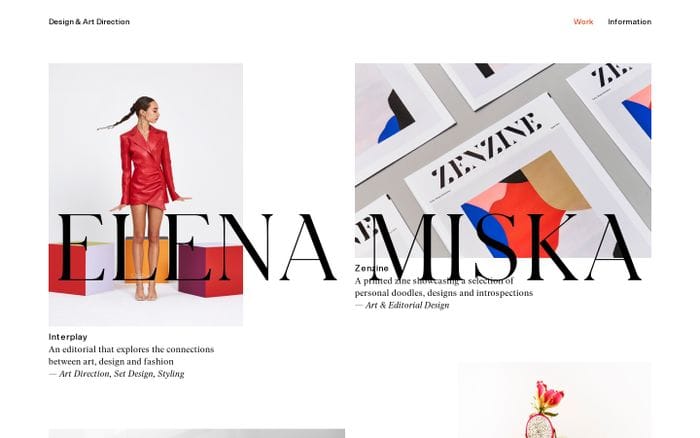
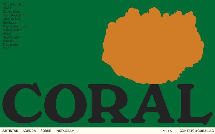
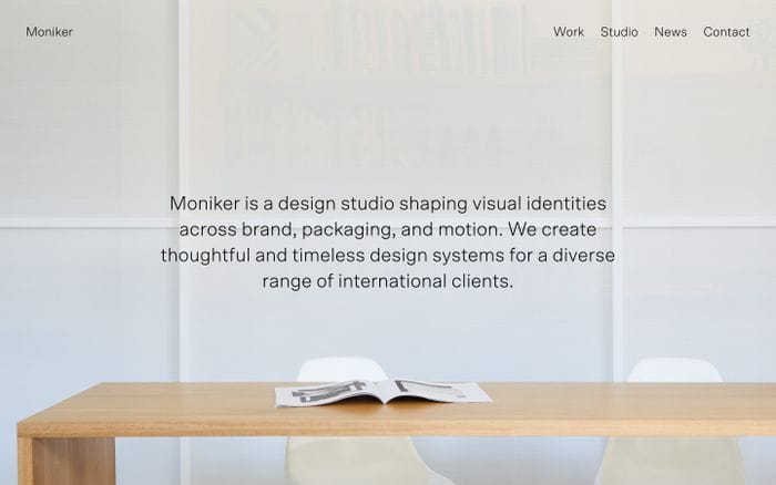
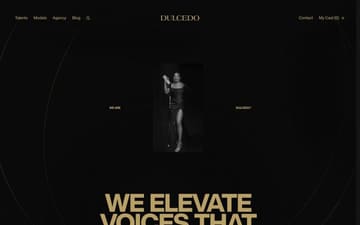
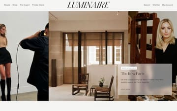
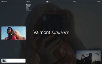
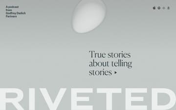
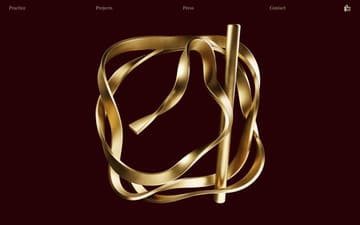
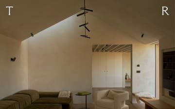
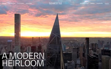
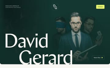
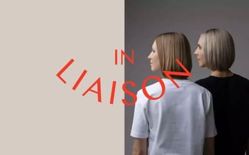
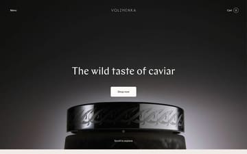
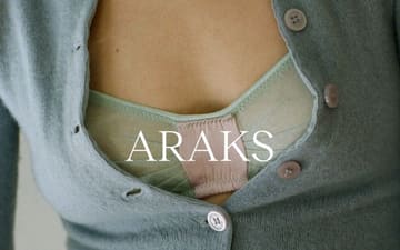
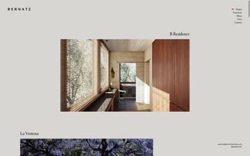
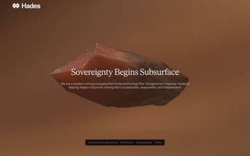
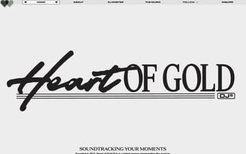
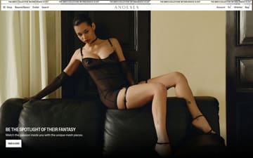
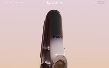
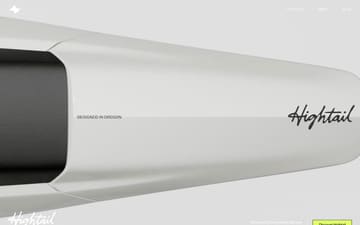
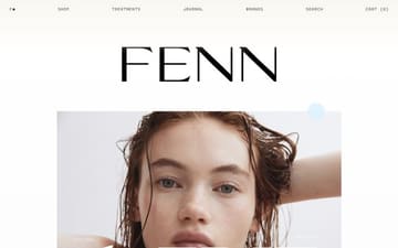
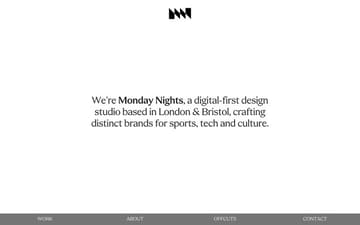
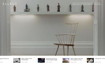
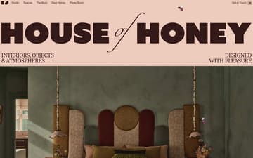
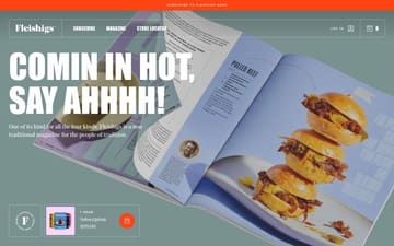
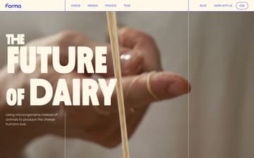
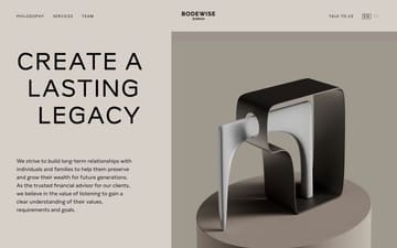
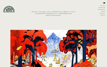
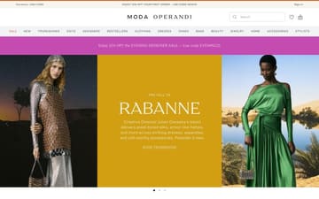
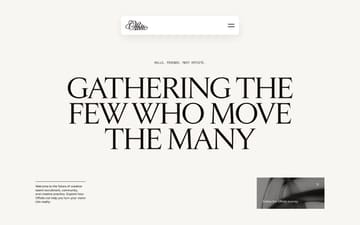
Websites using Scto Grotesk A

Nicelydone MCP
Give your AI agent access to 220k real SaaS screens

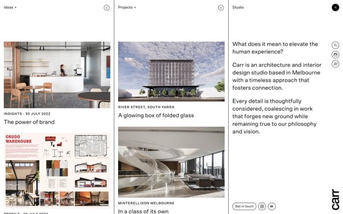
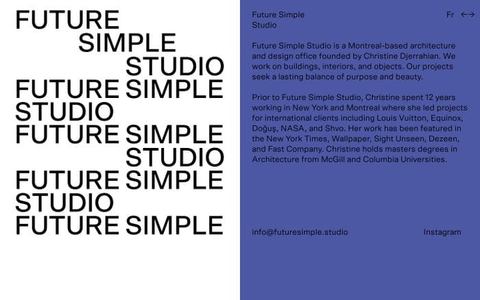
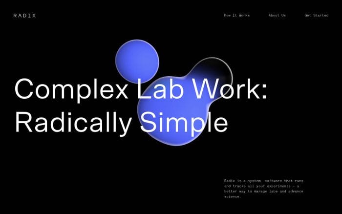
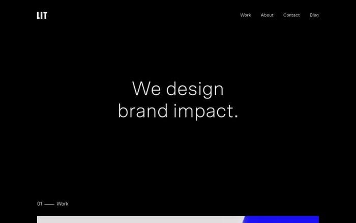
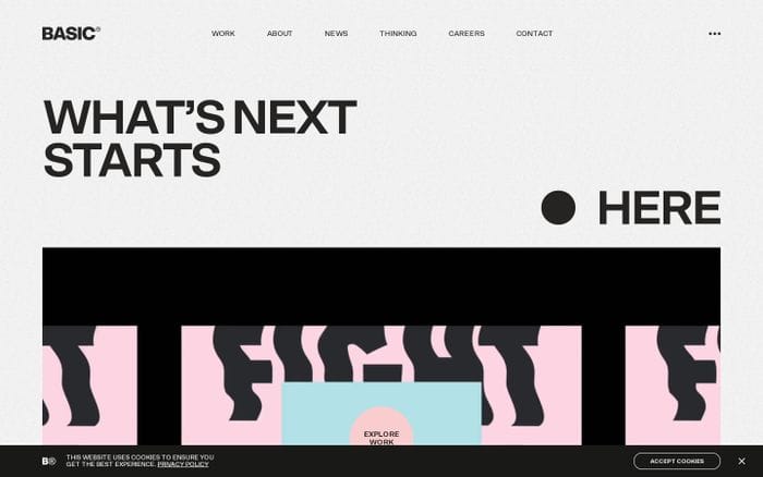
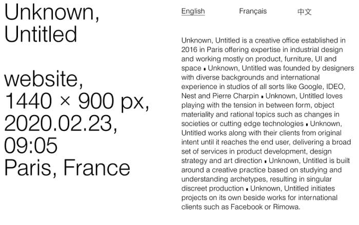

Readymag
Create your dream website with Readymag
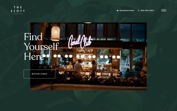

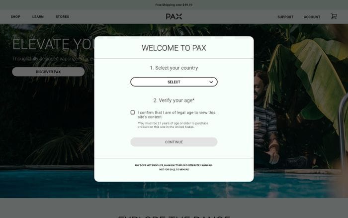
Get weekly top websites delivered to your inbox, every monday. No spam, only inspiration.Unsubscribe anytime.
Scto Grotesk A alternatives and similar fonts
Scto Grotesk A font combinations
Scto Grotesk A + Scto Grotesk
3
Scto Grotesk A + Ivar
2
Scto Grotesk A + Noe Display
2
Scto Grotesk A + Signifier
2
Scto Grotesk A + Merlo
1
Scto Grotesk A + Greed
1
Scto Grotesk A + Arial
1
Scto Grotesk A + IvyPresto
1
Scto Grotesk A + BL Arctic
1
Scto Grotesk A + GT Maru
1
Scto Grotesk A + PP Editorial New
1
Scto Grotesk A + Inter
1
Scto Grotesk A + Moulin
1
Scto Grotesk A + Ogg
1
Scto Grotesk A + Items
1
Scto Grotesk A + Shinka Mono
1
Scto Grotesk A + PP Pangaia
1
Scto Grotesk A + Montserrat
1
Scto Grotesk A + Teodor
1
Scto Grotesk A + Times Now
1
Scto Grotesk A + ABC Prophet
1
Scto Grotesk A + Le Murmure
1
Scto Grotesk A + Kommissar
1
Scto Grotesk A + Hellix
1
Scto Grotesk A + Poppins
1
Scto Grotesk A + Schnyder
1
Scto Grotesk A + ITC Garamond Condensed
1
Scto Grotesk A + FK Grotesk
1
Scto Grotesk A + Moret
1
Scto Grotesk A + Agrandir
1
Scto Grotesk A + Recoleta
1
Scto Grotesk A + Plaax
1
Scto Grotesk A + Chap
1
More fonts from Schick Toikka




























Curating the internet’s finest.