 +
+
Syllabus font (Serif font) pairing with Di Grotesk font (Sans Serif font)
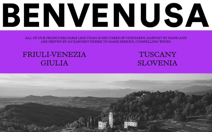
Examples of websites using Syllabus (designed by Vincent Chan and released by Matter of Sorts in 2020) with Di Grotesk (designed by Marian Misiak and released by Threedotstype in 2017)
Syllabus vs Di Grotesk
Syllabus is listed as serif, while Di Grotesk is listed as sans serif. Use this difference and the website examples below to choose the role each font should play.
The fonts appear together in 1 curated website example below.
| Compare | Syllabus | Di Grotesk |
|---|---|---|
| Type | Serif | Sans Serif |
| Foundry | Matter of Sorts | Threedotstype |
| Availability | Commercial font | Commercial font |
Syllabus + Di Grotesk in use
Curating the internet’s finest.