 +
+
Inter font (Sans Serif font) pairing with Tiempos font (Serif font)
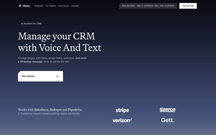
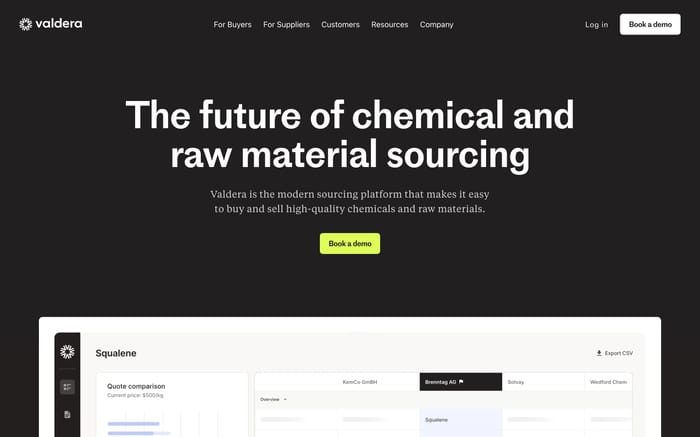
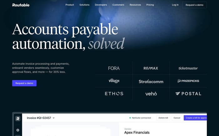
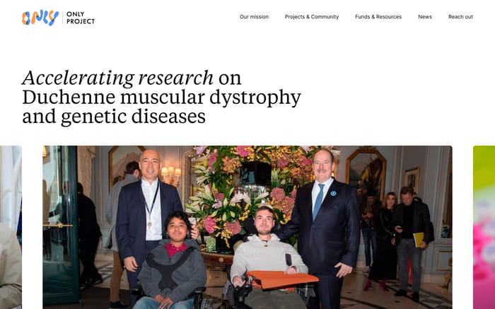
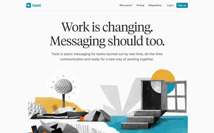
Examples of websites using Inter (Inter is a sans-serif font designed by Rasmus Andersson in 2016. It is a versatile font family that consists of 18 styles, including regular and italic variations, with a focus on legibility and readability) with Tiempos (Tiempos is a serif font designed by Kris Sowersby and released by Klim Type Foundry in 2010. The family includes four widths (normal, narrow, condensed, and compressed), each available in eight weights with matching italics)
Inter vs Tiempos
Inter is listed as sans serif, while Tiempos is listed as serif. Use this difference and the website examples below to choose the role each font should play.
The fonts appear together in 8 curated website examples below.
| Compare | Inter | Tiempos |
|---|---|---|
| Type | Sans Serif | Serif |
| Foundry | Not specified | Klim Type foundry |
| Availability | Google Fonts | Commercial font |
Inter + Tiempos in use

UI Component Inspiration
12,500+ UI components from industry-leading apps


❖
Go Pro Build a private inspiration library, not just a browsing session.
Go Pro to save every reference you want, keep private collections for projects, and unlock HD screenshots while you browse.
Unlimited saves, private collections, HD screenshots.

Curating the internet’s finest.