Arketyp Sans font (Sans Serif font) pairing with Arketyp Serif font (Serif font)
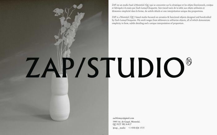
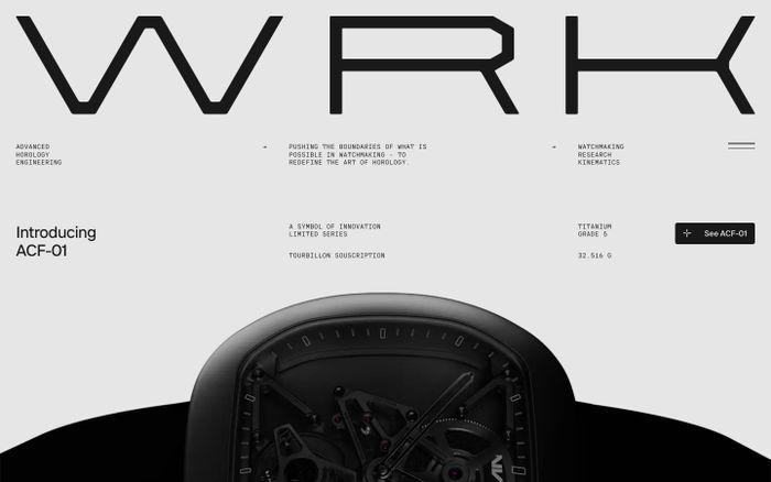
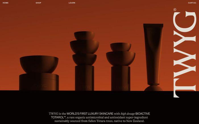
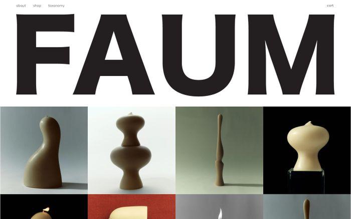
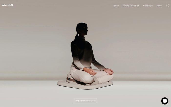
Examples of websites using Arketyp Sans (Arketyp Sans was designed keeping in mind the legibility factor, even at really small sizes on screen. This typeface has a standard set of tabular lining numbers that help in alignment in data sheets, making it an ideal choice for professionals who deal with data. The font's inspiration comes from old ink traps that existed to prevent letters from getting blotted in small sizes. While printing presses used ink traps, screens use pixels, and the situation becomes complicated with hinting in small sizes, different screen resolutions, hinting software, and various browsers. Space has been added for the most sensitive parts of the letters, which helps in hinting and ultimately results in more legible content. The typeface's design and pixel-perfect execution make it the go-to choice for web design and other digital applications, where clarity and readability are of utmost importance) with Arketyp Serif (Arketyp Serif was designed with the goal of creating a web-optimized Serif font that still retained the graceful qualities of 16th-century Serifs. It consists of one weight with two optical sizes for improved legibility. This typeface was inspired by sacred geometry, which was used to construct Cathedrals and Temples and involved the use of a compass and straight edge. In the 15th and 16th centuries, many typographers and artists like Felice Feliciano, Luca Pacioli, Johann Neudörffer, and Albrecht Dürer created their own alphabets that drew upon these old geometric principles and philosophies. Arketyp Serif is a modern Serif font that is functional both in large and small sizes, but its soul is rooted in medieval times and the old geometric concepts of the past)
Arketyp Sans + Arketyp Serif in use
SaaS Design Inspiration
150,000+ SaaS UI examples searchable in seconds
Get weekly top websites delivered to your inbox, every monday. No spam, only inspiration.Unsubscribe anytime.
Get weekly top websites delivered to your inbox, every monday. No spam, only inspiration.
Unsubscribe anytime.
Unsubscribe anytime.


