
Suisse Int'l Mono Font
by Swiss TypefacesSuisse Int'l Mono is the monospaced variant of Suisse Int'l, giving every character the same width, as on a typewriter. Designed by Ian Party at Swiss Typefaces, it fuses the objectivity of a Swiss Grotesk with the credibility of a typewritten document. Non-proportional spacing shortens the middle of M and introduces barred details, while the narrow capitals link it to the Condensed styles. It is used on its own in branding, stationery, posters, and on the web, and complements other Suisse faces for transcripts, captions, indices, and code. The family is available in Thin, Regular, and Bold.
Get access to more than 30,000 premium fonts that you can use for your next project
Try Adobe Fonts now
Try Adobe Fonts now
Fonts similar to Suisse Int'l Mono
Suisse Int'l Mono font pairings

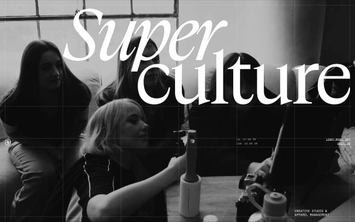
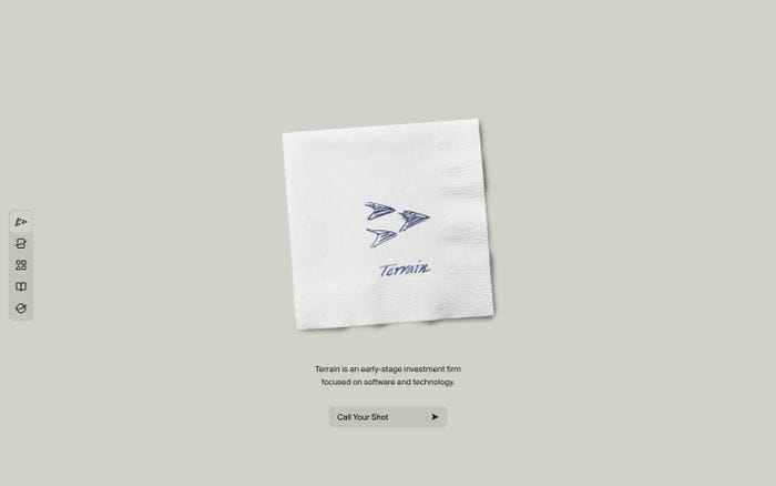
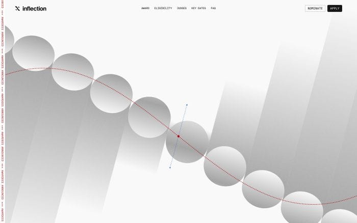
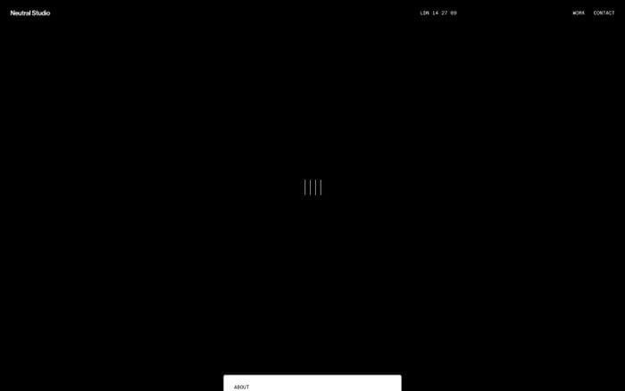
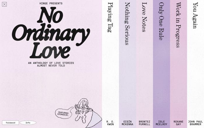
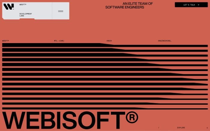
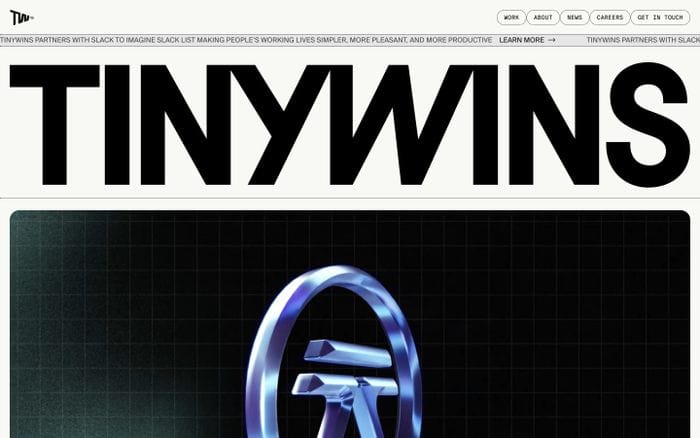
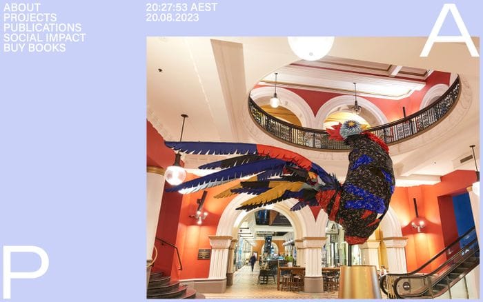
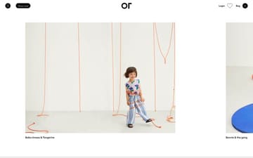
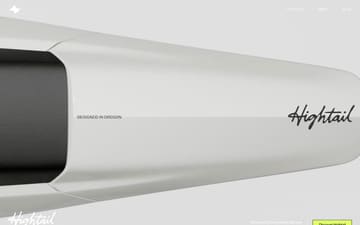
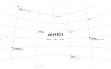
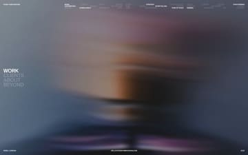
Websites using Suisse Int'l Mono



Nicelydone MCP
220k real SaaS screens, connected through MCP




Readymag
Create your dream website with Readymag



Get weekly top websites delivered to your inbox, every monday. No spam, only inspiration.Unsubscribe anytime.











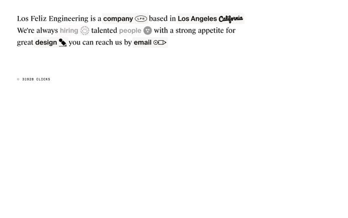
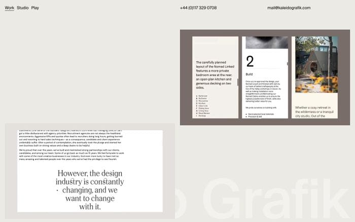

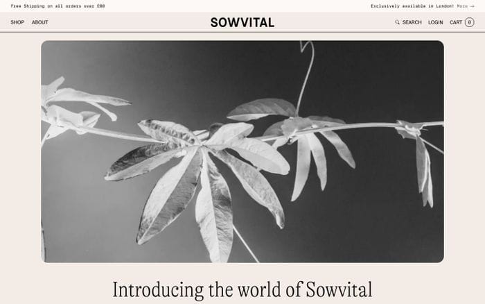



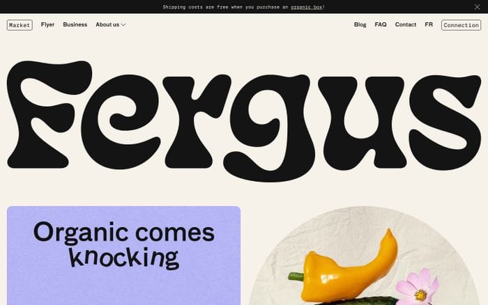



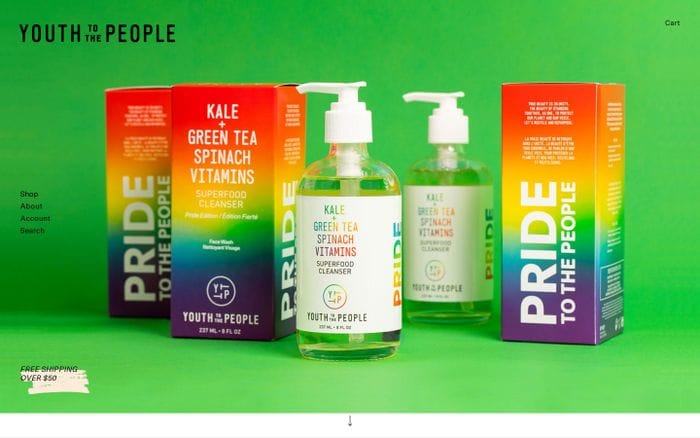
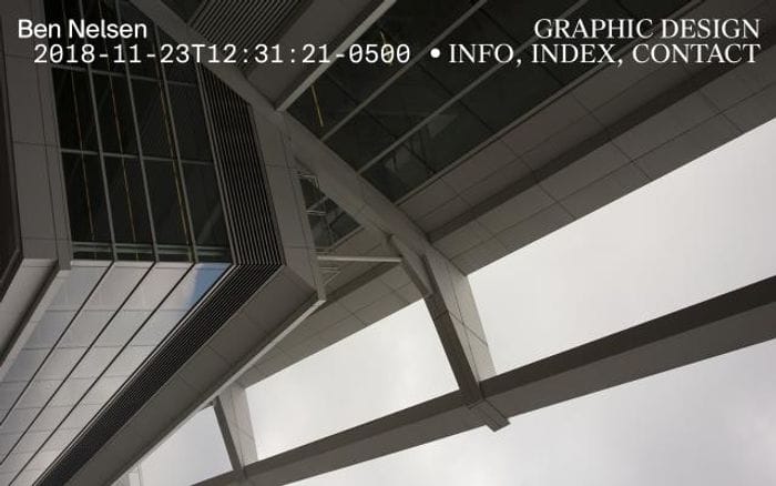
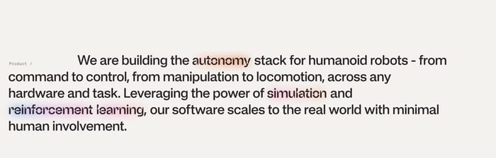
Sections set in Suisse Int'l Mono





Suisse Int'l Mono alternatives and similar fonts
Suisse Int'l Mono font combinations
Suisse Int'l Mono + Suisse Int'l
24
Suisse Int'l Mono + Suisse Works
5
Suisse Int'l Mono + Hauss
1
Suisse Int'l Mono + Boogy Brut
1
Suisse Int'l Mono + ABC Arizona
1
Suisse Int'l Mono + Neue Haas Grotesk
1
Suisse Int'l Mono + EK Roumald
1
Suisse Int'l Mono + Helvetica Now
1
Suisse Int'l Mono + PP Formula Condensed
1
Suisse Int'l Mono + ABC Arizona Serif
1
Suisse Int'l Mono + Banana Grotesk
1
Suisse Int'l Mono + Acumin
1
Suisse Int'l Mono + Feature Display
1
Suisse Int'l Mono + Acid Grotesk
1
Suisse Int'l Mono + F37 Bolton
1
Suisse Int'l Mono + Times Now
1
Suisse Int'l Mono + GT Alpina
1
Suisse Int'l Mono + ABC Favorit
1
Suisse Int'l Mono + FF Bau
1
Suisse Int'l Mono + NewParis
1
More fonts from Swiss Typefaces




















































Curating the internet’s finest.