 +
+
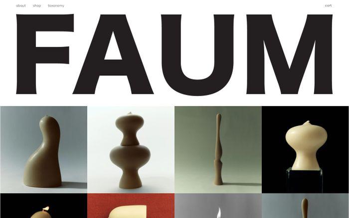
New Title font (Sans Serif font) pairing with Cy Grotesk font (Sans Serif font)
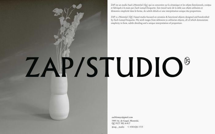
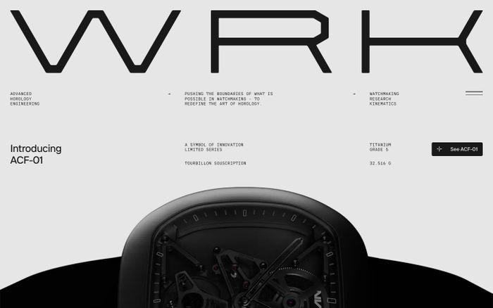
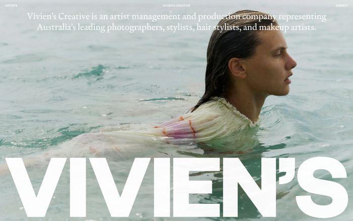
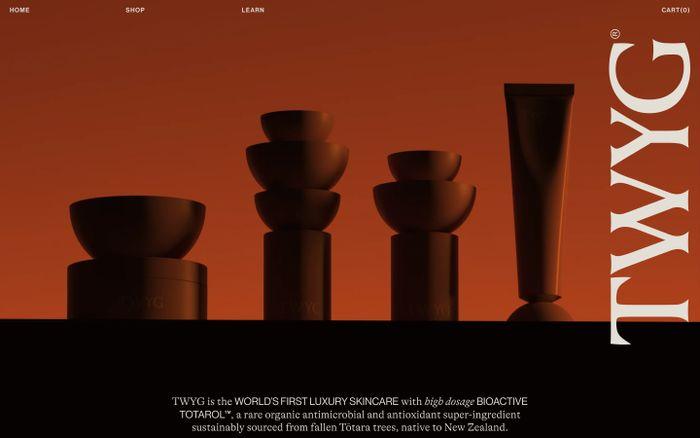
Examples of websites using New Title (New Title is a typeface family for film titles and credits sequences. Its design is narrow and utilitarian. The compressed letterforms are made up of almost monolinear strokes – only some characters have only visible contrast. Each font features a particularly unique capital ‘J’ that doesn’t descend; its out-stroke mirrors the terminals on ‘C’, ‘G’, ‘S’, ‘2’, ‘3’, ‘5’, ‘6’, and ‘9’. Title’s design also includes two forms of the lowercase ‘g’, and the fonts’ euro and yen currency symbols have a gap in the center of their main strokes) with Cy Grotesk (Cy Grotesk is the result of combining the clear forms of mid 20th-century European neo-grotesks and the expressiveness of the 19th-century grotesques. It is display typeface with an eccentric character and a special rhythm. Symbols have sharp long angled spurs and large wedge incision between the bowl and the stem, diluting it with smooth curves and the tight aperture. Built like a multifunctional workhorse that has a wide range of font uses. This type family consists of 27 styles that are adjustable in weight and width. Or one variable font with 2 axes. From pure thin to radically black. From roomy key to catchy grand. All styles include an extended set of Latin characters and a basic Cyrillic)
New Title + Cy Grotesk in use
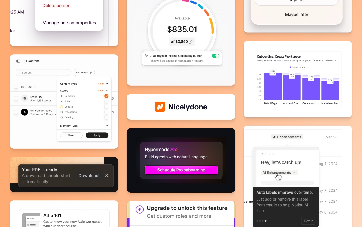
UI Component Inspiration
12,500+ UI components from industry-leading apps
Get weekly top websites delivered to your inbox, every monday. No spam, only inspiration.Unsubscribe anytime.
Get weekly top websites delivered to your inbox, every monday. No spam, only inspiration.
Unsubscribe anytime.
Unsubscribe anytime.

