 +
+
Public Sans font (Sans Serif font) pairing with New Title font (Sans Serif font)
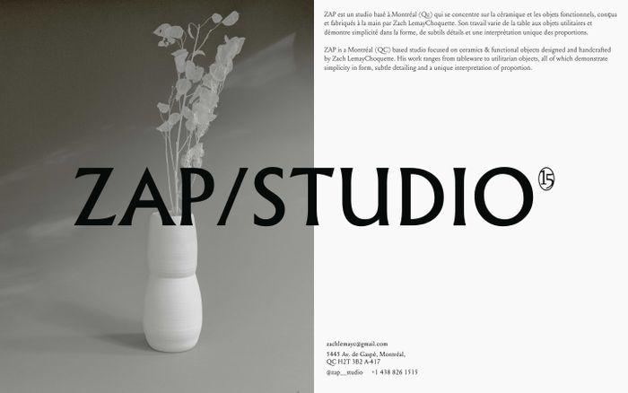
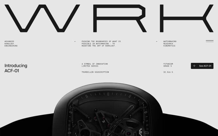
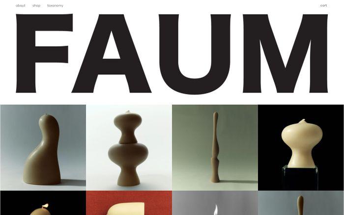
Examples of websites using Public Sans (designed by USWDS, Dan Williams, Pablo Impallari and Rodrigo Fuenzalida) with New Title (New Title is a typeface family for film titles and credits sequences. Its design is narrow and utilitarian. The compressed letterforms are made up of almost monolinear strokes – only some characters have only visible contrast. Each font features a particularly unique capital ‘J’ that doesn’t descend; its out-stroke mirrors the terminals on ‘C’, ‘G’, ‘S’, ‘2’, ‘3’, ‘5’, ‘6’, and ‘9’. Title’s design also includes two forms of the lowercase ‘g’, and the fonts’ euro and yen currency symbols have a gap in the center of their main strokes)
Public Sans + New Title in use

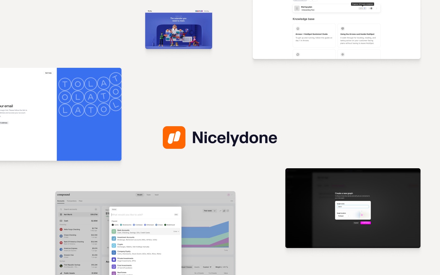
Your design research assistant
150,000+ screens, flows & UI components from best apps
Get weekly top websites delivered to your inbox, every monday. No spam, only inspiration.Unsubscribe anytime.
Get weekly top websites delivered to your inbox, every monday. No spam, only inspiration.
Unsubscribe anytime.
Unsubscribe anytime.


